Introduction
Among NN/g’s contributions to the world of UX, perhaps one of the most cited is the F-shaped reading pattern for web content, which we identified in 2006. Over the years, many have referred to this research, sometimes correctly, and in many other instances misinterpreting it. In this article, we aim to report on recent research revisiting it and also to clarify some of the misconceptions related to the F-pattern. In particular:
- Scanning on the web does not always take the shape of an F. There are other common scanning patterns too.
- The F-pattern is negative for users and businesses.
- Good design can prevent F-shape scanning.

The F-Shaped Pattern
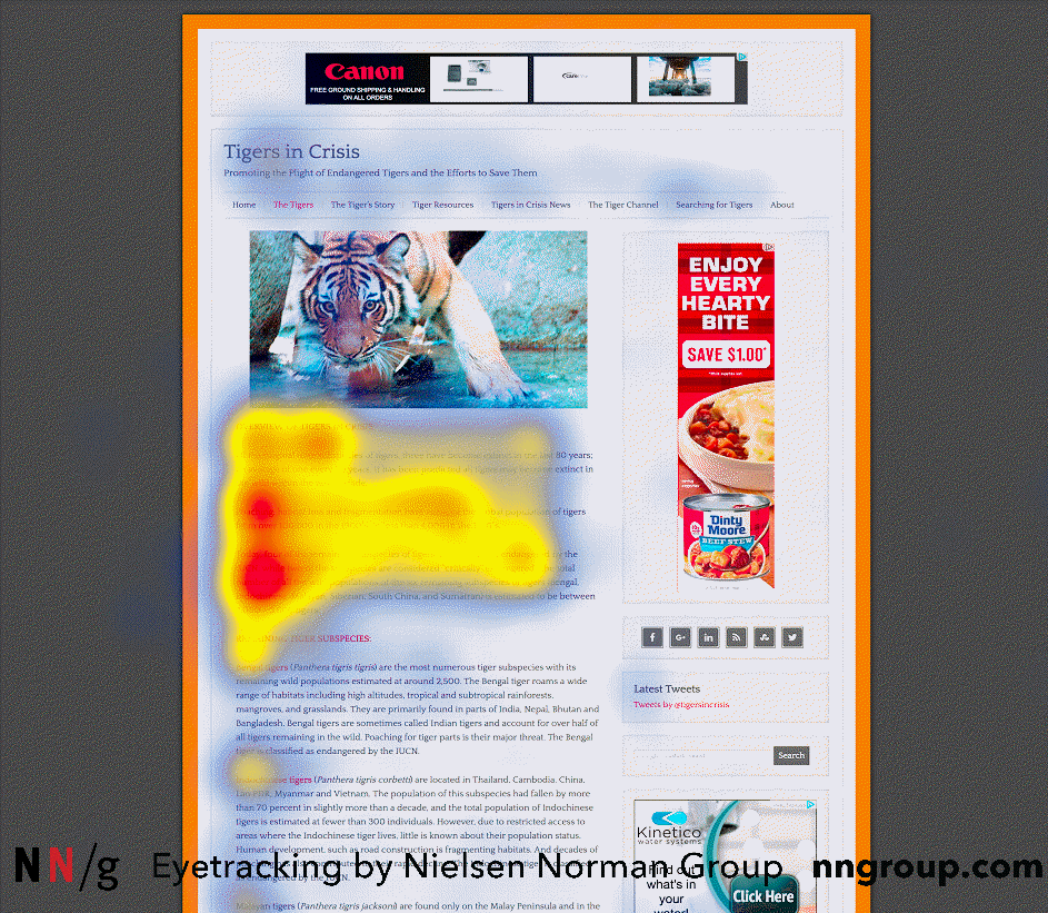
In the F-shaped scanning pattern is characterized by many fixations concentrated at the top and the left side of the page. Specifically:
- Users first read in a horizontal movement, usually across the upper part of the content area. This initial element forms the F’s top bar.
- Next, users move down the page a bit and then read across in a second horizontal movement that typically covers a shorter area than the previous movement. This additional element forms the F’s lower bar.
- Finally, users scan the content’s left side in a vertical movement. Sometimes this is a slow and systematic scan that appears as a solid stripe on an eyetracking heatmap. Other times users move faster, creating a spottier heatmap. This last element forms the F’s stem.
The implications of this pattern are:
- First lines of text on a page receive more gazes than subsequent lines of text on the same page.
- First few words on the left of each line of text receive more fixations than subsequent words on the same line.
Thus, on the first lines of text, people will scan more words on the right than on the following lines. This scanning pattern resembles the shape of the letter F, but it is rarely a perfect F. For example, in some cases, people may become interested in a paragraph down the page and may fixate on more words, reading toward the right again, so the pattern comes to resemble an E.
The F-shaped pattern applies to users’ reading of the content area of the web page. Thus, it describes people’s behavior when they visit a web page and assess its content, not their behavior when they are in a new section of the website and inspect the navigation bars (typically at the top and/or left of the page) to decide where to go next. So, in an F-pattern, the gazes on the left fall on the left part of the content area, not on the very leftmost part of the full page, if the left column is occupied by a navigation rail.
Our recent eyetracking research shows that the F-shaped scanning pattern is alive and well in today’s world — both on desktop and on mobile. A typical example of the longevity of UX findings which depend more on human behavior than on technology.
Our recent round of eyetracking research also showed that in right-to-left languages such as Arabic, people read in a flipped F-shaped pattern (as we had predicted but had not seen prior to this research).
The F-Shaped Pattern Is Not the Only Scanning Pattern
In addition to the F-shaped pattern, there are many other possible scanning patterns, including those listed below:
- Layer-cake pattern occurs when the eyes scan headings and subheadings and skip the normal text below. A gaze plot or heat map of this behavior will show horizontal lines, reminiscent of a cake with alternating layers of cake and frosting.
- Spotted pattern consists of skipping big chunks of text and scanning as if looking for something specific, such as a link, digits, a particular word or a set of words with a distinctive shape (such as an address or signature).
- Marking pattern involves keeping the eyes focused in one place as the mouse scrolls or finger swipes the page, like a dancer fixates on an object to keep balance as she twirls. Marking happens more on mobile than on desktop.
- Bypassing pattern occurs when people deliberately skip the first words of the line when multiple lines of text in a list start all with the same word(s).
- Commitment pattern consists of fixating on almost everything on the page. If people are highly motivated and interested in content, they will read all the text in a paragraph or even an entire page. (Don’t count on this to happen frequently, though. Assume that most users will be scanning.)
Why People Scan in an F-Shaped Pattern
People scan in an F-shape when all of these 3 elements are present:
- A page or a section of a page includes text that has little or no formatting for the web. For example, it has a “wall of text” but no bolding, bullets, or subheadings.
- The user is trying to be most efficient on that page.
- The user is not so committed or interested that he is willing to read every word.
The last two elements pretty much summarize all web behavior: the vast majority of the web users would rather finish their tasks as fast as possible with the minimum amount of effort; they visit a page because they want to find a quick answer rather than read a dissertation on the topic and educate themselves.
When writers and designers have not taken any steps to direct the user to the most relevant, interesting, or helpful information, users will then find their own path. In the absence of any signals to guide the eye, they will choose the path of minimum effort and will spend most of their fixations close to where they start reading (which is usually the top left most word on a page of text). It's not that people will always scan the page in the shape of an F. Although years of reading have likely trained people into thinking that more important content comes before less important content, no user really feels that the content has been arranged so the most important things appear in an F shape. The F-pattern is the default pattern when there are no strong cues to attract the eyes towards meaningful information.
People tend to minimize interaction cost and maximize the benefit they get from the work they do. For their eyes, this translates to spending few fixations, while still gleaning the information they need; being productive, engaged, and successful with what they take in from those fixations. Economizing on time means fewer fixations — looking at fewer words.
In some cases, people will get bored or fatigued as they scan text. Other times, the words they read offer only a weak information scent, which may be enough gratification to continue scanning, but not enough to read more of the text.
The F-Shape Is Bad for Users and Businesses
When people scan in an F-shape, they miss big chunks of content based merely on how text flows in a column. The skipped phrases and words are often as important — or even more important — as those words that are read. But users won’t realize this, since by definition they don’t know what they don’t see.
In responsive design, or any liquid-text layout for that matter, text flows differently depending on window size. So, a user who scans in an F-shape on his phone, for example, would not fixate on the same words if he F-scanned the same page on a desktop— just because of the way the content flows in different viewport sizes.
Make no mistake, the F-shaped scanning pattern is bad for users and businesses: it means that users may skip important content simply because it appears on the right side of the page. Good web formatting reduces the impact of F-scanning. If your pages have big chunks of unformatted text, people will scan it in an F-shape.
If scanning in an F-pattern is bad for users, why do they do it so often that it’s their dominant behavior on the web? Because it’s really only “bad” in terms of their ability to get the maximum benefit from their visit to your website. However, users don’t aim to maximize the benefits from a single website. They aim to optimize their cost–benefit ratio from their use of the web as a whole. Your website is like a grain of sand on the beach in comparison to the entire Internet. To build a nice sand castle — to stay with the metaphor — you can’t waste time searching out particularly smooth grains of sand. You have to scoop up sand by the bucketful. Similarly, users gain value from the web by dipping into multiple websites and spending little effort on each, often using page parking to keep many sites open concurrently.
The Best Antidotes to the F-Shaped Pattern
Do the work for the users instead of forcing them to exert effort and take bad shortcuts. Prioritize and format text to direct users to what you want them to see, and to what you know they want to see. Some simple tips:
- Include the most important points in the first two paragraphs on the page.
- Use headings and subheadings. Ensure they look more important, and are more visible, than normal text so users may distinguish them quickly.
- Start headings and subheadings with the words carrying most information: if users see only the first 2 words, they should still get the gist of the following section.
- Visually group small amounts of related content — for instance, by surrounding them with a border or using a different background.
- Bold important words and phrases.
- Take advantage of the different formatting of links, and ensure that links include information-bearing words (instead of generic “go”, “click here” or “more”). This technique also improves accessibility for users who hear links read aloud instead of scanning the content visually.
- Use bullets and numbers to call out items in a list or process.
- Cut unnecessary content.
Summary
Scanning on the web is dictated by:
- Users’ motivation
- Goals they are trying to achieve
- Layout of the page and formatting of text
- Page content
It’s hard to control people’s motivation or their goals, but you can optimize content and presentation so that users can find what they need quickly. In particular, use good web-formatting techniques to draw attention to the most important information instead of relying on the arbitrary words that people may fixate on when they scan in an F-shape.
For more information about the F-Shaped pattern and other scanning patterns, see our:
- Original research from 2006: F-Shaped Pattern For Reading Web Content
- Report How People Read on the Web: The Eyetracking Evidence