Aphantasia – “You have an extremely unusual way of solving problems!”

An image made without images.

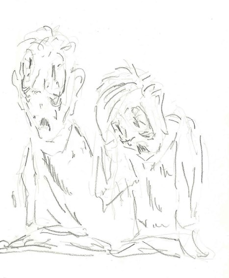
This is an old sketch from school days that I happened to have scanned. You can see the layers of lines built up as I felt around for the shape I wanted and then started to nail down the ones that landed where I wanted them.

When I was in fourth-year architecture, I took an elective course in multidimensional geometry. (Yes, I did this on purpose. It was a great course.)

In the opening lecture, the professor stood at the front of the class and asked us whether anyone could imagine an equilateral triangle with three right angles in it. Nobody could – it breaks all the rules about what triangles are. He then threw a transparency on the overhead (this was 1995 – ask your parents if you have no idea what an overhead was) that contained an image of the earth – a line was drawn along one line of longitude from the north pole to the equator (which meet at 90 degrees), then along the equator to another line of longitude 90 degrees from the first, then back up to the pole. Three identical curved lines meeting at right angles.

The sound of a roomful of minds being blown was distinctly audible.

The final exam for this course involved a series of ten mathematical proofs, all of which had to be made through drawing. No numbers were permitted in the answers. One example I happen to remember was that we needed to prove that one 3D-shape had 1/64th the volume of another. As exams go, it was kind of fun. I submitted it and left.

I happened to be back in the architecture building over the summer and was spotted and approached by the prof. He was quite animated.

“You have an EXTREMELY unusual way of solving problems!”

“Really?” (I was a little taken aback.)

“Every one of your answers, I’d look at it and think, ‘there’s no way this could possibly work,’ but then I’d sit and try to solve it step by step the way you wrote it, and each time I’d get to the end and say, ‘Oh my God, he’s RIGHT!’ I’d love to sit down and talk with you about it!”

There wasn’t time that day and ultimately I never got to have that talk. He was on sabbatical the next year and I graduated (it was a five-year program) and the mystery of my weird problem-solving mechanisms just sort of sat there as one of my collection of personal oddities. I was even a little proud of it and considered it a mark of honour. This prof taught some rather unusual courses and if he thought *I* was odd, well, that was kind of fun.

I wish now, however, that I had found a way to sit down with him. I might have learned something back in 1995 that I ultimately only learned this spring, even though there was no term for this back then.

I’m aphantasic.

Aphantasia is the term given to the lack of a mind’s eye. I don’t think in pictures. I “visualize” in total darkness (which is why I’ve never gotten the point of visualization exercises – they simply don’t work for me).

A lot has been written about aphantasia in the past few years since the condition was named. I don’t find much of it to be terribly satisfying. It seems very difficult to describe the experience of it without resorting to the language of disability and that doesn’t feel to me like an accurate portrayal. Teachers have known for years that there are different learning and cognitive styles. I think that this is one example of an identifiable reason why some of these styles might exist.

I’ve spent a lot of time analyzing the experience I had at university (honestly, imagine surviving architecture school without the ability to visualize) and in my work career since. Clearly, there are a lot of things that could have been easier for me and I now understand why I struggled under certain professors. A lot of design work assumes a visual approach. The professors who were trying to help me to come up with a good building design would find all of their techniques and tips crashing headlong into my thought processes. The last three years I was there, I’d end up cancelling all my sessions with them, going off on my own, solving things my own way and then coming back with a completed design. They could never figure out how I produced what I did and I couldn’t explain it because nobody understood that there was one key ability I didn’t have, forcing me to make do another way. My design process was dead opposite to everything I was supposed to do, in their eyes. As with my geometry prof, they couldn’t believe any of it could possibly work.

The thing is, though, clunky as it might have been, my processes did work and this is why I struggle with the representation of aphantasia that I often see. It’s regularly described as the reason people are unable do certain things, when in my experience, it’s more accurately the reason that these things just need to be done in a different manner. This might not always be the most graceful way to get to a solution, but this is unimportant if it works.

It does appear that the ability to synthesize sensory experiences is a spectrum. Some people can’t generate images internally. For others, it extends to the inabilty to imagine sound. It manifests differently in different people depending just what their level of ability is. As a result, I don’t know what the true consequence of being aphantasic is. Some people will say, “this is why I don’t like reading,” or “this is why I’m not creative,” or “this is why I have a terrible memory,” or “this is why I was bad at math.” I don’t really relate to any of that. I love to read. I create for a living. I have a tremendous memory for stories and anecdotes and little factual details. I was good at math. At the same time, I can’t tell the kids’ clothes apart. Asking me to sort the laundry is an exercise in cruelty. (I have no idea who wears what – if you ask me what the kids are wearing today, the answer is “likely clothing.”)

What I do find is that in order to create something, particularly something visual, I have to sort most of it out in my head before I can present it as an image. People like images because they’re faster to consume than text. (This is why “a picture is worth a thousand words.”) For me, though, I can’t think in pictures, so have to synthesize the picture out of the words. I have to translate what I understand into an image for others to consume. The upshot is that I can’t use a picture as a concept model that will allow me to drive out the details of a design. I need to sort out the details and then use them to build a picture.

In architecture school, this meant that where the design process was normally built around having a concept and fitting building functions into it, mine was to sort out the functions and then wrap them in a building. It often meant that my buildings weren’t as conceptually-driven, but they ALWAYS worked as buildings. I was often more concerned with what it would feel like to be in a space than what the space specifically looked like.

When I’m drawing something, I have a feeling for what I want even though I can’t see it. I liken it to walking around in a darkened room. I know there is furniture there and I have a rough idea where it is, but I have to feel around for it. Once I have a piece under my hand, suddenly I have context and can find my way around. In drawing, this shows up as a very sketchy style. I’m feeling around for the lines I want. Once I hit one, I darken it and make it solid. It then becomes the base around which I can make the rest of the picture.

I really dislike tools that don’t let me sketch. Any tool where I have to know what I want something to look like prior to making it will give me fits. Visio used to have just a handful of items to work with and I loved it. Now, it’s chock full of highly-specific items and I can barely use it. It won’t let me sketch.

My need to find a concrete point to use as a frame of reference in design means that the worst thing you can do to me is give me a truly open-ended project. To go back to my analogy of walking around a darkened room, an open-ended project is like putting me in a room where I have no idea where the furniture is or even what it is, where the walls are or whether there are even walls at all. To find my bearings I have to learn the entire room and since I don’t do pictures, I have to sort the entire thing out in my head before I can begin to draw it out. This is why I always preferred a renovation project over a new build, and why in software architecture (which is where I wound up), I need to see what components already exist. Having a reference point saves me at least half of the discovery effort. Greenfield development is normally the architect’s dream. It’s my nightmare.

Since figuring out a number of months ago that aphantasia was a thing and it represented my thought processes, I’ve been trying to find ways to align the needs I have in design with the needs others have in getting to pictures quickly. It hasn’t always been graceful. For the most part, I’ve sat on the fact that I now know this about myself because it seems career-limiting, despite the fact that I think it played a key role in getting me where I am. Because words (effectively text) is my default medium, I am incredibly good at dealing with data. It’s something I just get. I can feel it, understand the way it flows and relates, where it comes from, where it goes, what it means and what you can and can’t do with it.

But it also means I don’t fit the mold for my own position, and I know why I likely never will, and that’s kind of a lot to deal with.

Posted in aphantasia | 17 Comments

The top 100 (soon to be 110) Leafs of all time

Scotty Davidson - who should have appeared somewhere on the official Top 100 but doesn't

Scotty Davidson – who should have appeared somewhere on the official Top 100 but doesn’t

It’s centennial time!

(Not really.)

(Well, sort of – if you’re feeling kind of generous with your definitions.)

(The 100th anniversary of the first game involving the team that mostly technically is now the Toronto Maple Leafs will happen on Dec. 19, 2017.  This is the 100th season of play, but only if you count the season that didn’t actually happen in 2004-05.  The 100th season that the Leafs actually take part in will also be the 100th season that the NHL actually takes part in, and that will be next season, which also happens to coincide with the 100th anniversary of the first games – but I digress.)

So – centennial!  Yay!

The Leafs, as part of the centennial that kind of is and kind of isn’t today released a list of the top 100 Leafs of all time.  When I heard about this, my reaction was that after one gets to approximately #40, the ranking would be mostly a crapshoot.  Were I to do it, I said, I’d take ten from each decade and handle it that way.  How else does one choose between Harry Cameron and Tomas Kaberle?  They barely even played the same sport.

The Leafs then released their list.

Yep – after 40, it’s a bit of a dog’s breakfast.  James van Riemsdyk is rated #100, for example, right behind Joe Klukay.  JVR has been a decent scoring winger for mostly lousy contemporary teams.  Klukay was a penalty killer for the great teams of the late 40s. The only comparison I see is that they’ve scored 178 and 180 career points, respectively.  Who really made the call between who was a better Leaf?

Like I said, better to go decade by decade.

The breakdown is this:

1906-1916
1917-1926
1927-1936
1937-1946
1947-1956
1957-1966
1967-1976
1977-1986
1987-1996
1997-2006
2007-2016

One notes that the Leafs (of sorts) started play in 1917 and my list goes back to 1906.  I have three reasons for this:

The first is that the events of 1917 fall directly out of the events of the prior three seasons, and the team that would become the Leafs was lifted lock, stock and barrel from the old Blueshirts of the NHL.

The second is that by virtue of not being part of the NHL, the players who brought Toronto’s first Stanley Cup to town have been flushed down the memory hole and this has long annoyed me.

The third is, well, why not? My blog, my rules, my list.

Note that 1906 actually takes us not back to the start of the Blueshirts, but the start of the old Toronto Professionals (Argonauts) of the Trolley League.  None of these guys made the list.  They should have.

The first decade contains 11 years, much like my top 100 will contain 110. I will note that I grew up as a fan of the Hitchhikers series (the five-book trilogy).

I have the list ready for the first ten.  Time to build out the profiles.

Posted in Leaf of the Day, Leafs | Tagged | 2 Comments

Welcome, Auston Matthews!

No Pressure:

Joe Primeau - 1933-34 OPC

Joe Primeau – centred the Kid Line, 3X NHL Assist Leader, HHOF 1963

Syl Apps Bee Hive Photo

Syl Apps – Calder 1937 – Byng 1942, 5X All-Star, HHOF 1961

Teeder Kennedy 1952-53 Parkhurst

Teeder Kennedy – 3X All-Star, 5X Cup winner, Hart 1955, HHOF 1966

Dave Keon 1963-64 Parkhurst

Dave Keon – Calder 1961, 2X Byng, 2X All-Star, 4X Cup winner, HHOF 1986.

Darryl Sittler 1970-71 OPC

Darryl Sittler – 1X All-Star, first Leaf to 100 pt season, NHL Record 10 pts/1 game 1976, HHOF 1989

Selke 1993, Leaf season record for points (127), playoff points (35), HHOF 2011

Mats Sundin - Topps Heritage

Mats Sundin – 2X All-Star, Leafs All-Time Leading Scorer, PPG over 18 seasons, HHOF 2012

But honestly – just be solid.  For the first time in many, many years, there might be some help.

Posted in Leafs, OPC, Vintage Hockey | Tagged | 4 Comments

On Saying Goodbye to Your Captain (aka Where Have All the Captains Gone?)

Ted Kennedy - 1953-54 Parkhurst

Teeder – the Last Leaf captain to retire with the ‘C”

It has now been a little over a week since the Leafs sent Dion Phaneuf to Ottawa, rendering the Leafs captainless for a third time. Fan reaction was about what one would expect – equal parts acceptance, glee and despair.

What I found a little puzzling was a media reaction that I saw in multiple places: “Why is it that Leaf captains are never permitted to retire gracefully? Why do they always end up leaving, so often in poor circumstances?” (I’m paraphrasing, of course. It lets me clean up the grammar.)

In terms of who the last Leaf captain was to retire as captain on his own terms, this was invariably reported incorrectly.  The common answer was George Armstrong, but the correct answer is Ted Kennedy.  Armstrong did get to retire on his own in 1971, but had ceded the captaincy to Dave Keon in 1969.  Teeder retired as captain twice – once in 1955, again in 1957.

In terms of why Leaf captains always get sent away, the answer is the same as it is for every other team in hockey:

Failure.

With very few exceptions, the only time a captain gets to sail gracefully into the sunset is when they’ve been a winner, preferably more than once.  For the rest of them, it’s not so much about whether they are somehow insufficient as players or leaders, they’re just victims of the rebuild cycle every failing team undertakes with regularity (and realistically, 90% of teams haven’t won in recent memory and are unlikely to do so in the immediate future).

Everyone has seen it.  Team X isn’t getting where it needs to go.  The coach may or may not already be replaced.  The focus turns to the core of the team, the leadership and expensive veterans (one of whom is invariably the captain).  They’re either moved for different expensive core bits or more likely picks and youth, so the whole cycle can begin again.   This isn’t a Leaf habit.  It’s an everybody habit.  None of this is news.

For the record, this is what has happened to each captain since Teeder retired for the last time:

George Armstrong captained the Leafs to four Stanley Cups in the 1960s, so he earned his right to do what he wanted.  As the ’60s started to head into the ’70s, Armstrong became more ambivalent about playing (he was well into his late 30s) and needed to be talked into his last couple of seasons.  He ceded the captaincy to Dave Keon in 1969, but played on until 1971.

Dave Keon put up some of his best scoring totals as captain, but the Leafs stumbled primarily due to management.  The Leafs sold off most of their farm system in the late 1960s and were shredded by the WHA when Ballard decided he didn’t feel like playing the salary game.  By 1974-75, young kids like Sittler, McDonald et al were showing themselves ready and the Leafs decided to go with them.  Keon, hardballed in contract talks, went to the WHA, starting a long, long period of estrangement.

Darryl Sittler‘s Leafs fared pretty well, but could never get to the level that would let them get past the dynasty Habs teams of the late 1970s.  Ballard thus hired Punch Imlach as GM, hoping he still had some magic.  Punch decided that the players of the 70s needed to become the indentured servants of the 1950s and ’60s, which went about as well as one would expect.  The team was gutted and fell apart.  Sittler, who had a no-trade clause and a long-term deal, outlasted Punch but had had enough by 1982.  He was dealt to Philadelphia for picks and prospects, the best of whom was Peter Ihnacak.

Rick Vaive was named captain at just 22 years of age and led a team that relied heavily on players even younger than he was.  Things generally went badly.  In the middle of 1985-86, Vaive stayed out too late commiserating with former linemates and overslept, missing practice.  He was stripped of the captaincy and traded to Buffalo a year and a half later.

Rob Ramage was named captain immediately after arriving in a trade from Calgary, ending a period of three seasons without a captain (sound familiar?)  His first season went quite well and the Leafs had their best finish in a decade.  His second season was the great collapse of 1990-91, in which an injury-ravaged Leaf team traded everything that wasn’t nailed down in order not to not finish last and hand Eric Lindros to New Jersey.  Mission accomplished.  Ramage was left unprotected in the expansion/restocking draft for San Jose and Minnesota.

Wendel Clark captained the Leafs to within a goal of the Stanley Cup Final in 1993 – still their best showing since 1967.  After another semi-final trip in 1994, GM Cliff Fletcher and coach Pat Burns agreed that their team had maxed out its potential.  Clark was traded at the draft for future captain Mats Sundin.

Doug Gilmour captained a team that lost its way after losing Clark and never really found it again, even with Clark reacquired in an ill-advised deal.  The real problem is that there were far too many ill-advised deals.  The whole thing fell on its face in 1996-97 and the team was taken apart.  Gilmour eventually asked out and was traded to New Jersey for prospects.

Mats Sundin captained the Leafs through a period of resurgence under Pat Quinn and through two semi-final appearances in 1999 and 2002.  Post-lockout, the Leafs were old, lacked goaltending and the decision was made to rebuild.  Much like with Sittler, former GM Cliff Flectcher was brought back in to try to work magic and spent most of his time trying for force players to give up no-trade clauses and be moved.  Most of Sundin’s last season was spent with Fletcher publicly trying to convince him to accept a deal.  Sundin refused, saying he wanted to see things through with his teammates.  He would sign a half-season deal with Vancouver and then retire.

Dion Phaneuf, like Ramage, was brought in from Calgary after a couple of captainless seasons and awarded the ‘C’.  Very little has worked since.  Was it Dion’s fault?  No, not really.  But now he’s a Senator.

It looks bad to see it laid out like this, but it’s certainly not uncommon.  Most teams have similar stories.  Montreal hasn’t had a captain retire since Gainey.  Boston is the same. Detroit has had it, but of course, they’ve been winning.  Shane Doan looks like a possible exception to the rule, but really, he’s about it.

If Stamkos arrives and hoists a Cup while he’s here, well, then we’re talking.

Here’s the back of the Teeder card, since this is what I do:

Ted Kennedy - 1953-54 Parkhurst card back

Posted in Uncategorized | 4 Comments

The best Toronto Expo yet (1971 baseball everywhere!)

The blog went dormant for a long time.  There are myriad reasons for this, most notably that I’ve been absurdly busy, but just as important is that for most of this year, I’ve been poking away at the 1971 high series and it just didn’t seem interesting to me to post a 1971, then another, then maybe two – particuarly since this blog is doing it so much better.  I hardly did any hockey this year.

The Toronto Fall Expo, though, was going to change that.  My plan was to do precisely what I had done in the spring, which was to aim for a handful of 1952-53 Parkies, see whether I could find any 1973-74 OPC dark backs to get me closer to my master set, then try for some 1960-61 Topps or maybe a couple of 1969 OPC baseball cards.  There hasn’t been a worthwhile find of 1971s there in years.

So that’s precisely what I did.  Instead of wandering around exploring like I normally do, I went straight to the Parkies guy.  He had four I needed:

Hergesheimer, Stoddard, Lund and Stanley - 1952-53 Parkhurst.

Lousy image quality due to a somewhat dirty phone lens. Still, Hergesheimer, Stoddard, Lund and Stanley – 1952-53 Parkhurst.

I was a little disappointed in that I wanted to nail down the last Hab for the first page of the set, but this was an OK start all the same.  I paid for these, then remembered that in the spring, he’d had some of the 1973-74 OPC off to the side of his booth.  That box wasn’t there.  Instead there was a binder I’d never seen him bring before.  It read:

1971 OPC Baseball

Well, that was different.  What are the odds that there are high numbers in this thing?

high numbers - lots of 'em

Oh. My.

Gold mine.

He wasn’t breaking up a complete set, but what was in there landed directly on my list.  What you see here is a stack of 1971 OPC high numbers, all in outstanding condition.

a big spread

spread out across the floor, as cards are meant to be

The price was what made it even better.  Everything was a fraction of what it normally sees on eBay.  In fairness, this means they were probably priced at around book, but “book” is kind of a fairy tale when it comes to high-numbered 1971 OPC.  In the top row, buried next to Dick Williams, is a Mike Marshall.  The high-series Expos tend to run the better part of $100 (US) online.  That card?  Less than a seventh.

Complete pages abound!

A page of high numbers!

A page of high numbers!

So the set that I once felt would never be finished, and that this year I felt might get done, just not any time soon, now needs just sixteen cards.  A couple are ugly (most notably the Baylor/Baker/Paciorek RC, one of which just finished on eBay at about $65 US for a beat-up copy), but most aren’t too bad.  This could be a 2016 accomplishment.  Never thought I’d be able to say that.

More than happy with what I’d found, I abandoned the notion of more ’50s-60s hockey.  I did grab this, though, which gets me down to 10 remaning on the ’73-74 OPC Master set.

Stackhouse, Worsley, Dupere, Collins, Bucyk - 1973-74 OPC dark backs

That’s the last card of the Gumper, second from left.

I don’t expect that he’ll have my remaining 16 in the spring, but there were a bunch of other binders labeled 1967, 1968 and 1970….


Posted in OPC, Parkhurst, Vintage Baseball, Vintage Hockey | Tagged , , | 9 Comments

The ’74 OPC Hank Aarons – how six cards became nine

1974 Topps baseball opens with a six-card Hank Aaron tribute set that displays all of his previous Topps cards and lists personal records and season highlights on the back.  Other than card #1, they’re all done exactly the same way – four images to a card.

1974 OPC, on the other hand, takes those six cards and breaks them into nine.  Cards 1,2 and 6 (which is now #9) all carry over the Topps design.  Cards 3, 4 and 5 are each broken in half.  The vertical layout is swapped for a horizontal layout, two images per card.  The yellow border is replcaed with a bunch of blue stars and the text “Collector’s Souvenir Card” is added along the base.  It looks kind of hastily thrown together and also resulted in three Topps cards being dropped from the set of 660.  Why was this done?

The answer is fairly obvious when one flips the cards over.

OPC generally got away with reusing the basic Topps layout because the backs weren’t all that wordy.  OPC could thus simply print the text in both French and English using a much smaller font.  This is also why (in my opinion) OPC always went for a lighter card stock – it made a smaller font easier to read.

In this case, Topps had loaded the backs with so much information that there was no way to put it all in two languages and keep everything legible. (Card #2, for example, is kind of ridiculous.) To get all of Hank’s myriad accomplishments in the set, they had to add three extra cards to the subset.

I have no idea why they didn’t work with the existing Topps border.  It would have looked a lot better.

Note – as per Oh My OPC, cards 7-9 in the Topps set (Jim Hunter, George Theodore, and Mickey Lolich) were moved into the slots formerly occupied by the Brewers Leaders, Royals Leaders and Jim Fregosi, all of which were dumped out of the OPC set.

Posted in Card Design, OPC, Uncategorized, Vintage Baseball | Tagged , | 2 Comments

A successful spring expo

A week ago today, the Toronto Spring Expo started.  I only get to two card shows per year – this one and the Fall one.  They’re excellent shows but I attend them specifically for two reasons: they are accessible (not too far away) and they open on Friday rather than Saturday, so I can get there for an hour or so after lunch.

I’ve taken to going there with general purposes in mind rather than aiming for specific cards.  This year, my goals were to

  • knock off a few of the remaining cards from my ’73-74 OPC master set
  • get 3-4 of the all-time greats from 1960-61 Topps.  These ones are always a pain online.
  • find one or two really nice 1952-53 Parkhursts
  • serendipity

Note that I set no baseball goals anymore. For the largest of the Canadian shows, one would think that OPC baseball would be a reasonable find.  It’s not.  I think most of the baseball dealers are from the States and the one guy who has older OPC rarely has them in a state I want to pay for.

So my serendipty find was a bit of a shocker:

Bunch of 1969 OPC baseball

1969 OPC baseball.  The guy I dismissed had a bunch that were just fine and dandy, thanks.  I was particularly happy to find the leaders card, as it had eluded me and gives me a complete first page:

first page - 1969 OPC

Hooray!  1969 OPC set status: 192/218.  Getting there.

So with those safely in my pocket, I set off to tackle item 1.  The 1973-74 master set is two complete sets, one each in the light and dark backs.  Everything I still need is a second-series dark back, which seem difficult.  Nailed a few:

bunch of '73-74 opc hockey

The Mahovlich was a dupe because I couldn’t read my own list.  Still, only $3 misspent. Set status: 507/528.  Also getting there.

Got my 1960-61s from the same dealer.  This got me enough of a discount to account for the second card bought in error:

1960-61 Topps hockey

The second one is #10, Bill Cook. I needed #10 in 1959-60, not 1960-61.  Got too excited. Not sure what I will do with this.  I may use it as trade bait in the fall.  Set status: 33/66. Exactly half.

I was looking for one particular vendor for my ’52 Parkies as he always has a few, his prices are decent and he always knocks off a bit.  Couldn’t find him.  I ended up making three circuits before finding him at precisely the same table he always has.

Another person was wading through the ’52s already, so I had to wait.  I spent my time repairing stacks I kept absently knocking over.

Finally, it was my turn.  Remember, I wanted one good one – two if I got lucky:

A bunch of 1952 parkies

Glory be!

I was particularly happy with the Butch Bouchard (bottom right) because a card in that shape will always run at least $40 online.  This, with my discount, was less than half that amount and in the local currency, to boot.

Set status: 84/105 – precisely 80% of the set.  This one may yet get done.

A good day, all in all, and $10 under budget.

Posted in Parkhurst, Uncategorized, Vintage Hockey | Tagged | 1 Comment

May you live in interesting times (and ’71 ball!)

“Interesting times” means things like blogs fall by the wayside for a spell.  I’ve got scans of all the great things Fuji sent me, but can’t write any of them up yet because I need to research them to sound like I have a vague sense of what I’m talking about.

However, this happened, and it speaks for itself, mostly:

1971 OPC baseball - cards 676-684

Yes, complete pages from 1971 baseball are not uncommon.  What’s the deal?

Well, it’s this:

1971 OPC baseball - cards 676-684 backs

This is the first page of the OPC high numbers I’ve managed to complete, almost six years after starting to build the set.  If one wants to get really pedantic, it’s the second, since I also have the last page done, but this is the first 9-card sheet of highs I have.  Jack DiLauro was the straggler.

As is obvious, by the last couple of series, OPC had given up on the redesign of the back and abandoned the French text.  I’m not sure whether they got in trouble for this, but I note that in 1972. they didn’t bother with the high series at all and stopped the set at 525 cards.  Most likely (IMO) they were knee-deep in hockey and didn’t want to spend the effort on the baseball anymore.

77 cards to go.

Posted in Joy of Completed Things, OPC, Vintage Baseball | Tagged | 6 Comments

More tinkering with the 70-71 customs

Bobby Orr - 1970-71 OPC hockey

I have a nicer version of this card. I really should scan it.

Fixing the 1970-71 Topps/OPC hockey set is becoming a minor obsession.  All the way back here (images on the link are dead, so it’s of limited use until I fix them) I noted that the set was basically an inverted 1971 baseball and in this post I got it into a nice looking card (in my opinion, anyway), but my inability to fix the text of the team name really irritated me.

The problem with the text is that either the ink isn’t 100% evenly applied or the process of compression the image into a jpg muddies the borders.  Either way, those letters can’t be selected in a photo-editing tool in such a way that the lines actually wind up straight.  When I tried it in the past, what I wound up with was this:

Bobby Orr - 1970-71 OPC custom

It feels so much better, but it’s not quite right.

It took quite a lot of effort to get the letters even to be that good and it became clear when I went after it again that no amount would ever get it looking quite right.  I was stuck with trying to find an appropriate font and making the best of it.

After some trying, I hit on this.  The font is “Lucida Bright” in a demibold, 30-point.

Bobby Orr - 1970-71 OPC custom

Cleaner, anyway

It’s cleaner and not inappropriate.  I was almost happy with it, in fact.  It just lacked a little, I don’t know, call it pizzazz.  I monkeyed around a little bit before hitting on something called “Informal Roman.”  It’s kind of arty and wispy and I like it.

Bobby Orr - 1970-71 OPC custom

Now, we’re cooking

Is ti to everyone’s taste?  Dunno, but I like it.  To test the design, I took another ’70-71 of some prominence:

Gordie Howe - 1970-71 OPC

Again, I have a better one and should have scanned it, but no matter.  All it was doing was donating some text.  Gordie, reworked, gives me this:

Gordie Howe - 1970-71 OPC custom

I like it.

This is why I like the Informal Roman.  For whatever reason, I think “DET. RED WINGS” looks awful in the Lucida Bright.  It works OK for Boston, but not Detroit.  This, I like.

And one more for the moment.  I didn’t have this scanned at all, so I scooped one of the internet.  This works well, too:

Gerry Cheevers - 1970-71 OPC custom

I like this better than any card Cheevers ever had, actually.

I think I might end up trying to make a bunch more of this set.  It’s kind of cool, really. These cards desperately needed action shots.


Posted in Card Design, OPC, Vintage Hockey | Tagged , , , , | 7 Comments

Christmas comes early – Fuji-style

When I finished off the last post, I mused that I needed a new project – something that shouldn’t be a bank buster and something that feels a little different than what I’ve been doing lately.

That very day, an envelope arrived at the house.

It was a large envelope from California, and I cringed a little at this because I know what happens when one combines large envelopes with international postage.  I’ve tried to become adept at maxing out the little mailers that don’t (yet) count as packages.

I remembered that when Fuji had asked me what I was interested in collecting, I mentioned that I had virtually no basketball at all, so any commons would be cool. I mused that this package might have some 80s Fleer or some such.  That would be neat.

Then I opened it:

lots od old stuff

Oh, my

Now, this is awesome.

That first block of four? 1972 Topps.  The next two? 1978.  The third? 1975.  I had a few of these from Mark Hoyle a few months back and thought they were neat and worth pursuing, but this brings it to a whole ‘nother level.

Part of the reason I’ve always liked old cards is that they offered a chance to learn things about people I never saw play.  This gives me a whole new sport!  I mean – the top of the second package is a player from the “Tams!”  What on earth is a Tam?  I have no idea!  It’s wonderful!

Given the sorry state of my hockey team and the fact that the local basketball club is actually competent again, I’ve been meaning to give this sport more attention.  This gets me going.

I had to resist my normal urge to tear everything open.  I am rationing myself with these. One per week, and then I will be able to post some highlights.

Thanks so much, Fuji.  I will scour around for more Padres and A’s and so forth. 🙂

Posted in basketball | Tagged , , | 3 Comments