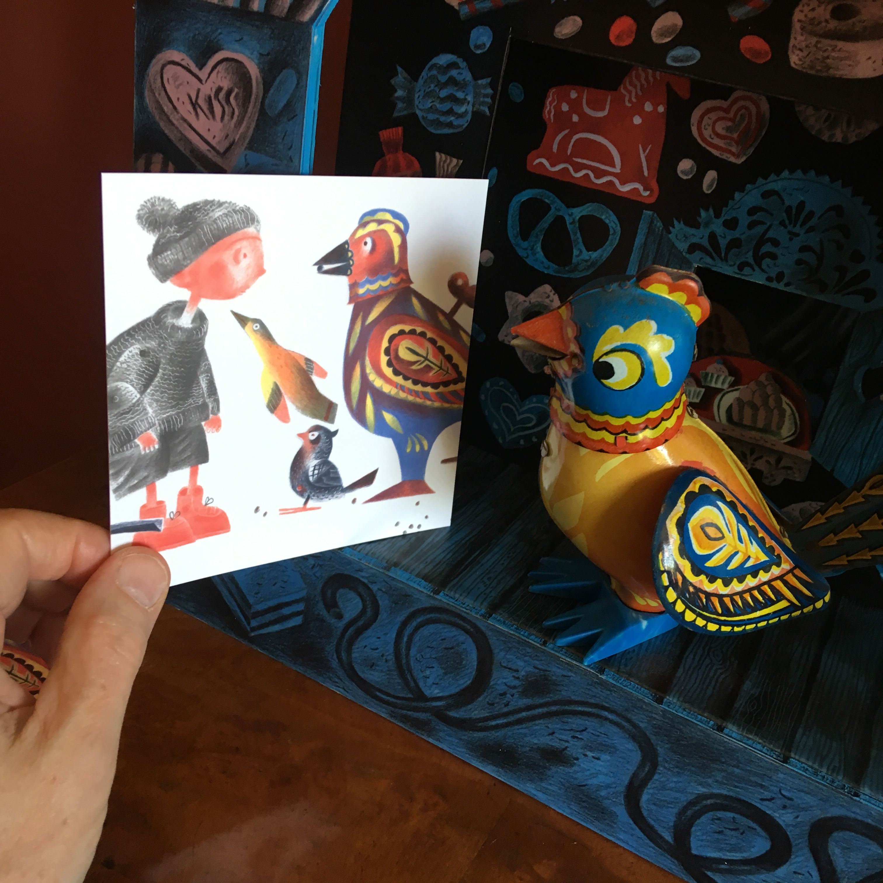
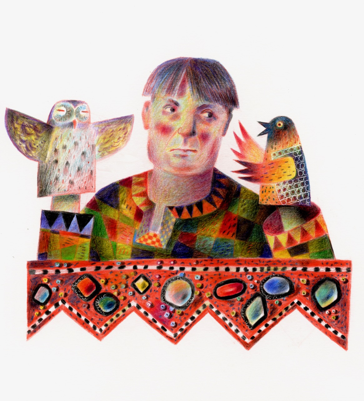
For those who didn’t know Sandy, she’s the one with the pre-Raphaelite hair kneeling centre in the first picture, larking about in a rickshaw with the team of dancers during rehearsals for Aladdin at the New Theatre, 1982 – 83. I was the choreographer.
Sandy was one of a small team of dancers who worked regularly for me on stage and tv, and in conference shows and product launches. We met when she attended a group audition arranged by the agency office at my old vocational school, Italia Conti, and from the moment Sandy stepped onto the rehearsal-room floor, she was mesmerising.
Throughout our years of working together I called upon her to do the strangest things, all of which she entered into with infectious mirth coupled with her fantastic precision as a dancer. In terms of dance she was creative to her fingertips. I had her vomited up by a giant plastic leech in a nightclub floorshow on the Algarve, thrown around as a Peruvian mummy while being unwrapped to Peter Gabriel’s Rhythm of the Heat on tv, and partnered by a dragon puppet, though in what I can’t remember except that it was a hokey idea that Sandy made work. That was the kind of performer she was. I was a choreographer who wanted to play with ideas, and Sandy always played wonderfully and kept all of us laughing while we explored, even when the deadlines were pressing and the producers were getting nervous! But the way I remember her most was in the small role of Bo-Peep in the New Theatre Cardiff 1983 – 84 Christmas pantomime Humpty Dumpty, stepping onto the stage like a Fragonard painting come to life, trailing satin ribbons and full of grace. (Sandy was shy of delivering lines as she never felt acting was her skill-set, but as I was writing the script for the production, I was able to persuade her.)
In the days before mobile phones it was hard in the hurly-burly of rehearsals before opening a show to get decent photographs of the experience. In my archives for Humpty Dumpty Sandy always seems to be at edge of frame or a blur of movement, but I found this one shot of the Act II opening in which she’s in the costume of a gypsy-dancer with a group of travelling players, sitting left of the platform-stage. I loved designing costumes for her as she wore them so beautifully, and this one was a riot of appliqué folk patterns on wildly extravagant skirts and petticoats that looked wonderful when she danced.
And here’s a shot of the production curtain-call, in which Sandy is on the top step, to the left of the cavalier in the middle, her hair hidden under a powdered wig. (And my thanks to David W. Slack for helping rescue a rather poor photograph.)
Of the dancers I worked with back in the days before my career change, Sandy and Kathy Blyth – Kathy is seated behind Sandy in the two photographs at the top of this post – kept in touch with me over the years, together visiting Peter and I when we lived in Cardiff, and then again in 2018 at Ty Isaf. The two will always be a double-act for me, because in their company the laughter never stopped. Back in the day they were often super-naughty, but I can see at this distance that they were at their naughtiest when I needed to laugh, and once the laughter had broken the tension, then we all put our heads down and delivered. Together they were my muses, but muses who were like mischievous monkeys.
Sandy died on February 1st, and her funeral was last week. I wasn’t able to be there. The past months have been wall-to-wall punishing deadlines. I hate it when work doesn’t allow for life. It isn’t always like it, but sometimes the deadlines coalesce and there’s no getting around them. I’d been been pushing Sandy’s death to the back of my mind so as to focus on what needed to be done, but now I’ve stopped, and it’s all hit me. Though our lives had gone in different directions for the longest time, she was a huge part of my creative world before I changed course. She comes so swiftly to mind the moment I think of her. Her laugh, her conspiratorial whispers, her dazzling smile, the sometimes serious, sideways glances I caught when she thought I didn’t see, and I fall apart at the recollections. Long after the event she and Kathy confessed that after the first night party of Humpty Dumpty, as my then boyfriend Richard and I headed for home, the two of them followed us through the streets, giggling and hiding in the shadows watching us. Richard and I never knew. Those girls would have made good spies!
Farewell my beautiful Sandy. I always felt the world was better knowing you were in it.
To mark St. David’s Day (March 1st), a new design has been produced in collaboration with Sussex Lustreware to commemorate the Welsh poet, teacher and mariner, Sarah Jane Rees. (1839 -1916.)
As a teenager Sarah Jane declined the dressmaker’s apprenticeship suggested to her by her family, and instead spent two years crewing on her sea-captain father’s ketch before returning to study for her master mariner’s certificate in navigation in London.
Despite being fully-qualified there was the expected opposition to her captaining any ship, so instead she returned to Wales where she became a teacher, educating children and tutoring young men in the arts of navigation.
A celebrated poet in the Welsh language, Sarah Jane was also known by her Bardic name of Cranogwen, and those who she helped gain their master mariner certificates were known affectionately as ‘Cranogwen’s Captains’.
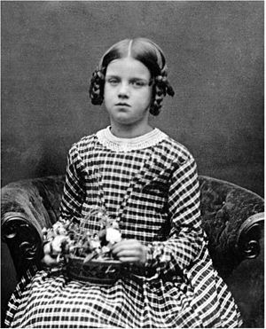
Studio photographs of the adult Sarah Jane show her long hair centre-parted and worn tightly arranged against the head, with the jewellery, gleaming gowns and velvet jackets of a woman of her class.
What she wore when she crewed her fathers ship is not known, and so my portrait of her is a fanciful one in the tradition of the romantically inclined depictions of sailors on nineteenth century ceramics and toy theatre character sheets.
I’ve given her the varnished and be-ribboned straw-boater of a nineteenth century sailor, with a neckerchief knotted at the collar of a shirt worn under an open jacket.
Sarah Jane Rees must have been a woman of courageous and independent spirit to have taken the path she chose. She was a lecturer in an age when public speaking by women was frowned upon, she established a women’s magazineand foundedthe South Wales Women’s Temperance Union in order to secure the safety of women in both their homes and within society.
Sarah didn’t marry, and there is clear evidence that her lasting relationships were with two women: Fanny Rees, who died young from tuberculosis, and Jane Thomas, the lifelong companion addressed by Sarah in her most celebrated poem, My Friend:
“I love you, my beloved Venus”.
Below: The maritime tradition of Sunderland Lustreware
Inside the collar of our jug runs the text: Sarah Jane Rees, also known as Cranogwen: Morwr (Mariner) Bard (Poet) Athrawes (Teacher)
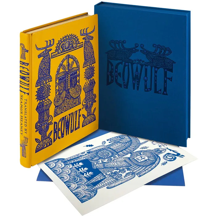
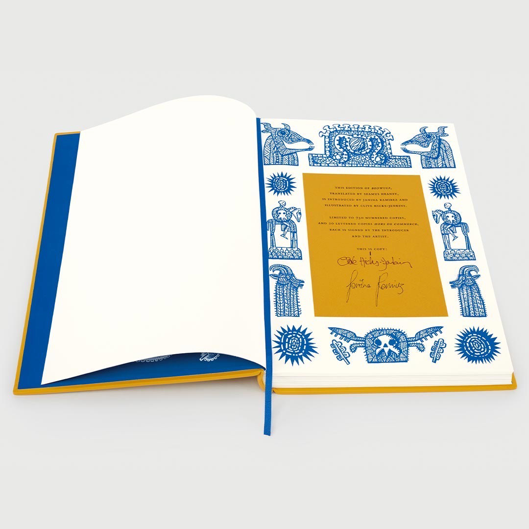
Letter sent to the Beowulf team at Folio Society, 14/11/23.
“Today the most enormous box arrived from Folio Society. Packed immaculately, it took me a while to work my way to the contents and unwrap the top copy of the three books within. I’m not sure I have the words to express what I feel, but I’ll do my best.
The edition is staggering, unarguably the most magnificent and significant creation of my career as an illustrator. My hands shook as I went through it page by page. The book design and text layouts, airily perfect. The translation from pen and ink artworks into illustrations, nothing short of a miracle. I worked on the drawings for many months, so I know what they look like in every detail because my nose was practically glued to them as I tapped away into the small hours rendering all that pointillism. But even though they’re all but tattooed on the insides of my eyelids, seeing them afresh and reinvented by the inversions and additions of colour, I’m knocked sideways. (The printing of the images is perfect in every way.) I’m so happy that the book is steeped in all the right traditions, and yet feels boldly contemporary. The binding and box are wonderful beyond all my imaginings and anticipation. Sumptuous in every way, the sensations of opening and turning the pages of the edition become visceral. Everything under the fingertips silky to the touch. The scents of the book, the leather, paper, glue and ink, all immersive and thrilling.
Sunday marked my seventy-second birthday, and Beowulf has been the best present. Not all book outcomes can be happy. I’ve made books in the past for which my hopes were high but things were not, in the end, done well. However all disappointments crumble before this edition of a text I love. Seriously, I could die happy knowing I’d made this one book.
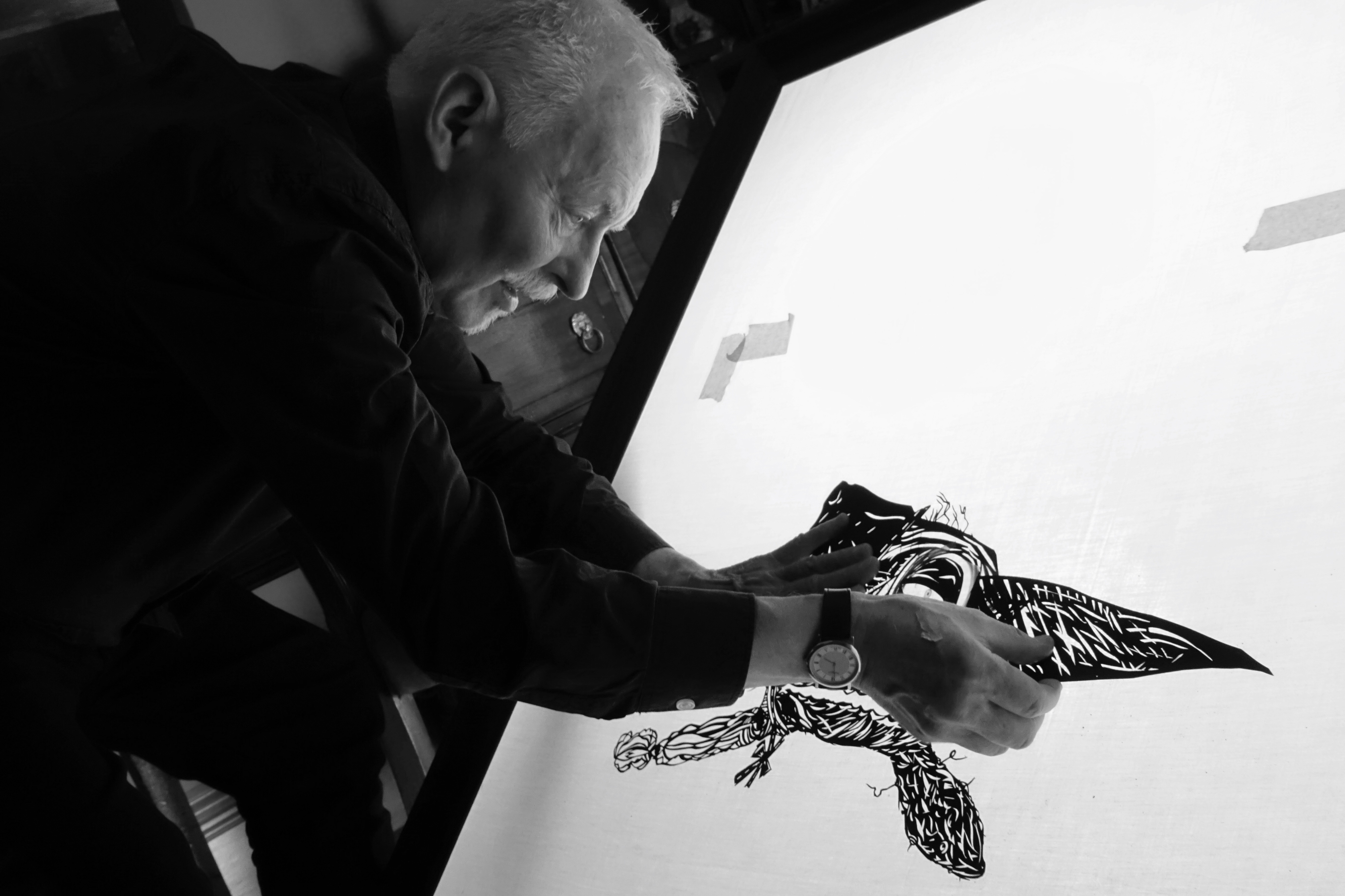
Above: promotional animated video for Beowulf produced by David W. Slack
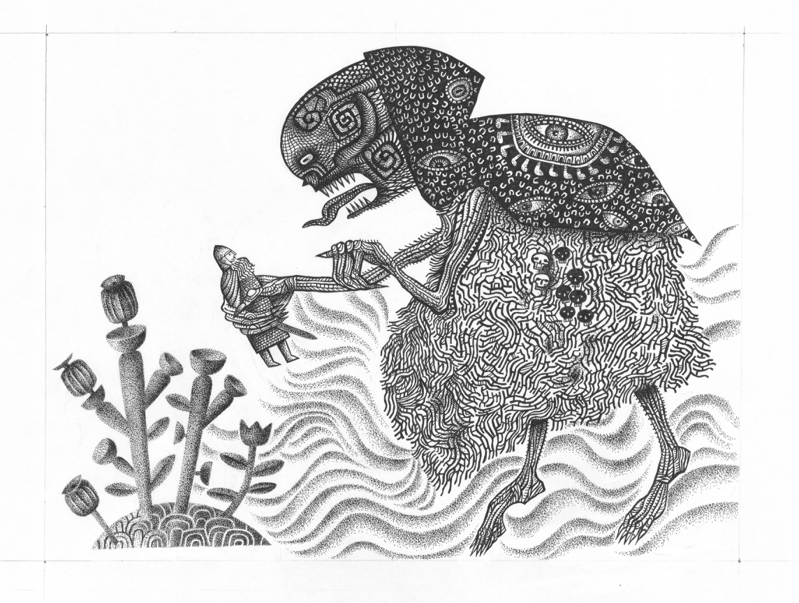
I had no idea just how lavish the book was to be when I first began work on it. It was only stage by stage that it began to dawn on me that the binding and clamshell box, built at the bookbinders Smith Settle in Leeds, were going to be works of art in their own right. I made all the illustrations at the size they were to be printed, so from the start I was aware that the edition was going to be on a handsome scale.
Above: Pen and ink illustrations in progress on my desk
Reviews from the Folio Society Website
Heroic volume for a heroic tale! I could smell the vellum the moment I opened the beautiful cloth-covered box. Wonderful. The book’s cover and the marvellous illustrations are reminiscent of Sutton Hoo without being exact copies. The thick, high quality paper is a joy to handle. The new Introduction is interesting. This is a volume to treasure. Really not too pricey considering its very high quality, the greatness of the tale and the beauty of the Heaney translation.
Review by Mr James Barry on 03/01/24 *****
Simply a stunning classic which I will hold for a lifetime and pass on to be enjoyed. The design and illustrations take you into the mythology with a powerful effect.
Review by a customer on 18/07/23 *****
A stunning book I can’t fault in any way.
Review by Steve Shaw-Wright on 21/07/23 *****
Extra large format book expertly produced with high quality components and materials. Not a single defect in craftsmanship. Oh, and my favourite translation by the way!
I’m having the most extraordinary creative relationship with Penelope Jane Ross. We’ve never met, but the friendship that’s developed from our exchanges at Insta ‘direct messaging’ have coalesced into the most beautiful range of glass pieces, made by Jane using source drawings of mine, now emerged as a range of pieces under the name Glassworlds.
What I enjoy about this so much, is the translation required when Jane sets about adapting a drawing into a relief-model sculpted from Plasticene. The model is then cast as a plaster mould, filled with glass chips and placed in a kiln, emerging transformed as a coloured glass version of her original sculpt.
It’s one thing to realise a flat drawing made in a folk-art idiom into a free-standing, bas-relief sculpt, but an even more extraordinary one when the sculpt is transformed into coloured glass, with the flows, eddies and bubbles of its liquid form hardened into a material so distant from the graphite and paper of the origin art. Something flat and graphic turned into shimmer and gleam and transparency, the patterning becoming a sort of brocade stitched out of light.
The early pieces made were on a small scale and quite soft in their modelling so that the results, cast in aqua blues and greens, were reminiscent of sea-glass. The effect was dreamier than my crisp and graphic drawings, and had the results been placed at the bottom of a well or scattered in the stones and silt of a stream-bed, it would have been easy to mistake them as dating back a hundred years or more. Some, like the cavalryman below cast in rose pink, had opalescent depths.
First Jane made animals and items I’d drawn out of my love for vintage Erzgebirge, the region of Germany famous for its wooden toys. But quite quickly I got to thinking that maybe the cast of characters would sit well within a setting, so I made drawings of toy houses and trees for her to sculpt.
At my Insta page I began to describe the colours in terms of being edible: the rose of Turkish Delight, the citrus fruits of boiled sweets and the greens of pistachios.
Jane devised self-coloured pedestals that were added, so the flat-backed pieces could stand, ideally placed where the light could shine through them.
As the project evolved – and with a bit of technical advice from my frequent collaborator David W. Slack – Jane began making positive casts of the original Plasticene sculpts. These positive casts permitted multiple plaster negative moulds to be made from them. While the plaster moulds are always destroyed in the process of removing the cast glass figurines, there’s no longer the problem that for every plaster cast there’s a lost Plasticene sculpt. Now Jane has positive casts that can be used to generate multiple plaster moulds, and she doesn’t have to make a new Plasticene sculpt for every glass cast.
A new development has been the introduction of vibrant colours, and the recent work emerging from the kilns is as richly hued as anything you might see in the window of one of the great cathedrals. The modelling has become crisper, and as a result the decorative surfaces are more sharply defined. I love both the earlier, slightly dreamier figurines, and these fruit-drop coloured beauties, equally. Creativity needs to evolve as the artist explores all options, and the latest version is just different to the last, not a replacement.
The original drawings had been made for my friend Gloria at Sussex Lustreware for a new range of lustreware ceramic titled Summer. The goat, cavalryman on a wheeled horse and dog had already appeared on the lustreware at the time Jane was trying them out in glass form.
Soon I was producing new drawings for Jane with the express intention of them becoming elements in the Glassworlds series. The arched building and the cat below were both made for Jane, but then transmigrated to the lustreware. The traffic flows in both directions.
See more of Glassworlds at Jane’s website and shop
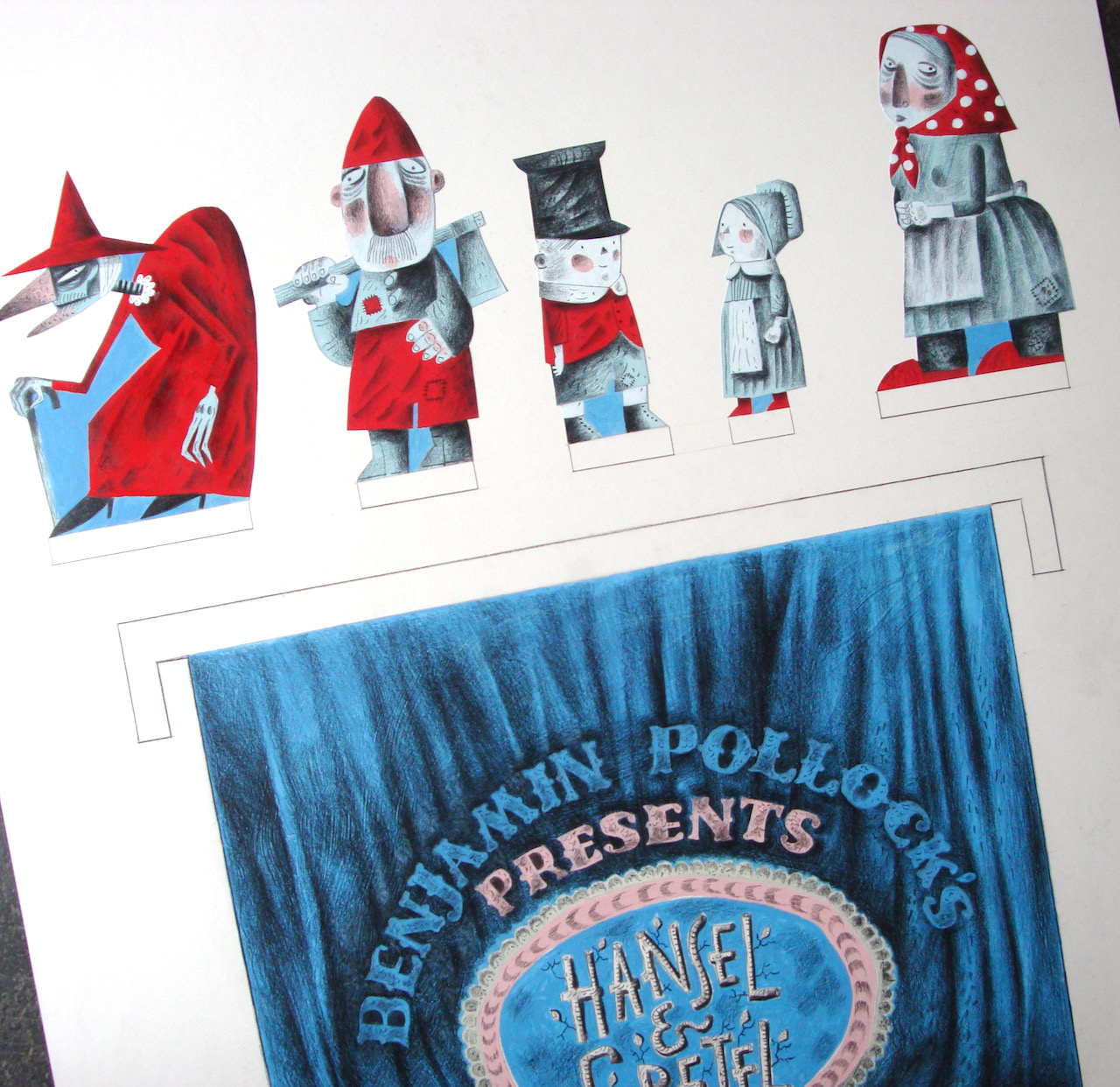
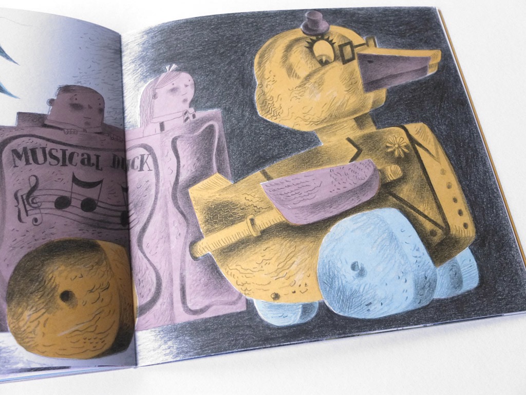
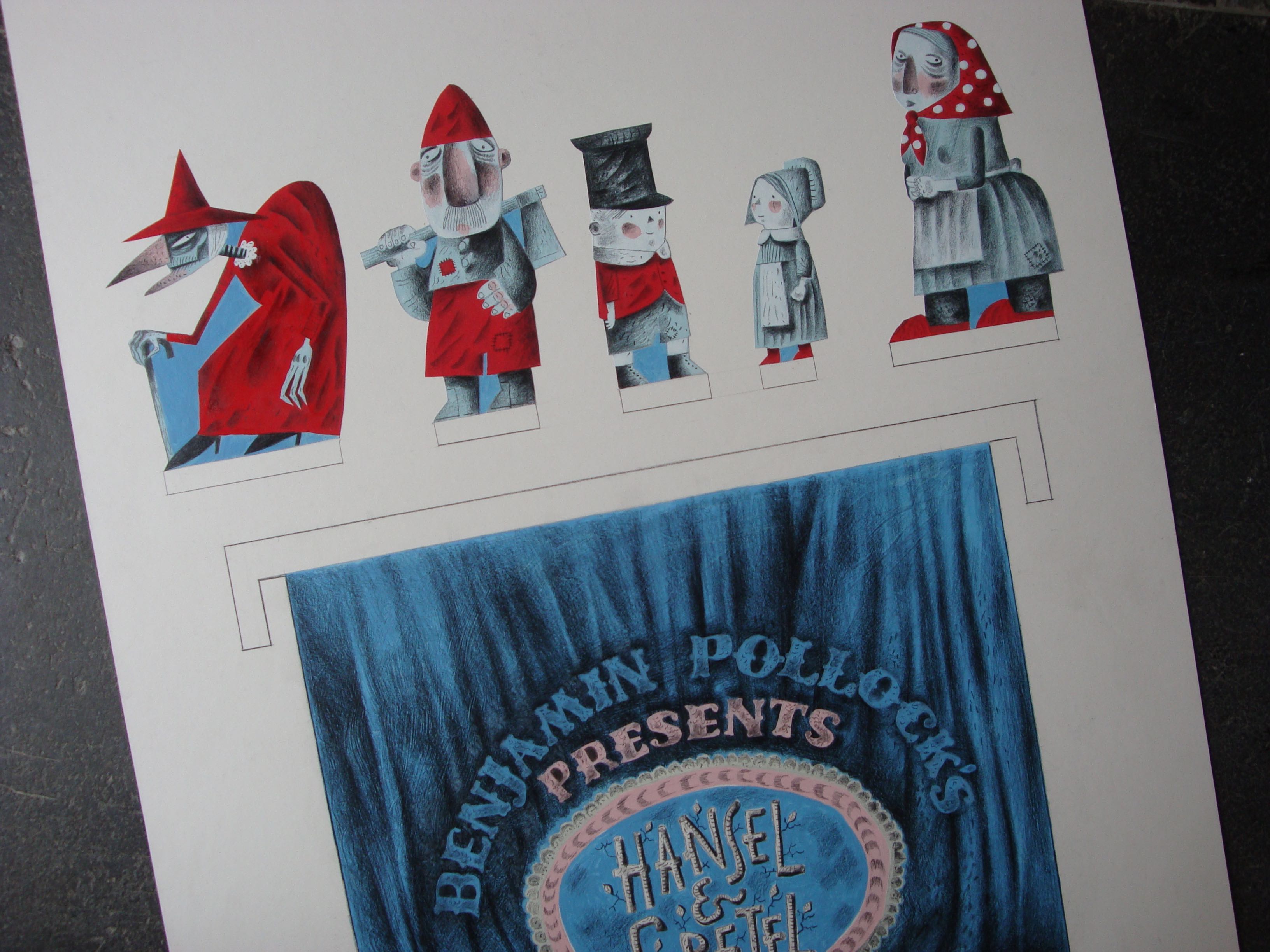
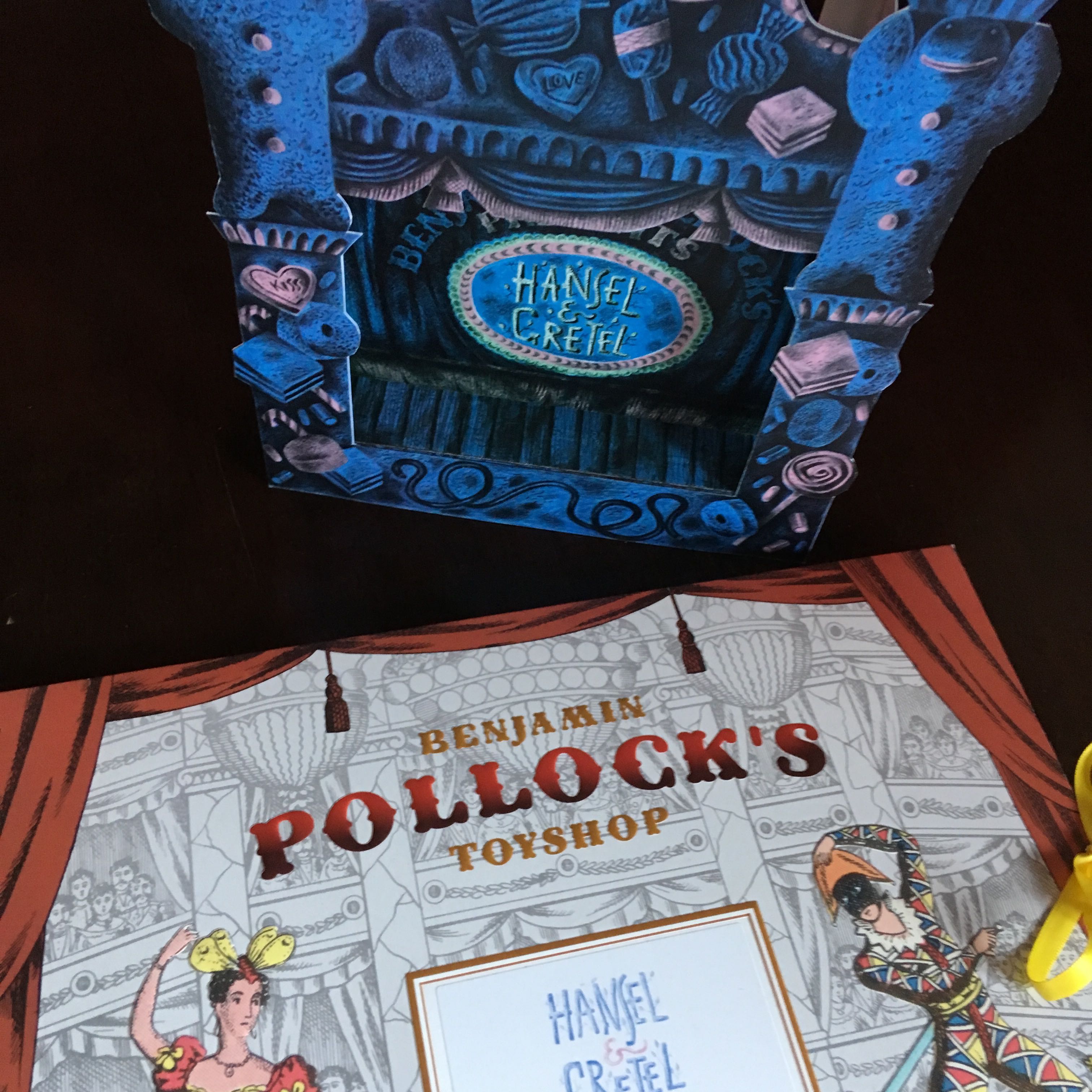
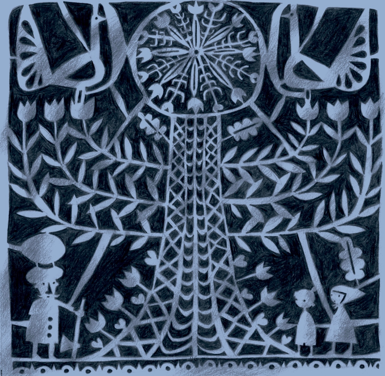
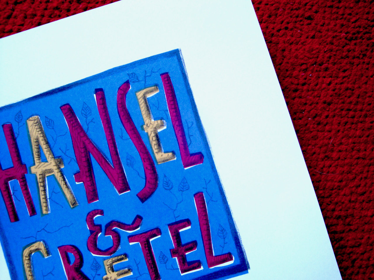
I designed the Hansel & Gretel Toy Theatre for Benjamin Pollock’s Toyshop in 2016 and it was published in 2017. It’s still available at the shop, having been re-printed several times. It comes as a 6 x A4 sheet kit in an envelope, requiring a craft-scalpel, cutting mat and glue to assemble. The original commission had been to create a ‘model’ theatre with a couple of scenes and characters to display, but by the end of the project I’d created a complete toy theatre at a small scale, with instructions for building the stage, together with scenery and characters to perform the play script I adapted from the fairy tale, and even a theatre poster to advertise a performance.
During the Covid lockdowns, in solidarity with the difficulties faced by all small shopkeepers trying to run their businesses, I gave the rights of the Hansel & Gretel Toy Theatre to Benjamin Pollock’s Toyshop, so the business would no longer be obliged to pay me royalties. It was a small but I hope significant gesture of support during very hard-to-negotiate times.
Simon was a wonderful interviewer. He’d undertaken meticulous and lengthy research and was well prepared to take me back along the pathway to childhood and the roots of my love of toy theatre. We could have talked for days about our shared passions for folk art, the Erzgebirge tradition of toys and the magic of toy theatre, but in the end we had to wrap it up in just under an hour. Simon is the artist behind the wonderful shadow-boxes published by Benjamin Pollock’s Toyshop, some still available at the Pollock’s online store.
In 2019 Olivia Ahmad wrote about Clive Hicks-Jenkins’ explorations of Hansel & Gretel for Varoom magazine.
Clive Hicks-Jenkins’ retellings of classic fairy tale Hansel & Gretel have an edge. Taking in the original tale’s horrific neglect, abuse and murder, Clive has adapted the story into a picture book, toy theatre and original stage production. Olivia Ahmad looks at Clive’s startling manifestations of the familiar story.
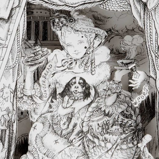
“The boy was called Hansel, the girl was called Gretel – hence the title, Hansel & Gretel.” So the narrator opened Clive Hicks-Jenkins’ 2018 staging of his version of the European folk tale, first recorded by the Brothers Grimm in 1812. The performance had the subtitle a nightmare in eight scenes, which undermined any notion that Clive’s combination of animation and puppetry would be a saccharine adaptation of the story of the witch who tempts two lost children into her house made of gingerbread. “It’s a dark and brutal story”, he says, “the mother has been cruel and treacherous, and is dead by the time the children return home, with no explanation of what happened to her. Gretel has killed the witch in the most dreadful manner, which is not just something you can brush aside. There will be psychological scars. So the story is odd and downright nasty and has too often been glossed in endless re-tellings. It was just too good a chance to miss.”
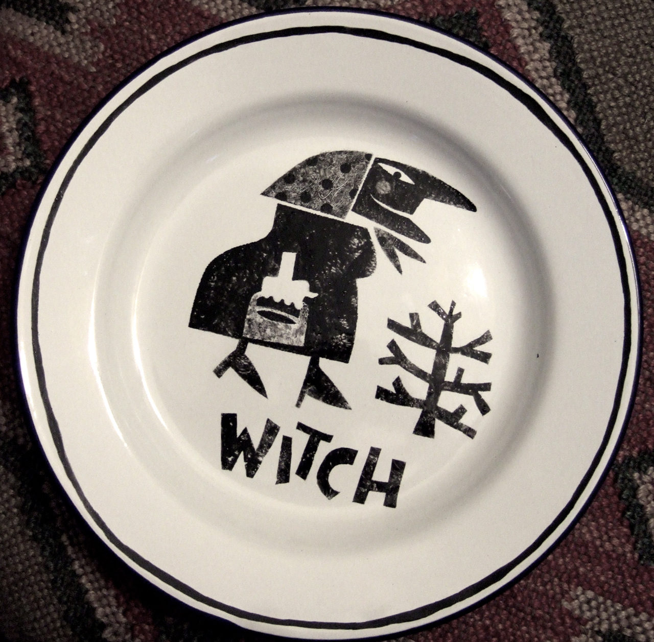
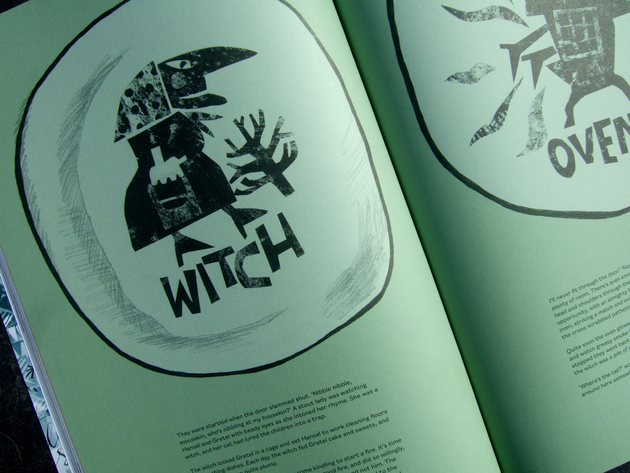
Clive first took up the chance to envision the story for a book in 2012, inspired by a childhood memory. “I had a Toby Twirl annual,” he explains. “There was a story of a witch who captured Toby and imprisoned him. The pictures of her terrified and enthralled me. She stuck like a burr in my imagination and she’s been there ever since. When in an idle moment some years ago I felt the need to be drawing a witch, I chose Hansel & Gretel as the vehicle simply because a witch was central to the plot. I painted the characters onto a set of enamelware plates for a bit of fun, for no other purpose than for use at home. And in so doing, I laid the foundations for the larger project, though I didn’t know it at the time.”
The plate designs, produced with hand-cut stencils reminiscent of European folk art, migrated from Clive’s kitchen shelves in 2014 when he adapted them into a series of illustrations for Random Spectacular magazine. After a passing comment at social media that he would like to expand the magazine piece into a picture book, Random Spectacular agreed to publish one. Clive envisioned a dark tale, one that asked difficult questions: “What happens to children who kill? What effect will it have on them?”
The character design of the siblings was vital to telling their story: “The children that I designed right at the start were really simple. There was a touch of St Trinian’s to them: short and pod-like with skinny arms and legs and dressed in school uniforms. Though caricatured there was a tenderness and bewilderment to them that was touching. Hansel is incredibly passive throughout, a poor lost puppy. Gretel appears meek, though later manifests an awesome inner Ninja.”
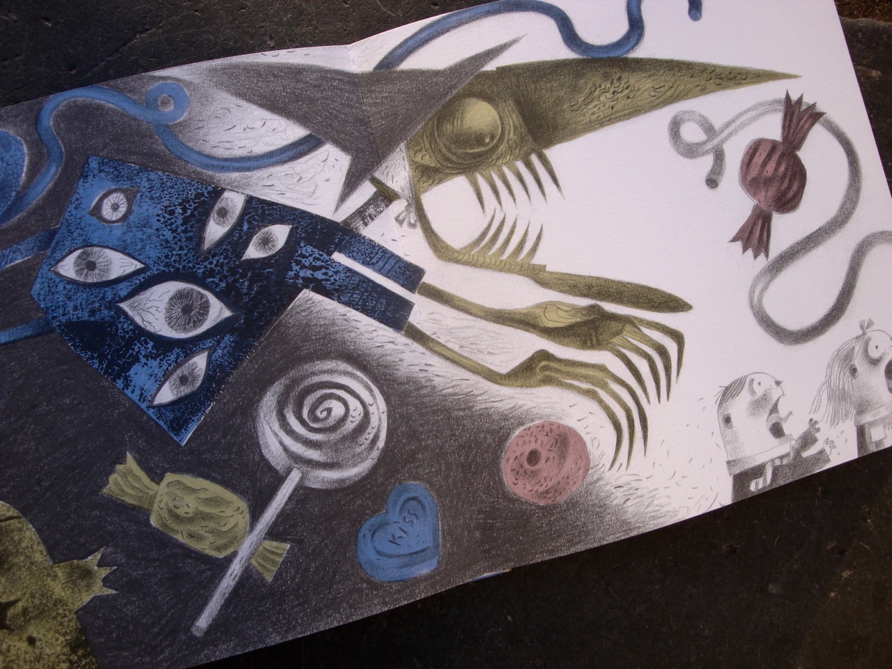
Alongside the cast of characters appear occasional motifs drawn from European toys and popular design ephemera that Clive has gathered over the years. “It’s not exactly a collection”, he explains, “but a loose gathering of objects that interest, intrigue and move me. Some inherited and some sought. I find that vintage toys worm their ways into my imagination and from there into my work.” While these elements represented a personal history, moments like Hansel and Gretel making their getaway with the aid of a duck based on a 1950s Fisher Price pull-toy, make Clive’s fantasy world uncannily familiar.
For the rendering of the book Clive made separations, a technique previously unfamiliar to him. Creating a drawing for each coloured layer of an illustration, the layers of drawings were then scanned and coloured digitally according to Pantone references he selected to create a sugared almond palette.
The Random Spectacular picture book was published in 2016, and the same year Clive was commissioned for another Hansel & Gretel project by Benjamin Pollock’s Toyshop in Covent Garden, which sells historic and contemporary cut-out-and-assemble toy theatres. The commission to create the Hansel & Gretel Toy Theatre resonated with Clive’s childhood: “As a boy I’d cut out, coloured in and performed Pollock’s productions on a home-made stage constructed from a cornflakes packet, and so this was a dream come true for me.”
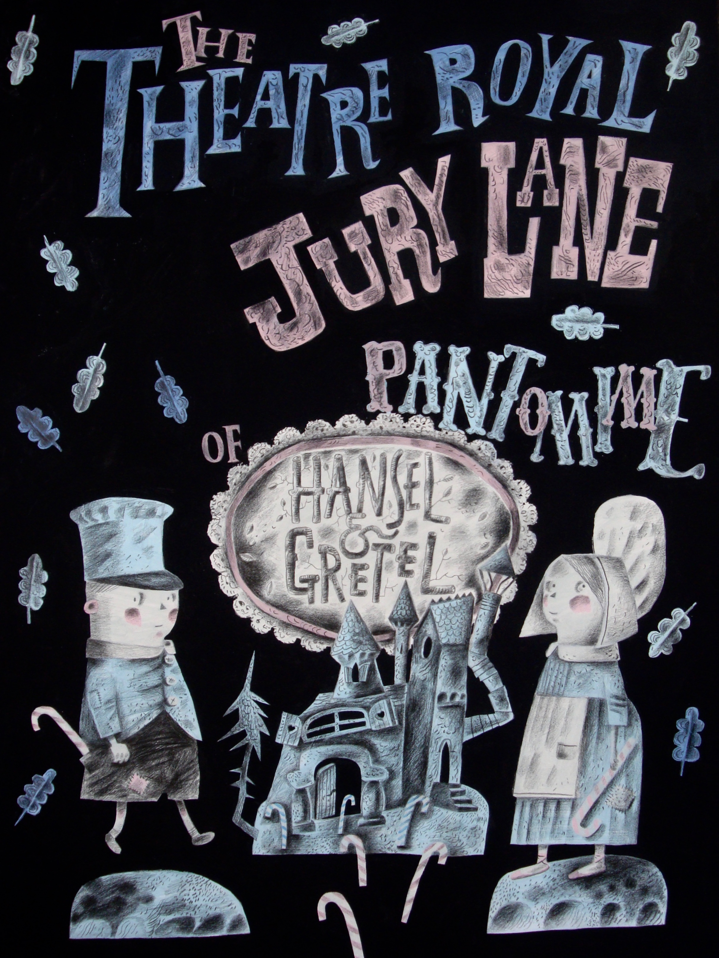
He initially suggested an adaptation of his Hansel & Gretel picture book, and while the Pollock’s project went on to incorporate some of the atmosphere of it, many of the more grotesque elements were considered “way too scary” for the toy theatre’s intended family audience. So Clive embarked on yet another adaptation of the story, re-fashioning it to create a meta- production in miniature, perhaps informed by his early career as a performer: The Pollock’s Hansel & Gretel Toy Theatre starts from the point where the picture book finishes. “Having survived the ordeal of the witch, the children leave home to make their way in the world. Arriving in the big city they’re picked up by a theatre impresario who promises fame and fortune if they sign a contact with him, and they duly end up starring in a pantomime version of their own story, though with most of the unpalatable bits edited out.
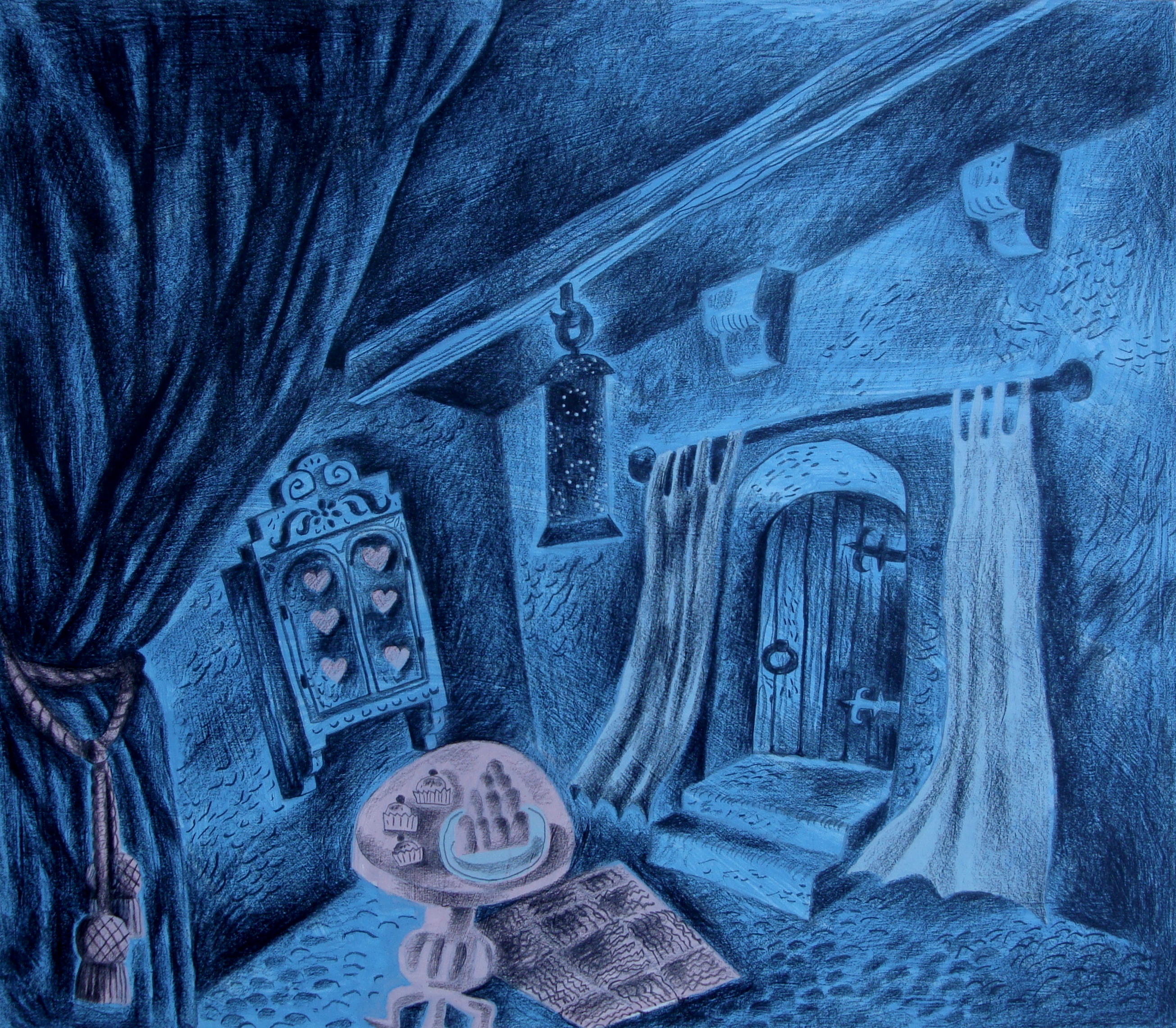
So no wicked mother ending up being murdered by their father, and a much tamer version of a witch who doesn’t have tentacles where her nose should be!” The performance takes place at the fictional ‘Theatre Royal, Jury Lane’, a play on word of London’s Theatre Royal in Drury Lane.
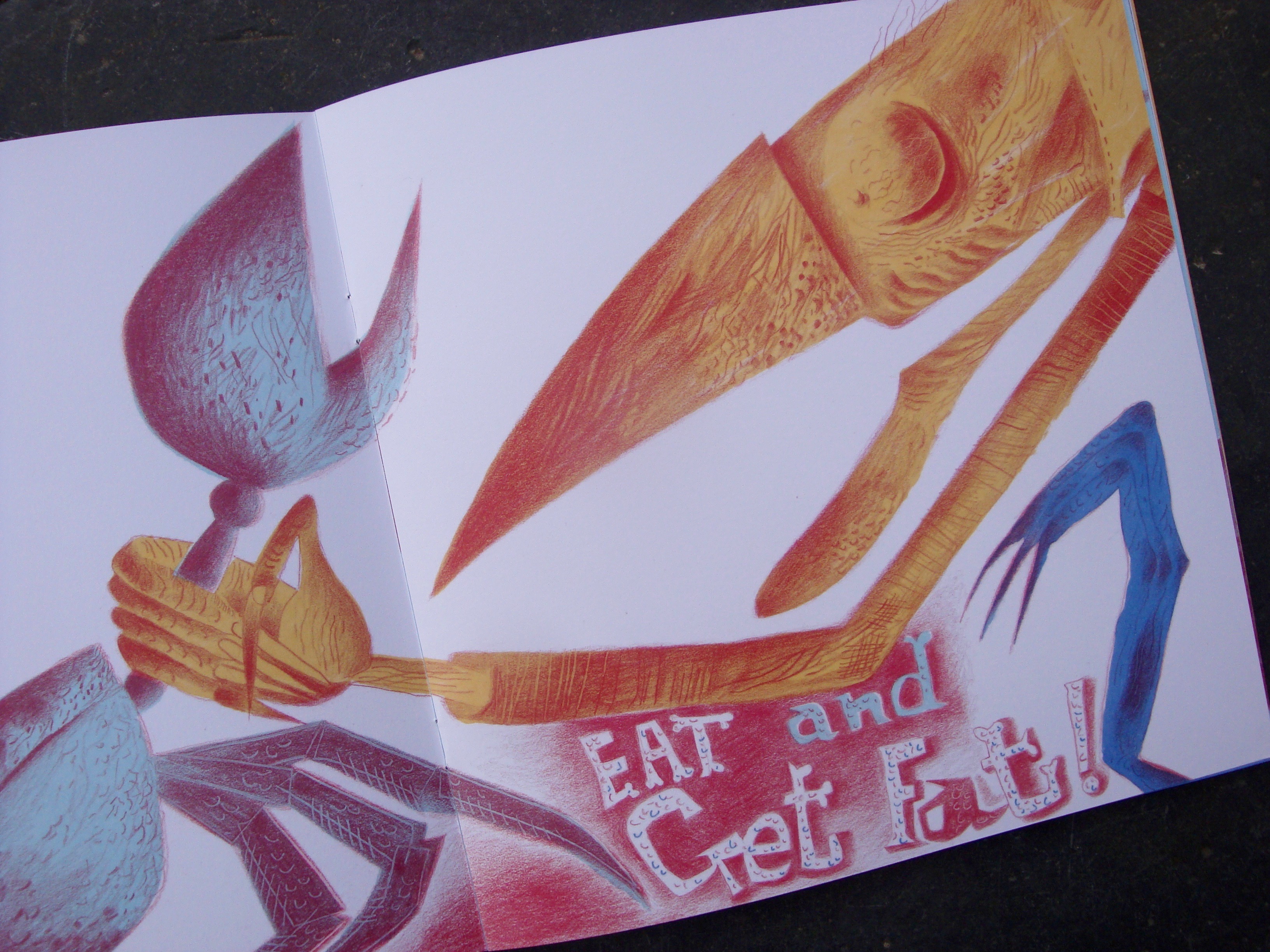
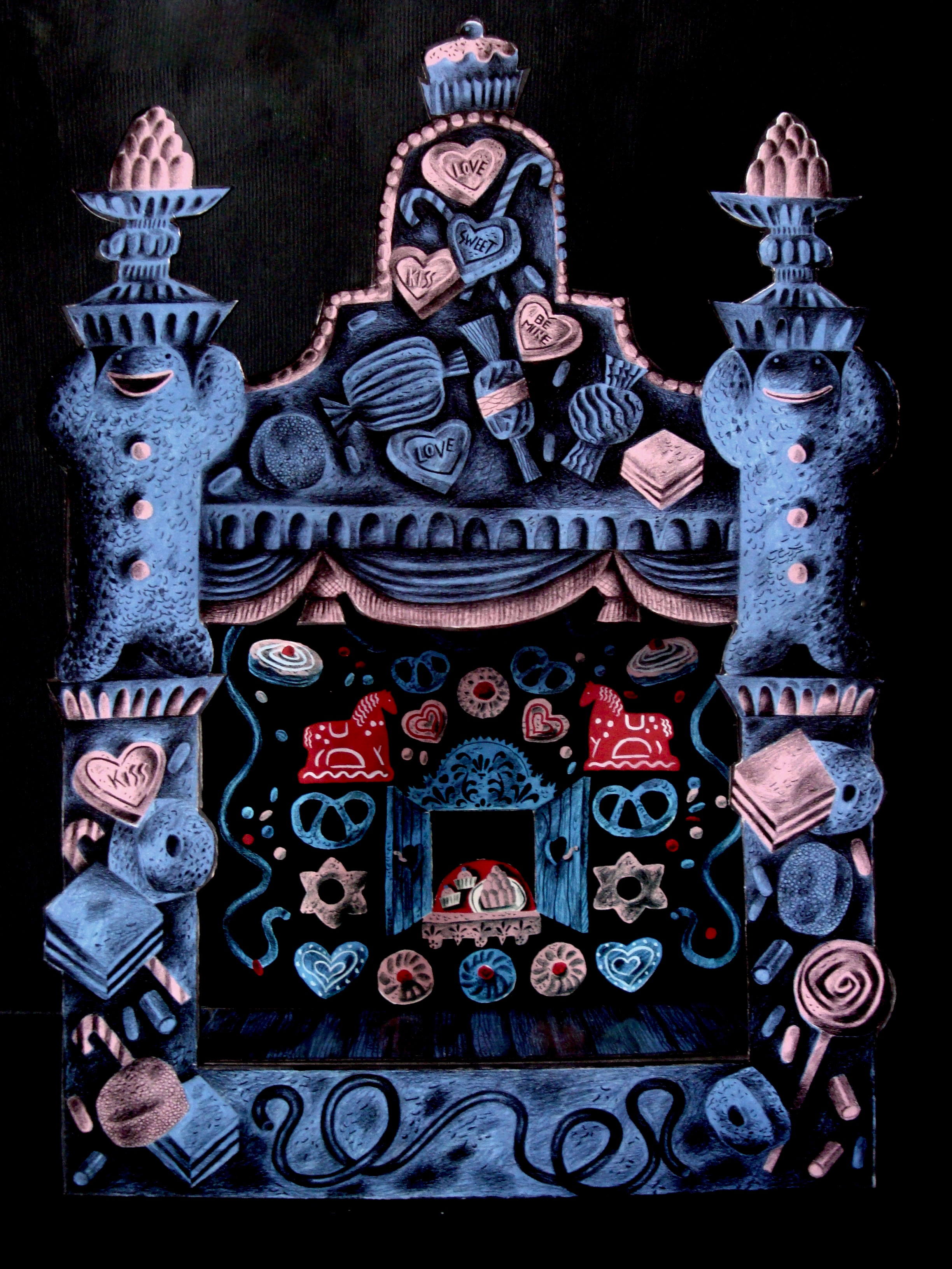
The Benjamin Pollock’s Hansel & Gretel Toy Theatre was published in 2017, and while light-hearted in tone, it retained some of the gothic horror of the picture book with its poisonous candy blues and pinks overlaid with a blanket of dark pencil hatching. The flatpack consists of a stage, proscenium arch, scenes, characters and props, along with a script and a poster to ‘advertise’ the production.
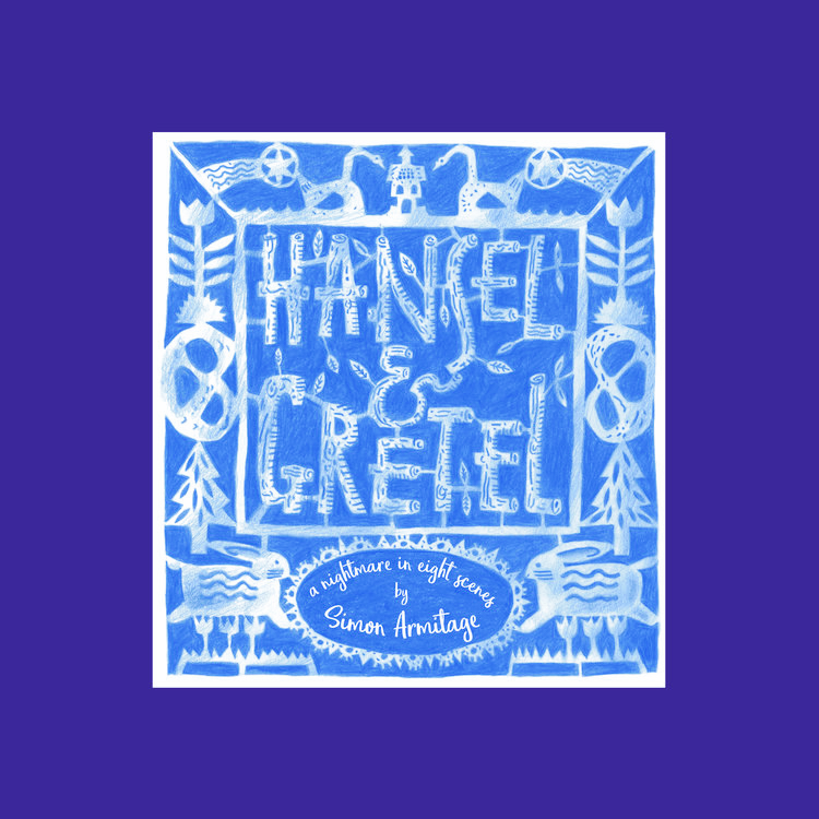
The following year, Clive’s Hansel & Gretel: a nightmare in eight scenes premiered on a life-size stage at the Cheltenham Music Festival. It subsequently toured the UK, finishing at the Barbican in London where a performance was recorded for broadcast Christmas week 2018 on BBC Radio 3.
For this his largest imagining of the story – a combination of live narration, music, animation and tabletop and shadow-screen puppetry – Clive collaborated with producer Kate Romano and the Goldfield Ensemble. The producer had originally visited Clive to discuss another project, but after seeing his Pollock’s designs suggested they make a music theatre production about the ill-fated brother and sister.
Clive recommended the producer enlist the poet Simon Armitage to write the libretto. Simon took the story in a completely different direction by placing the children into a contemporary context. “I think it was genius on Simon’s part to set the story in a conflict zone, and to rewrite the adults as loving parents fearful that their children might become casualties of war,” Clive says. “That changed everything for me in terms of how we relate to the family. They’re not dysfunctional, but find themselves in terrible circumstances.” The performance opened with animations of marching toy soldiers, which soon fall into the disarray of battle. Hansel and Gretel’s parents send their children away from this carnage in order to protect them.
However without their parents’ protection, they become enticed and ensnared by a witch. When she prepares to bathe them so they can be trafficked, Gretel fears that the hot water for the bath will be used for boiling them alive. “Everything that we see and hear is filtered through the overheated imaginations of the children who are full of fears and misunderstandings,” Clive explains.
“Everything in the production, from the predatory witch and her grubby icing-sugared cottage, to the layout of its bleak interior conjured from a doll’s house, is how they see things.”
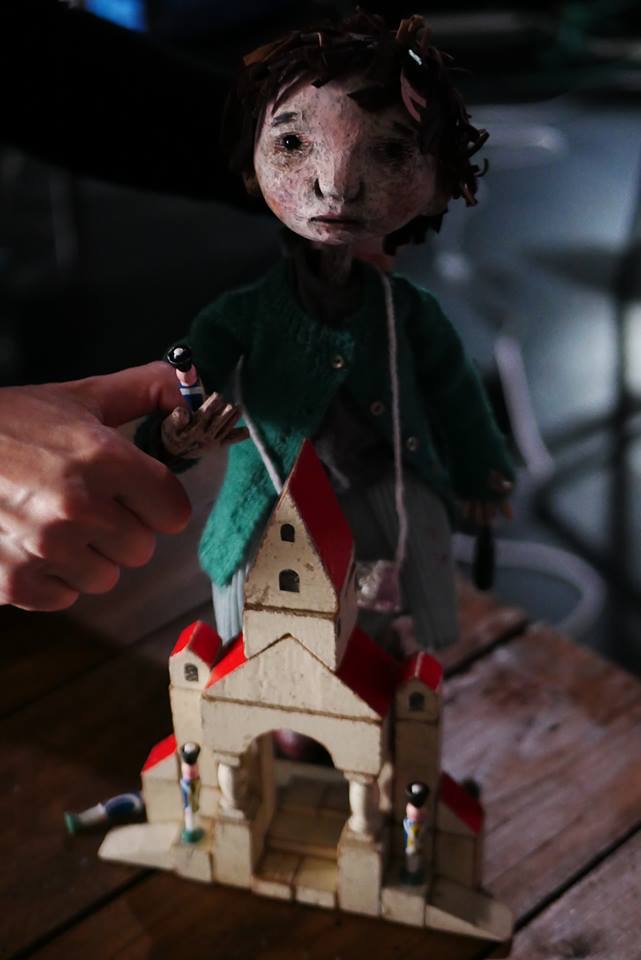
Hansel and Gretel were puppets designed by Clive and made by Jan Zalud. “I needed the puppets to function at a different level to their picture book counterparts, and be fully up to the emotional requirements of Simon Armitage’s text, ” Clive says, and his designs evolved from research on the experiences of children in transit camps. This approach was not welcomed by the Goldfield ‘project team’, who reported his drawings made them think of children in concentration camps. “I stuck to my guns,” he remembers, “because I knew the direction was the right one.”
Only one Hansel and one Gretel puppet appeared in the production, so the design and execution created appropriately neutral expressions for the puppet’s faces onto which many thoughts could be projected by audiences. Because the streaming would see them much magnified on the screen, they’d need an innate grace of movement so the moments of tenderness and vulnerability would withstand close scrutiny.
Several collaborators were assembled and directed by Clive to realise the project. The composer Matt Kaner had come to it through Kate Romano. Clive invited Peter Lloyd to produce shadow puppets of the children’s parents and the witch, Pete Telfer, to film the animations to be projected onto the stage, and his regular collaborator and assistant Phil Cooper, to be in charge of the model sets and painted backgrounds for the puppets. Puppeteer Di Ford came to the project at Clive’s invitation having previously worked with him on the stage production of The Mare’s Tale, and after a puppeteer audition and workshop, Lizzie Wort joined the company. Costumier Oonagh Creighton Griffiths was brought in to dress the puppets.
As director of such a broad team, how did Clive retain his vision of the piece? His earlier career was in stage direction and choreography, and so he knows his choice of collaborators is vital. “I mostly work with people I know well and feel at ease with,” he says, “the team are my professional family. When we’re all pulling together there’s not really a hierarchy. Once briefed I trust them. Sometimes they bring me what I expect, and occasionally there are surprises. There need to be the possibilities that some elements may exceed my expectations or bring something entirely unanticipated.”
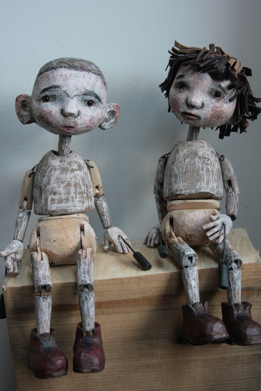
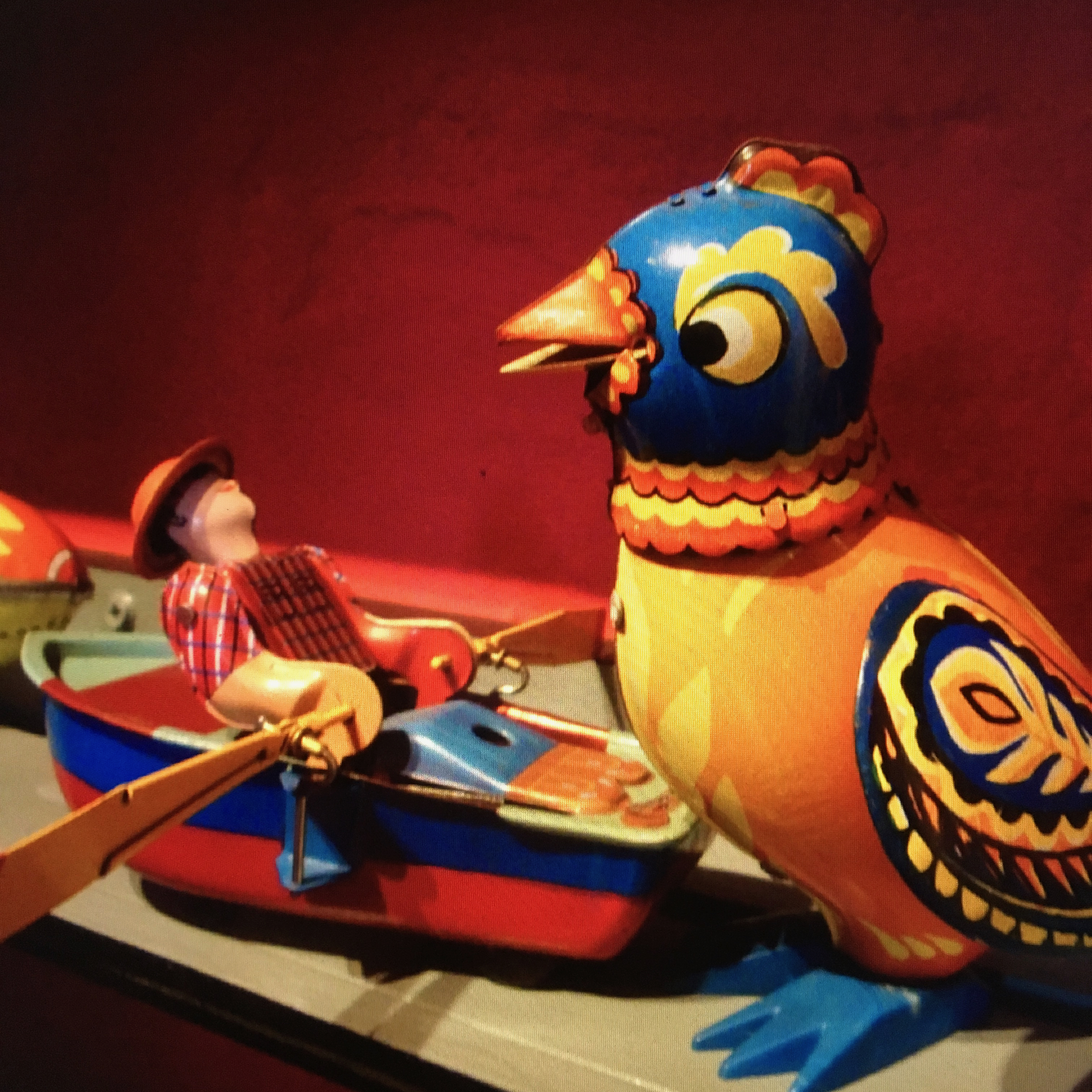
Clive’s own vintage toys played an important role onstage. One hundred year old German building blocks became the playthings of the children, and clockwork ‘pecking chickens’ stood in for the flock of birds that ate Hansel’s trail of breadcrumbs.
The chickens and a Russian clockwork ‘singing’ bird are also due to appear in Clive’s next iteration of the story: a richly illustrated edition of Simon Armitage’s libretto, produced by independent publisher Design for Today and due for release later this year.
“A toy,” Clive says, “can open your heart and make you remember what wonder feels like.” However his adoption of these tokens from the past is not an indulgence in nostalgia. “I’m not such a fool as to think that yesterday was better. I was there and it wasn’t! My explorations are all about objects being repositories of histories. They’re like radio dials, and if you twiddle them you ‘hear’ the past. That past can be anything, from sweet to despairing. It’s the focus that’s all important, and what the focus opens in the mind and heart.”
Olivia Ahmad, 2019.
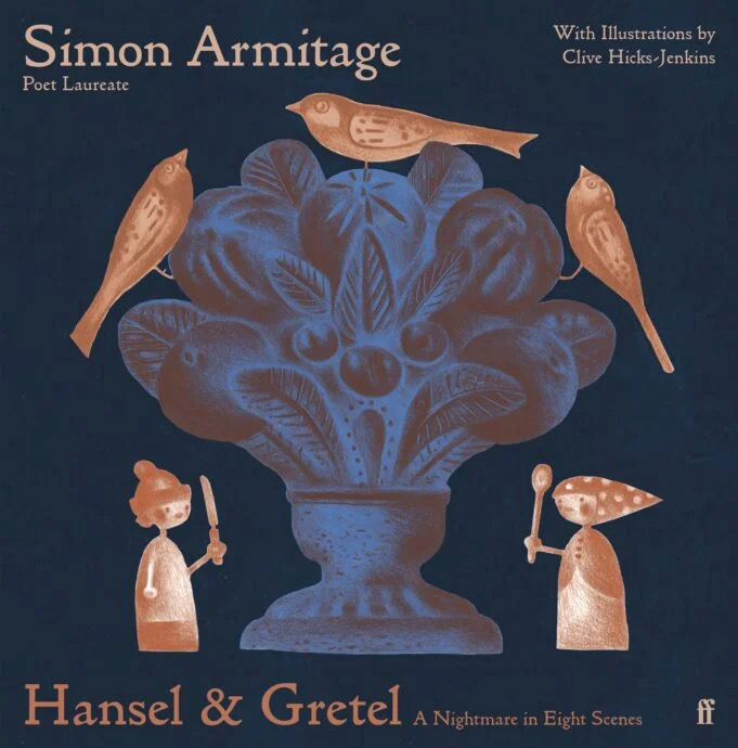
Hansel & Gretel was published subsequent to this article and in 2020 won the V&A Illustrated Book Award. It’s still available from the publisher at THIS LINK. In October a new hardback edition is due out from Faber & Faber.
Above, the 2019 Design for Today edition of Hansel & Gretel: a Nightmare in Eight Scenes, and below, the new edition forthcoming from Faber & Faber in October 2023.
The deeper I get into middle-age, and the more my time is swallowed up by the just demands of family and parish ministry, the more gruesome my crimes against literature become. Here is an egregious one: until recently, it had been far too long—probably years—since I’d read a narrative poem. But recently, I read Marly Youmans’ Seren of the Wildwood.
The poem came providentially, an unlooked-for eruption of goodness into my stacks of commentaries and sermon notes. Seren of the Wildwood is a thin place, a nexus between the waking world and that hazily surreal, maddeningly concrete, constantly shifting landscape of the dream world. Youmans’ gift for creating primordial archetypal images that stir the gut and fascinate the eye of the mind places her among the best of the poets. If you’re a connoisseur, even a lapsed or dilatory one, of narrative poetry, buy Seren of the Wildwood and read it today.
To begin with, the book, a stereotypical slim volume of poetry, is gorgeous. The work of illustrator Clive Hicks-Jenkins is fantastic—in the etymological and informal senses alike—in how he translates Youmans’ copious and varied imagination into a visual lexicon. The images interspersed through the text recall (inter alia) the doodles and illuminations of Irish monks, Greco-Roman sculptures, William Blake’s illustrations, and Van Gogh’s still-life paintings. Perfect harmony exists between text and image, even on the occasions when the image doesn’t obviously function as an illustration of some particular concept from the poem.
There is also a nice congruence between the poem and the page: each stanza fits perfectly onto a single 9” x 6” page. It’s almost as if Youmans planned her formalized stanza with the volume in mind. Most spreads have two stanzas; the rest include an image on one side plus a stanza and doodle on the other. The pages feel neither too empty nor too crowded—which is good, because by golly the poem itself is crowded, but I’ll get there later.
Above: drawings for the book’s illustrations underway, with a print-out of the poem as the artist’s guide.
Seren of the Wildwood begins not with a prologue, but with a prolegomenon. The difference is significant, for a prolegomenon is not merely informative, but schematic or methodical. It provides the interpretive key for what follows. My policy as a reviewer is to avoid spoilers at all costs, which (thankfully) in this case relieves me of the burden of explaining how to interpret Seren of the Wildwood—my children often ask me about my dreams, and however powerfully I experienced them, I find it difficult to explicate their deeper meanings. Nevertheless, the prolegomenon is deeply significant both in its proleptic function (which provokes the reader’s sense of dread and hope for redemption) and in the way it raises questions that will not be answered for quite some time, if at all.
Above: drawings for the book’s illustrations underway.
Youmans tackles two big tasks in the prolegomenon. First, she introduces the primordially mystic wildwood, the wholly ambivalent landscape that dominates the poem. In Youmans’ words, “The wildwood is a tough / Terrain, yet beauty springs / Like diamonds from the rough.” The rhyme of tough/rough gropes towards the ferocity of the place; the image of the emergent diamonds testifies to the painful possibility of redemption. The prolegomenon also complicates any interpretation of the poem with its maddeningly suggestive title, “Prolegomenon, in the voice of Wren.” Who speaks “in the voice of Wren” – the poet, Wren herself, or some other entity? I reckon answering that question (even with the likely answer of “Who knows?”) is an obvious starting place for any sort of critical reading of Seren of the Wildwood.
The prolegomenon is identical in form to the other 61 stanzas: 21 lines of unrhymed iambic pentameter followed by a bob-and-wheel metrically similar to that used in Sir Gawain and the Green Knight: a bob (one-foot line) rhymed into the wheel (four three-foot lines). That makes a total of 62 stanzas of 26 lines, and while my inner numerologist and medievalist are screaming about palindromic or chiastic significance, the still small voice of my inner editor exhorts me to move on. Perhaps some arcane consideration for mystic numbers impelled Youmans to end the poem where she did; I thought that it ended suddenly, and more like a motorway ending abruptly in the middle of a city than a trail coming out of a forest and halting on the edge of some precipice affording magnificent panoramic vistas of the illimitable ocean. A few more stanzas to round things off would, in my estimation, make the thing feel more like a conclusion than an ending.
That said, I suspect Youmans knew exactly what she was doing by ending Seren of the Wildwood as hastily as I felt she did. Although neatly assigning a genre to the poem may prove impossible—is it a fairy tale? a lay? a Greekish tragedy?—it certainly has strong affinities to medieval dream visions such as The Pearl or Confessio Amantis. But of course, deeply steeped in medieval poetry as Youmans is, she has recourse to a rich vein of sophisticated techniques for narrating the inner workings of the human soul. Seren of the Wildwood is nothing if not dreamlike—and not in a comforting way. The prolegomenon strikes a note of foreboding which swells perceptibly in the first stanza and dominates large portions of the poem. Reading the poem is like a feverish nightmare, in which some awful and awfully inarticulable sense of doom hangs over the reader as the scene shifts whimsically and characters flit momentarily across the periphery of vision while leaving a sharp impression, where everything seems startlingly new yet possessed of a familiarity that is simultaneously welcome and terrifying, where it feels like your feet are chained or weighted as you try to flee from whatever fell beast is pursuing you through the weirdest and most inhospitable terrain—and that terrain itself seems to be indistinguishable from all the nightmarish terror—when all of a sudden, striking through the disorientating web of dream, comes unexpectedly the blessed gift of waking to the birdsong of a bright morning of the incipient spring. Perhaps the sudden ending is Youmans’ mimesis of waking to the fragility of renewed hope.
Acentral component of Seren of the Wildwood’s mythical dreamworld is the ubiquity of primal archetypes. Rash words; woodside cottages; prophecies; unheeded warnings; god-kings; fertility religions; hermits; rites of purification by water; preternatural births; mountaintop gardens; dreams and visions—these are the threads with which Youmans weaves, and of which no lover of narrative poetry grows weary. What is particularly impressive about Youmans’ weaving is her ability to use such venerable archetypes freshly. Yes, I’ve met them all before, and given time I could tell you where. But meeting them in Seren of the Wildwood reminds me of the time a man I’d known for years shaved his moustache and became unrecognizable for a few shocking minutes. The effect was initially disruptive—for several seconds I knew I was failing to recognize a familiar face, a face I’d seen recently in different guise. Recognition came soon, but it was not particularly comforting to see the pale wide acreage of his upper lip. Something essential, I felt, had changed in the man’s appearance. The same with the landmarks and inhabitants of Youmans’ Wildwood; they seem hauntingly familiar yet disconcertingly strange. Her power simultaneously to defamiliarize and reenchant is enviable and deliciously enjoyable.
Even more so is Youmans’ willingness to venture into dark places—into the black heart of the Wildwood, no less—and return carrying a light. Terrible things happen to poor Seren, who becomes a sort of Job or Griselda (though without a YHWH and Satan or a Walter directing her testing in the background), yet she is neither bereft of friends nor devoid of healing. Youmans is neither sentimental nor nihilistic about suffering, but rather glimpses something of its obdurate inevitability and its redemptive capacities. The Wildwood is not just a dreamscape, it is a place where at some point in life every person wanders, torn and hungry, yearning for nothing more than to encounter the spreading horizon where the forest ends.
The poem is not perfect; only rarely does a poem of any length attain perfection, and I doubt a single poem anywhere near the length of Seren of the Wildwood avoids the odd misstep. Youmans’ vocabulary is rich and her syntax wonderfully fluid, but my feeling is that she sometimes goes too far in piling up synonyms. For example: “the shape was such / A wraith, phantasm, apparition” (pg. 42); “His fairy-story growth ferocious, fierce / Outlandish and preposterous […] It seemed satanic, manic, half insane” (pg. 45); “All the ground seemed jocund, jaunty, gladsome” (pg. 52). Such variation might delight some readers; it reminds me of P.G. Woodhouse dropping thesaurus entries into his prose for comedic effect, which rather blunts whatever edge Youmans hoped to wield. Also, a few phrases were unquestionably clunky. But Youmans’ shortcomings are few and relatively minor. After all, even Homer nods.
Distant are the days when writing excellent poems assured a poet of a place in the canon, or fame, or even public notice equivalent to the exploits of a D3 college football team. Such are our times—which is surely unfair on Youmans, who at the least deserves to be known as the creator of the Seren stanza. My first encounter with Seren of the Wildwood brought to mind dozens of my favourite poems, poems that over the millennia people have taken the trouble to read, copy, annotate, memorise, and perform. Seren of the Wildwood reminded me of them by way of family resemblance; the poem is at home among the poems that last. It is a good poem. A very good poem.
Here is what Seren of the Wildwood has done for me: it’s rekindled my love of narrative poetry. Once I have read several of my old favourites, I’ll read it again, and then I’ll move on to the rest of Youmans’ work. In the meantime, dear reader, put your order into Wiseblood Books and get to reading the instant your copy of Seren of the Wildwood arrives. If your literary tastes are vaguely similar to mine, you’ll enjoy it thoroughly.
1. Where are you from and how does it influence your work?
I was born in Newport in Gwent. Hard to say exactly how it’s influenced my work as an artist. Countless ways, probably, if you trace all the threads back to source. I loved the place as a child, and there’s a sort of ghost version of Newport in my head, which is how it used to be. I realise at this distance how rich Newport was architecturally back in the 1950s, and how the character of the place and its topographies of streets and hills and contrasting neighbourhoods have stayed with me.
There was a fine covered market, a handsome and thriving high street with diverse businesses and many wonderful old cinemas scattered about the town.
There were the docks and the transporter bridge. In the neighbourhood of Maindee where I lived there were several small parks, a pint-sized library, a picturesque police-station complete with Dixon-of-Dock-Green blue lamp, my primary and junior school, a public baths and a cinema, all within an area you could circle on foot in thirty minutes. Later so much that was lovely was shamefully destroyed by ham-fisted planning and craven building developers. I remember my mother weeping when the bulldozers moved in on the old Lyceum Theatre at the bottom of Bridge Street.
Both my parents were from Monmouthshire and had deep attachments to its landscapes, so most weekends our family would go walking in Wentwood, the stretch of woodlands between Newport and Chepstow, having picnics and enjoying the views from the summit of Grey Hill. My dad had started his career as a land agent working for Lord Tredegar on the Tredegar Estate.
However after the war he hated the way the tenant farmers were being treated as his employer sold off the land, so he left to become a wayleaves officer with the South Wales Electricity Board. During school holidays I’d accompany him as he criss-crossed the county and beyond, negotiating easements with farmers and landowners. That informed my eye. He informed my eye. As a painter I would not have seen landscape the way I do without what he showed me.
2. Where are you while you answer these questions, and what can you see when you look up from the page/screen?
I’m in the library/study at home. Warm grey walls, full bookshelves, art.
A wall-mounted construction by my husband’s father, Dick Wakelin, a large Ernie Zobole landscape, a Ceri Richards ‘Heron’ print, a framed articulated maquette by Philippa Robbins and a preparatory drawing of mine for a book. My dog, Rudi, asleep in the armchair next to the window.
3. What motivates you to create?
At the heart of it, a need to make order out of chaos. (I’m talking about the universe, not the state of my sock-drawer!)
4. What are you currently working on?
Several illustration projects for a number of publishing houses, all of them for titles I can’t at this point reveal. Next year I have an exhibition at the Table Gallery in Hay on Wye to coincide with the Festival of Literature, which will focus on my work in the field of books. There’s a currently delayed exhibition of all my work on the theme of the fairytale Hansel & Gretel planned as the inaugural event at Oriel Myrddin when the current building work has been completed.
5. When do you work?
Every day. I like to start early when I can. But because the studio is in the house, I can work all night if it suits me or when deadlines are tight. There’s not much division between the various parts of my life at Ty Isaf. Work and maintenance of house and grounds intermingle, all flowing together.
6. How important is collaboration to you?
As an artist I’ve frequently drawn on literary sources. Even when working with a text by a dead writer, I regard the process to be a collaboration. When I’m taking something made by another person and reacting and adjusting to it, I feel a responsibility. When illustrating a book by a living writer, such as Simon Armitage, with who I’ve made three books and directed a stage production with a libretto by him, then the collaboration is necessarily more active.
For fifteen years I’ve been designing the covers of books for the American poet and novelist Marly Youmans, and for many of those books have made black and white illustrations, too.
Our relationship is tremendously close. We’ve been collaborating for so long that we imaginatively inhabit each others territories.
7. Who has had the biggest impact on your work?
I can’t give one answer to that. Life is not so simple. There are those whose early encouragement greatly helped me, chief among them the painter Dick Chappell who was generous with his practical advice. (Not all artists were as kind as he.) My partner – now my husband – Peter Wakelin, supported me as I became an artist. He took my work to the Kilvert Gallery, where the late Lizzie Organ gave me my first exhibition opportunities. But before all this, in my earlier days, there were the many teachers and mentors who set me on journeys I may not have taken without their encouragements, and those who gave me opportunities which changed my directions at several critical points. There are the artistic influences to be considered too. The painters and makers, anonymous and known, who taught me how to analyse and appreciate. Film-makers – cinema has played a significant role in forming me as an artist – composers, poets, novelists, historians and philosophers.
Animators and puppeteers, dancers and actors, directors and choreographers. I’ve fallen under the spell of many brilliant creators who showed me ways forward. Some I have known in person. I’ve been very fortunate in that respect.
8. How would you describe your oeuvre?
I am a narrative artist of diverse practices.
9. What was the first book you remember reading? I remember sitting on my father’s lap as he helped me read a Rupert Bear annual. He was good teacher and I was an apt pupil, so I could read before I got to school.
There weren’t a lot of books in the house, but such as there were I tore through. A few inherited ‘children’s’ books were on the shelves. I read a dense volume of Kipling’s short stories with not very exciting Edwardian illustrations that had been my father’s as a boy, and there was Ruskin’s The King of the Golden River in a slender edition illustrated by Fritz Kredel. My sister is six years older than me, and so I enthusiastically devoured her books because they were lying around, mostly novels about girls at boarding schools where the pupils had jolly adventures and illicit dorm tea-parties. Later when she started reading more adult fare, I got hooked on the Pan horror anthologies edited by Herbert Van Thal, read secretly by torchlight under the bedcovers because my parents wouldn’t have approved.
I was madly keen on H. Rider Haggard and Edgar Alan Poe, and the Greek myths, thanks to my mother who pointed me toward them.
I have an Oxford edition of Myths of Ancient Greece Re-Told for Young People (Oxford, 1951) by Robert Graves and illustrated by the wonderful Joan Kidell-Monroe (1951), and a later Larousse Encyclopaedia of World Mythology, both inscribed to me by my mother.
10. What was the last book you read?
The Mabinogi, in Matthew Francis’ poetic retelling published by Faber & Faber. (I’d kill to illustrate an edition of that!)
11. Is there a painting/sculpture you struggle to turn away from?
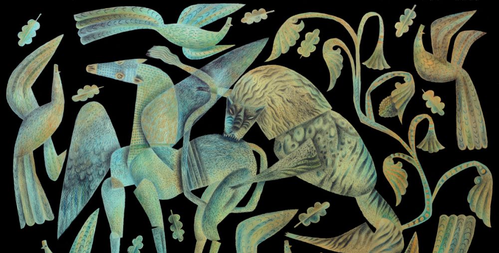
Hambeltonian, Rubbing Down by George Stubbs. It is the single most moving painting of a creature in extremis known to me. I’m mesmerised by the strangeness of it. I’d put it on a level with the Grünwald Christ. Stubbs homes in on the psychodrama underpinning the moment depicted. The racehorse is in a pose with both legs on one side raised, a stance not physically possible as it would just keel over. The artist knows that, but he does it anyway, because it’s right for the painting and the unease he wants to convey in this spectacle of an animal in a fearful state after a hard-won race.
The handlers are tender, but Hambletonian’s ears are laid flat, his nostrils flared, he sweats and his lips are pulled back to expose his teeth. He’s clearly in a bad way after the terrible exertion. The painting was a commission by Hambletonian’s owner, the twenty-eight year old Sir Henry-Vane Tempest, who dissatisfied with it refused to pay the agreed sum to the seventy-five year old artist, claiming to the court in the case brought against him that his reputation as a racehorse owner had been called into question by Stubbs having portrayed the horse in a state of exhaustion. Unexpectedly given the times, the Judge ruled in the artist’s favour.
12. Who is the musical artist you know you can always return to?
Singer, Nick Drake. Composers, Philip Glass and Ravel.
13. During the working process of your last work, in those quiet moments, who was closest to your thoughts?
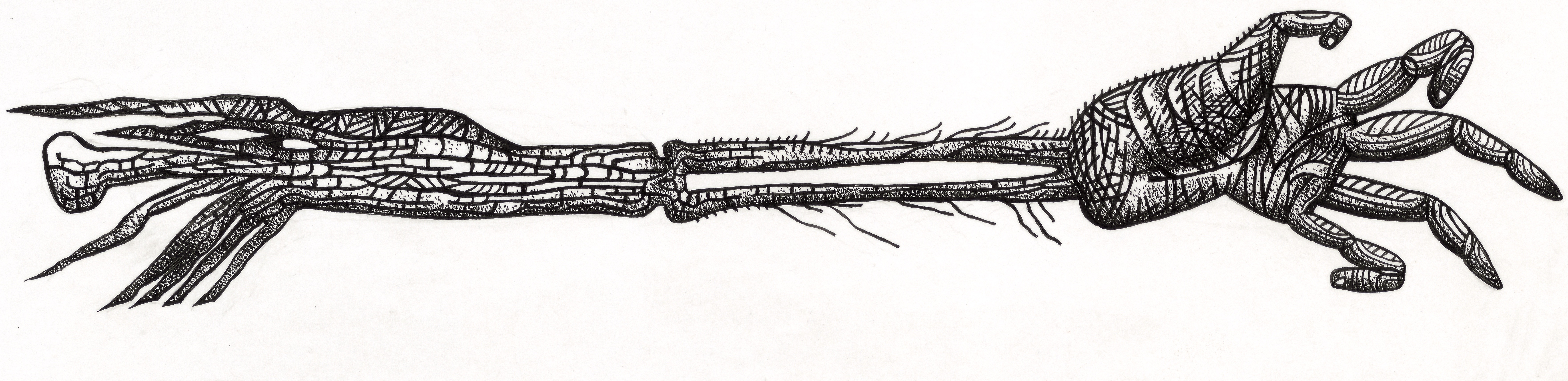
I was illustrating Seamus Heaney’s translation of Beowulf in a new edition for Folio Society, so the text was at my elbow at all times. As I was constantly referring to it, I guess it could be said that Seamus Heaney was closest to my thoughts.
14. Do you believe in God?
No.
15. Do you believe in the power of art to change society?
I believe in the power of art to change myself. Society I’m less confident about.
16. Which artist working in your area, alive and working today, do you most admire and why?
If I’m candid, I’d be hard pressed to identify an artist working precisely in my area, given that I paint, illustrate, animate and direct. There can’t be that many. Also, I’m at that stage where so many of the people I most admired across the creative arts and looked to for inspiration, have died. Too many in the past few years. It broke my heart when Maurice Sendak passed, and Sondheim, too. Bowie and Glenda Jackson, gone. I can hardly believe it. These people were signposts and anchors for me.
17. What is your relationship with social media?
I harness it as best I can for work and making connections. It’s served me well for being able to reach out to people I admire, and that’s worked in both directions. Undoubtedly many of my projects of the past decade have had their foundations in collaborations begun online. I never liked or wanted to be a part of the way artists were traditionally presented by galleries in bibliographies, their lives reduced to lists of dates and achievements. In 2011 Lund Humphries published my monograph, for which I steadfastly refused to produce a bibliography. Instead I contributed a biographical chapter in which I presented, if not the definitive account of my achievements, then something which gave a sense of the journey. Since 2009 I’ve run a blog, the Artlog, at which I write candidly about my practices, my life, people I admire, collaborations and works in progress. In so many ways social media has deconstructed the tired old clichés of how things were once done, and as a consequence given artists – or the ones who choose to engage – the chances to speak for themselves
18. What has been/is your greatest challenge as an artist?
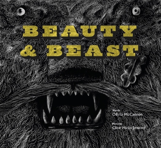
Getting up to speed quickly when faced with unfamiliar challenges is always a thing. But at this stage of my life I believe it’s fine when undertaking something for which I’m only partially equipped, to say “Look, I can do most of this, but these are the areas I’ll need help with.” I’ve been working for publishing houses over the past few years on several big projects, and I always kick off by saying to the art directors “You know I’m a dinosaur, right? I don’t do digital and so everything you’ll be getting will be analogue, made with hands wielding brushes, pencils and pens.” And it always is alright. I work with really skilled technicians. Laurence Beck has been my clean-up artist and colourist at Design for Today for two books, Simon Armitage’s Hansel & Gretel: a Nightmare in Eight Scenes and Olivia McCannon’s Beauty & Beast.
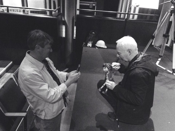
In the past couple of years I’ve worked very closely on publishing projects with David W. Slack, who is an artist in his own right, but has collaborated with me as a model-designer and maker, and recently worked as Animation Producer on the two films we were commissioned to create by Folio Society to promote Beowulf.
Back in 2016 I was invited by Dan Bugg at Penfold Press to work with him on my first screenprint, a process that to begin with utterly bewildered me. But Dan guided me through the processes of it all, and since then we’ve completed a phenomenal body of work, including the fourteen-print series that went on to accompany Simon Armitage’s acclaimed translation of Sir Gawain and the Green Knight in the 2018 Faber & Faber illustrated edition.
19. Do you have any words of advice for your younger self?
It’ll all be alright in the end.
20. What does the future hold for you?
I have enough exciting projects to keep me gainfully occupied for several years. Every time I think that maybe my moment has passed, then someone new comes knocking with a wonderful suggestion/opportunity. (One came yesterday with a proposition so exciting I didn’t sleep all night.) I’m grateful for that. It would be a good way to end one’s days would it not – hopefully some way down the line from here I should say – with something interesting in the pipeline? I don’t think I’d last long if the days stretched emptily ahead. I don’t know whether it’s true, but they say sharks have to keep swimming in order to stay alive. I think that might apply to me.
Please Click on the title above to watch the videos embedded in this post.
Above: click to view the book trailer for Beowulf
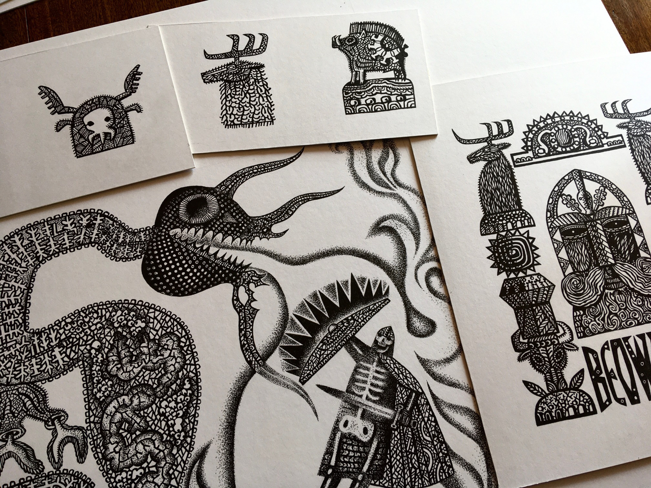
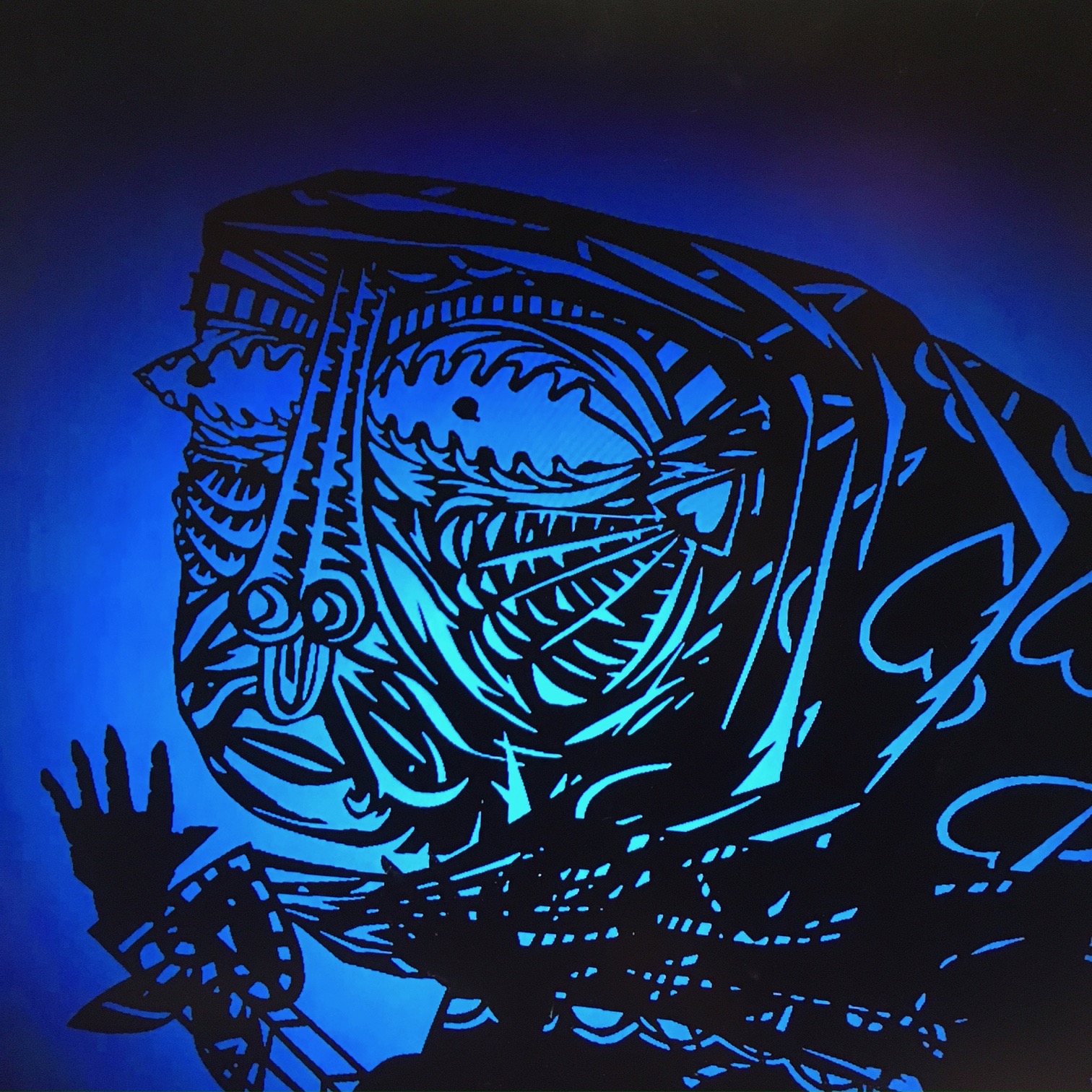
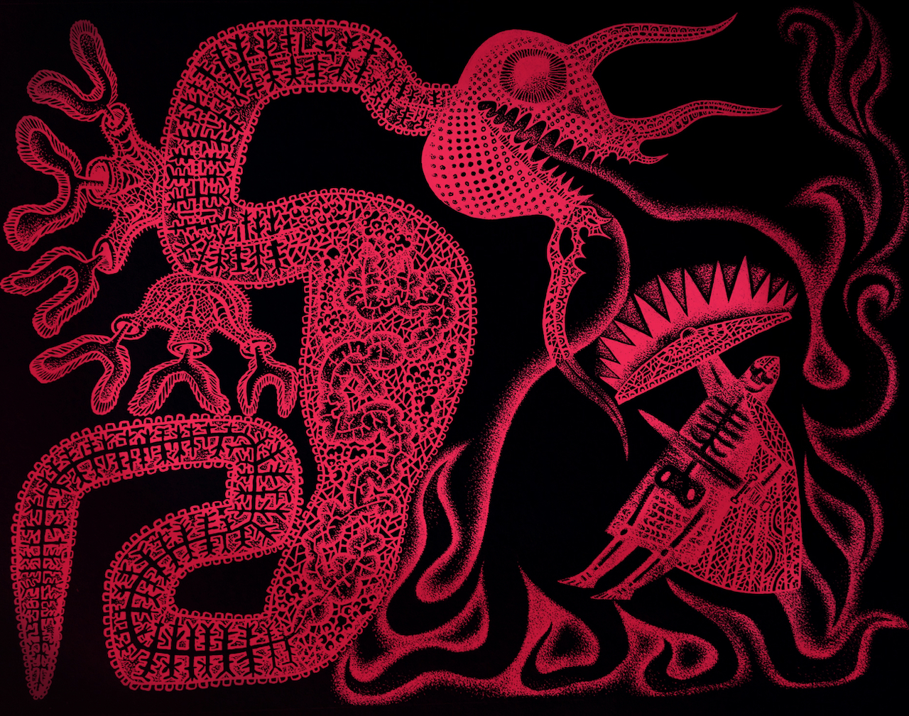
Clive: David, you were undertaking trial digital work for me while I was working on the illustrations for Beowulf. I made them in black ink on white board, but had it in mind to see how they’d look when inverted to white on black. What you produced provided me with inverted images of drawings and digital colourings of them throughout all the earlier stages of the book’s creation. Although the final additions of colour were done at Folio Society, you did all the preliminary ‘tests’ that enabled me to make the decisions ready to brief the Folio team.
Above: detail of illustration from the book after image inversion and digital colouring by Folio Society.
Below: original ink artwork on mountboard with pencil trim guide, before inversion and colouring.
David: Oh it was such a joy to have a private viewing of your Beowulf drawings, and because I was messing around with them digitally, I could easily produce many different versions. It was fascinating wasn’t it, that some worked instantly as inverted images, while others were more powerful as you’d drawn them?
Above: finished ink drawings piling up on the artist’s desk.
Clive: In the end we included some drawings as made and some inverted. The combination worked well.
David: I made some red versions which were just OK, but I remember layering a deep spot-lit blue-green with the image for the first time, and it pulsed and sang immediately.
Below: trial colour images of inversions made by David.
But I think you had committed to the blue at that point, and the intensely saturated blue-on-black and black-on-blue that their production manager achieved in print for your full-bleed double-page illustrations, is way beyond anything I’ve ever seen in print. I’ve done a lot of printmaking through the years, but how they achieved that glowing deepest blue is beyond me. It pulses with some sort of other life and is just unforgettable. I know that you were blown away by the book when you saw it.
Clive: I couldn’t stop shaking when I received and opened my copy. I was anxious because I knew by this point the edition was printed, bound and boxed, and there could be no turning back. I’d seen many page proofs over the months, but between the last proof seen and the finished book the production manager had worked miracles. I was simply speechless when I saw the the quality of the printing.
Because of your contributions at preliminary stages, and because you knew the illustrations inside out, it was inevitable that at some point we’d start talking about the potential of the images to be animated into life, and that’s exactly what happened.
David: Well of course, what a gift this was! Your drawings for Beowulf were in a paper-cut style, and so ready-made for shadow theatre puppetry. I’d learned to animate a while back when we’d made an animated film to promote the Design for Today Beauty and BeastToy Theatre. With that experience under my belt, how difficult could it be to create a three or four second animation as a test run for a potential Beowulf book-trailer? I have to say that it was BLOODY difficult. I’m pretty sure that the learning curve was so steep that at more than one point my neuron’s firing registered on Google Earth. But anyway, this idea of a moment of animation er… well, it snowballed rather didn’t it?
Above: articulated paper maquette made as a compositional aid during the early stages of planning the book.
David: Much of your preparatory-stage work for illustration is built upon the idea of the jointed maquette, so animation is a perfect fit. And of course you’ve made many frame animations in the past, for example on your stage productions of Hansel and Gretel and The Soldiers Tale. By now you and I had made many animations together, almost all set within the bounds of a toy theatre. The images of Beowulf were so exciting to imagine unshackled and animated into life. They were perfectly suited to the medium.
Clive: Because we felt some animation sequences could enhance the promotional video Folio would be sure to make to launch the book, I decided to ask them whether they might consider permitting us to submit a couple of trial animation sequences by way of introducing the team to the idea. Luckily they were open to that and you began work almost immediately.
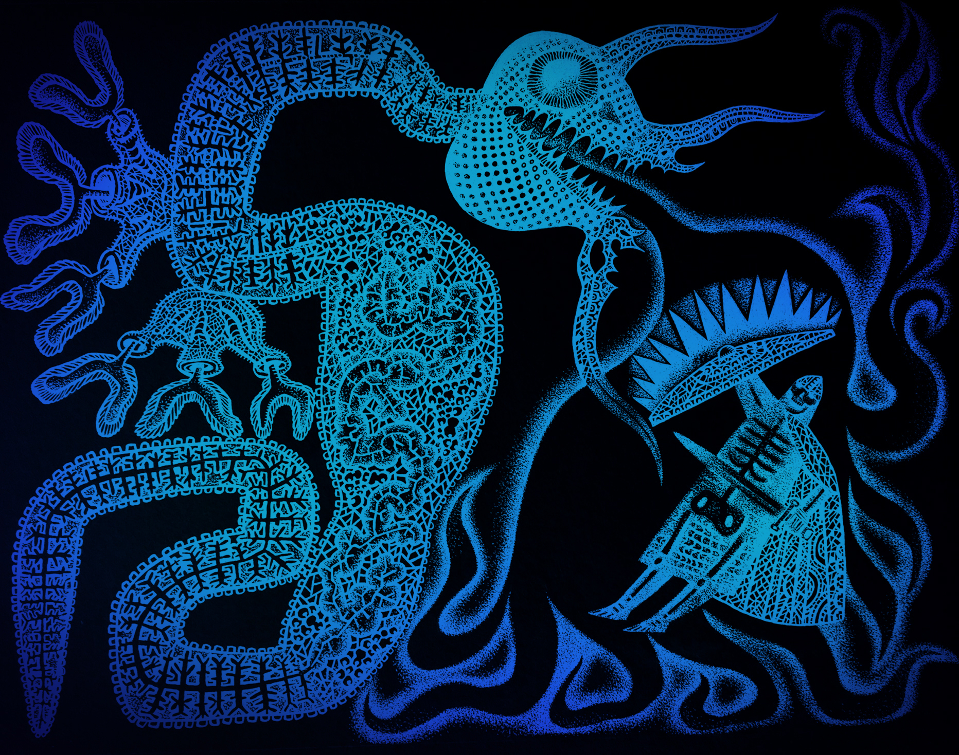
I recall conversations we had about the ‘character’ of the animation, degrading the imagery to make it look almost like ‘found footage’ with that sense of vintage film scratchiness and fluttering. You might have different recollections to me, but among references we discussed there was the idea to animate the dragon almost as if it were some kind of nematode worm being filmed on a slide under a microscope. I think I may have mentioned the title sequence for the film Seven to you, with its sense of flickering unease. And then of course there was our shared passion for Smallfilms and the work of Oliver Postgate and Peter Firmin. It’s just not possible to be in a world of Norsemen without having a conversation about Noggin the Nog.
David: Ah yes! The David Fincher/Smallfilms mash up. I loved your suggestion of a squirming dragon as a micro-organism under magnification. It adds an edge of discomfort to see inserts of a different texture, speed and animation style within the piece. I used the same concept in the jerking movements of the wolf and the tentacles whenever they appear.
Above: black original ink drawing and the digital translation to colour in the book.
David: Tonal changes are essential to my mind, especially when the piece is very dark, or heavily stylised. The most incredible imagery in a movie can actually become dull after a while, unless the viewer is shaken out of it – like a little hit of spice. I watched versions of scenes of the Beowulf animation without the degrading filters we talked about. Your drawings moving across the screen were so striking without the added optical effects that I found it tough to dull them down. Nevertheless I added scratchy inclusions of scrabbling colour to make the films glow and dull in turn, and the decision worked wonders in unifying the animations and the sequences of the book itself. One of the things I had to keep reminding myself was that this wasn’t a trailer for a movie, but for a beautiful book. (The Hitchcock in me was forever edging it to a movie trailer.)
Clive: We waited with bated breath once the sample shots had been delivered to the Folio team, but when the responses came they were wholeheartedly enthusiastic. Far from delivering a few short cuts to be edited into a promotional film, we were tasked with producing the whole shebang. After a briefing Zoom with the team at Folio we got working. There were to be 2 x 30 second films, one at a format for viewing on smart-phones, and a second for viewing on laptops and tablets.
David: Oh weren’t they wonderful? They showed such faith in us that I did feel confident about how it would turn out. Working with such carefully considered and rendered drawings I knew the results would be beautiful. Like cooking with the best ingredients. Although the brief was for 30 second films, I overshot and both edits came in at one minute and six seconds. I think just over the minute stands up very well. I would have been pushed to get the pace right in 30 second films.
Clive: I agree. 30 seconds would have been too rushed. As the films stand, each at just over a minute, they fly by when watching them.
As with all our animation projects, once we’d discussed I absented myself to concentrate on sourcing the music. You in the meantime were off like a rocket. I remember your utter confidence that you knew where to go with all this, waiting only on the music to provide the structures to the films. You were not just animator on the project working to my brief. You were now Animation Producer!
David: And a very cocky one at that, due in no small part to the confidence and enthusiasm you demonstrated in allowing me to hack up and rearrange your artworks.
While you researched the music, I got busy anatomising your Beowulf characters to assemble a cache of puppet elements. You always show an astonishing faith in me to infill the drawings when I amputate an arm, head or leg, or need to find fingers or a neck. I in turn feel safe in the knowledge that you’ll always find the perfect piece of music which will make the pace, depth and rhythm of the story appear clearly in my head. This time you found four tracks, one of which though amazing, we both thought a little too disturbing. (Maybe it’ll be right at another time for another film.) I viewed the films hundreds of times when making them, and have watched them many times since completion. I’m confident the two music pieces we settled on had just the right aesthetic, power, drive and primal drama. People report that they watch them repeatedly, and a big part of that is because the music makes them so moreish.
Above: click to view this animated book-trailer for the new Folio Society edition of Seamus Heaney’s translation of Beowulf.
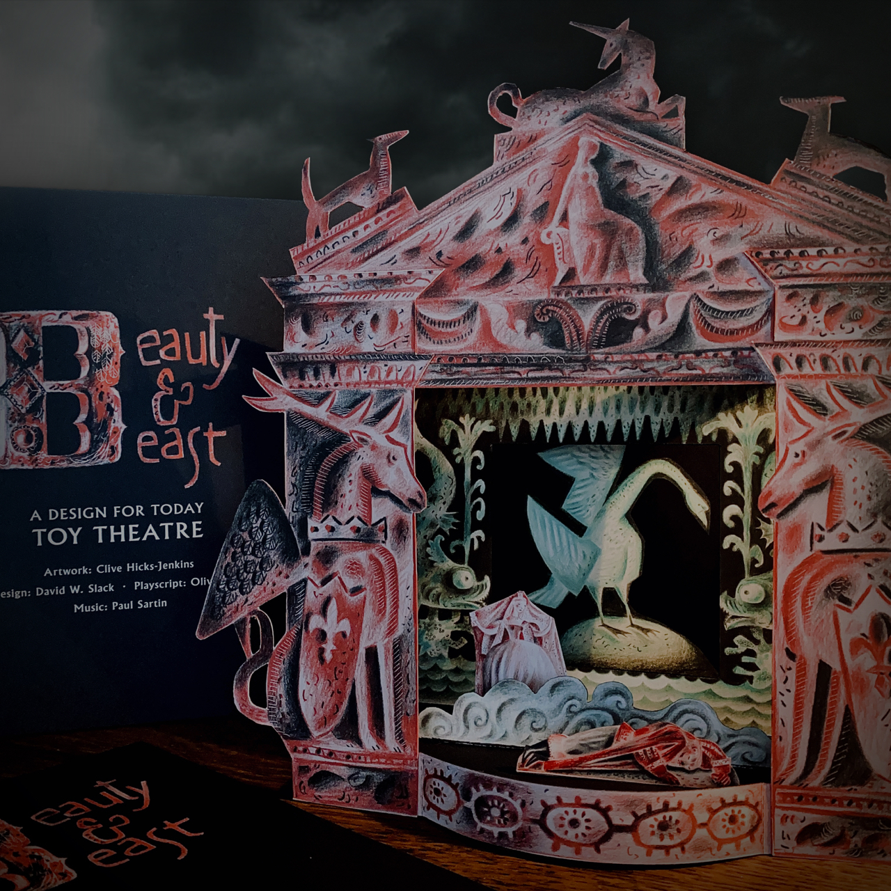
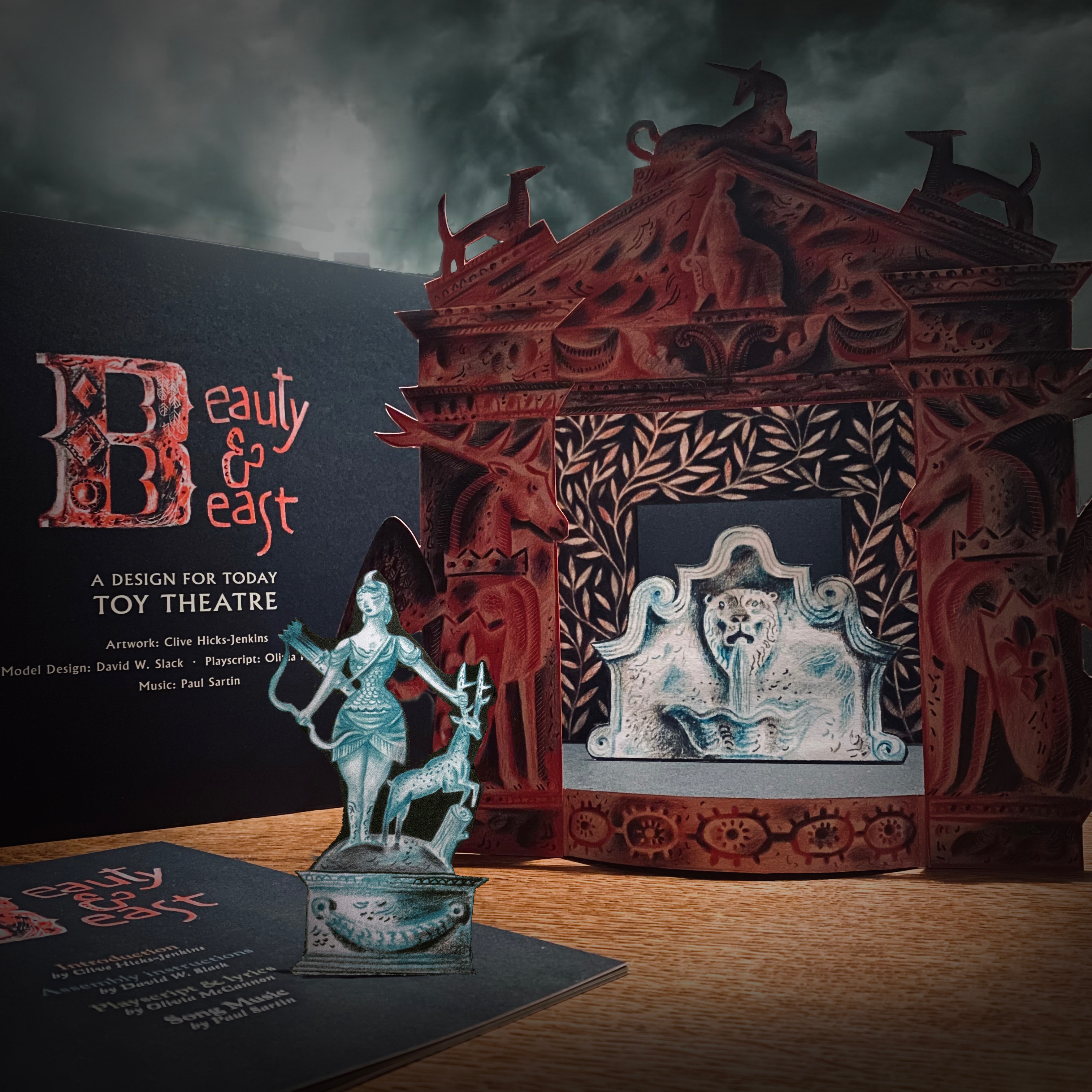
On June 27th Folio Society will be launching their ‘special edition’ of Beowulf, translated by Seamus Heaney and illustrated by me. Heralding this are two animated films to celebrate the event, produced by my regular collaborator of the past few years, David W. Slack. David is a painter in his own right, and it’s his breadth of knowledge and practice as an artist which strongly underpins what we make together. We first collaborated when I asked him to construct preliminary models for the Beauty & Beast Toy Theatre Kit I was preparing for publisher Joe Pearson at Design for Today. In this first of two recent ‘conversations’, David and I track how he went from model designer on Beauty & Beast to being appointed Animation Producer on Beowulf.
Clive: David, I first came across images of yours at Insta when you were ‘enhancing’ your copy of the Hansel & Gretel Toy Theatre I’d designed for Benjamin Pollock’s Toyshop. What first struck me was how good a model-maker you were, followed swiftly by how improved the model was by the curved stage-front you were adding to it. “Damn it!”, was my initial response. “I wish I’d thought of that.”
Above: David’s ‘improved’ Hansel & Gretel Toy Theatre, with the footlights and curved stage-front he added.
David: That model was really lovely. When it arrived I was amazed at how few sheets you’d managed to condense the entire story into, yet when cut and assembled it became a very layered and complex model. You sent me the additional scan of the stage floor so that I could print the floorboards I needed for my planned stage extension.
Clive: For the record you’re a better model-maker than I am, and I remain envious of your framed model of the adapted Hansel & Gretel Toy Theatre complete with lights and curved apron. Overworked as I was by this point, the idea of inviting you to collaborate on the Beauty & Beast Toy Theatre was already churning away in my head keeping me awake at nights.
David: I’d seen an Insta post of a beautiful architectural doorway you’d made for Beauty & Beast flanked by sinister white-eyed caryatids. Having contacted you to ask how you’d feel about my interpreting the idea into a painted wardrobe, you were extremely encouraging.
Below: preliminary work on an illustration of a garden door in Beast’s realm.
When I ventured further and wrote that a toy theatre might be fun, you admitted you were planning one, had a preliminary dummy on your desk at that very moment and were wondering whether I might help with it. After that it was just a case of me trying to jump onto the already speeding train!
Your work on the book of Beauty & Beast with writer Olivia McCannon was already well underway, and although that collaboration was quite separate to the toy theatre, the two projects were clearly intended to be viewed as a pair. From the start your advice to me was to “do less”, and it was much needed as my first response was to turn the model into the toy theatre equivalent of a big old Busby Berkeley number in a Hollywood musical. Fortunately, better understanding that a lighter touch benefits toy theatre, you stayed my hand. More sketches went back and forth to get us to the same starting point, and thereafter everything was much clearer. I outlined my understanding of my role as the facilitating designer who’d translate your evolving illustrations for the book into a working toy theatre model.
Clive: And that was a good starting point for both of us, though in fact your role quickly became much more than that of model designer. With sections of Olivia’s text for Beauty & Beast arriving daily I was up to my eyes in keeping apace with my illustration schedule, so it was a relief that you were able to efficiently keep me up to speed with what you needed for the model and when. You’d effectively become the project manager.
David: Once bedded in I began to lobby for an increase to the six construction sheets you’d advised were the maximum we could afford for the model. I hope I wasn’t too pushy.
Clive: I saw it more as a case of your enthusiasm for what we were making. However while excited by what was emerging from your desk, I was growing slightly anxious about the implications for the budget. It was time to explain to Joe the publisher that I’d gained a collaborator, and to sound him out regarding expanding the project from six to ten sheets. By now you were producing prototypes like a man on a mission, and with the tangible evidence of what we were achieving, Joe agreed to the new proposal.
David: SO many prototypes, yes. How my printer didn’t explode I will never know. I was desperate to get the maximum-sized model into the smallest space, so there was a lot of jiggery pokery.
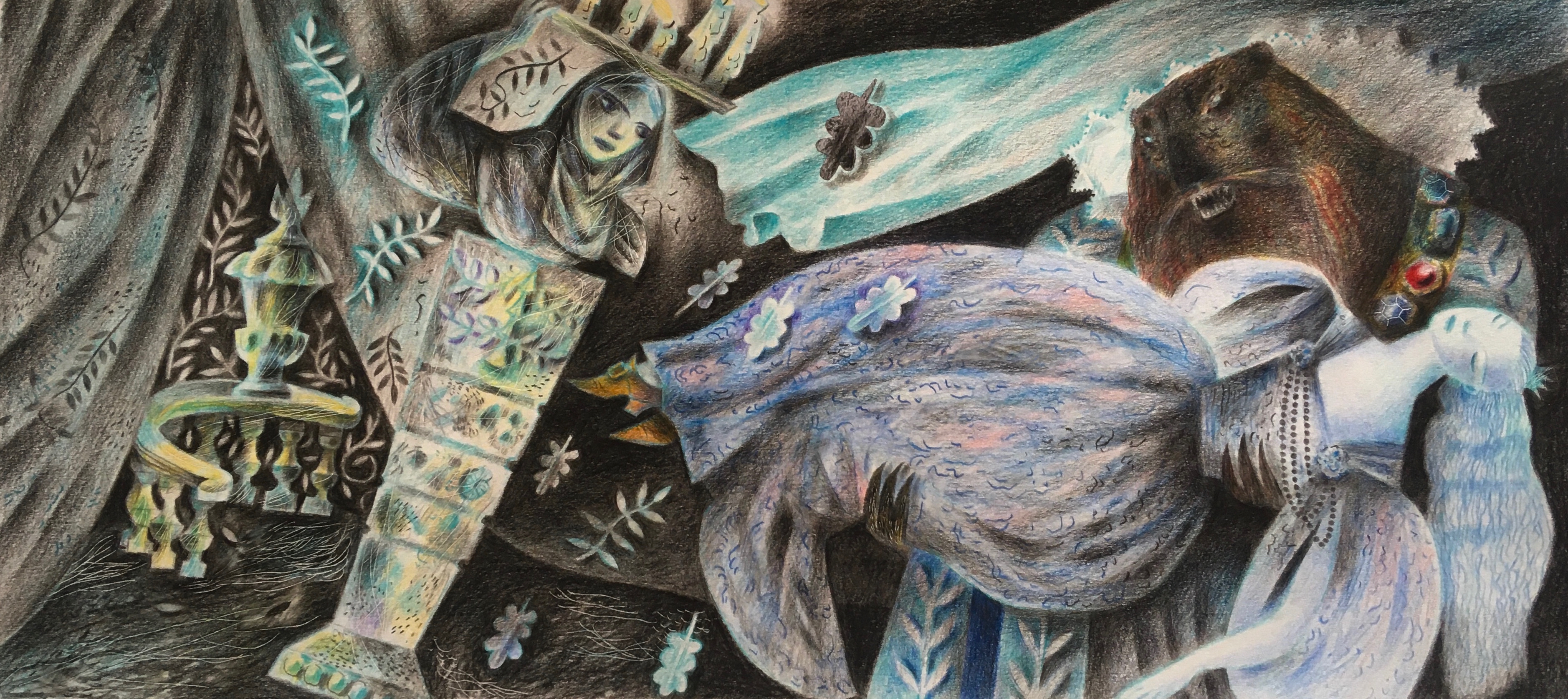
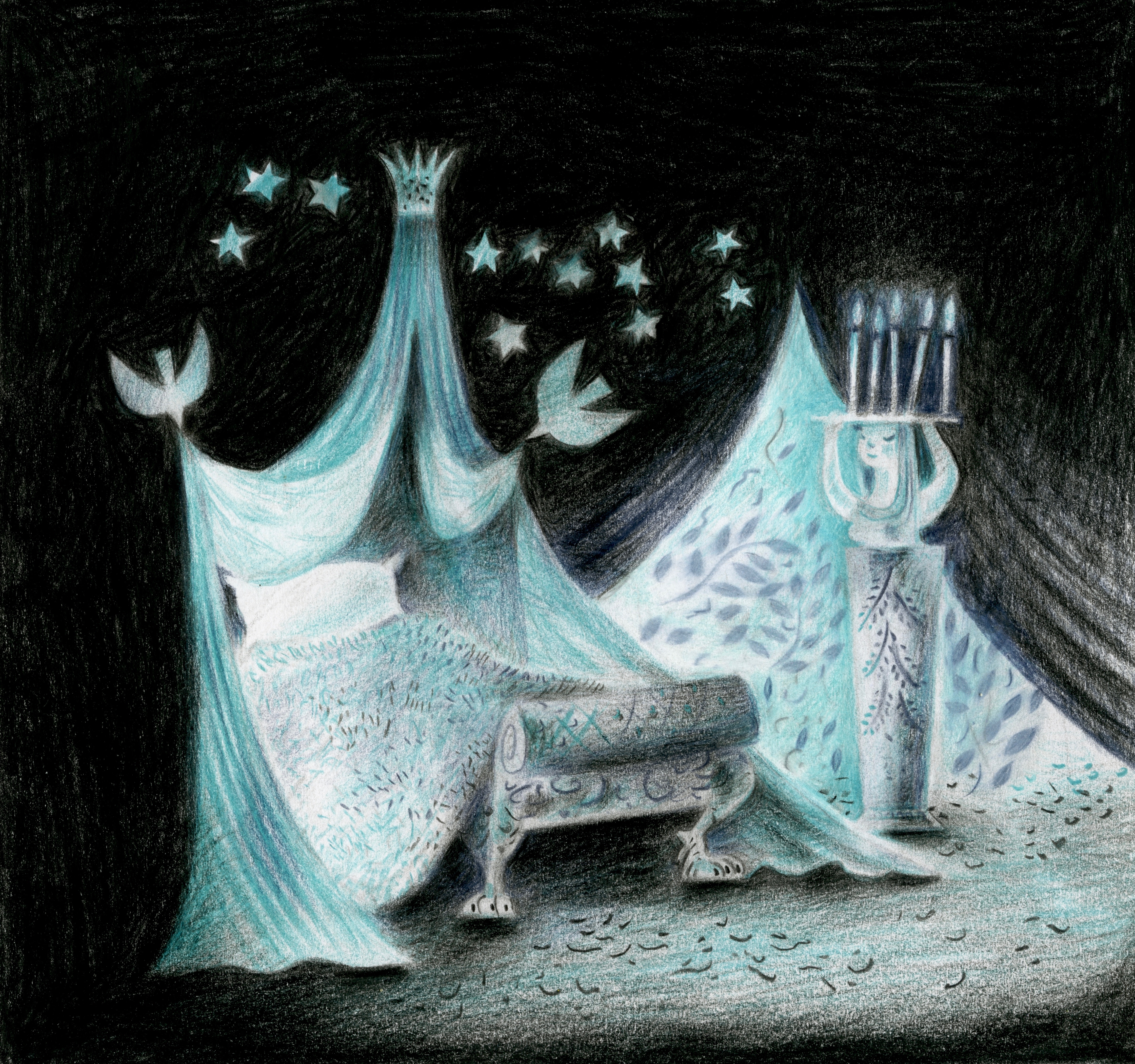
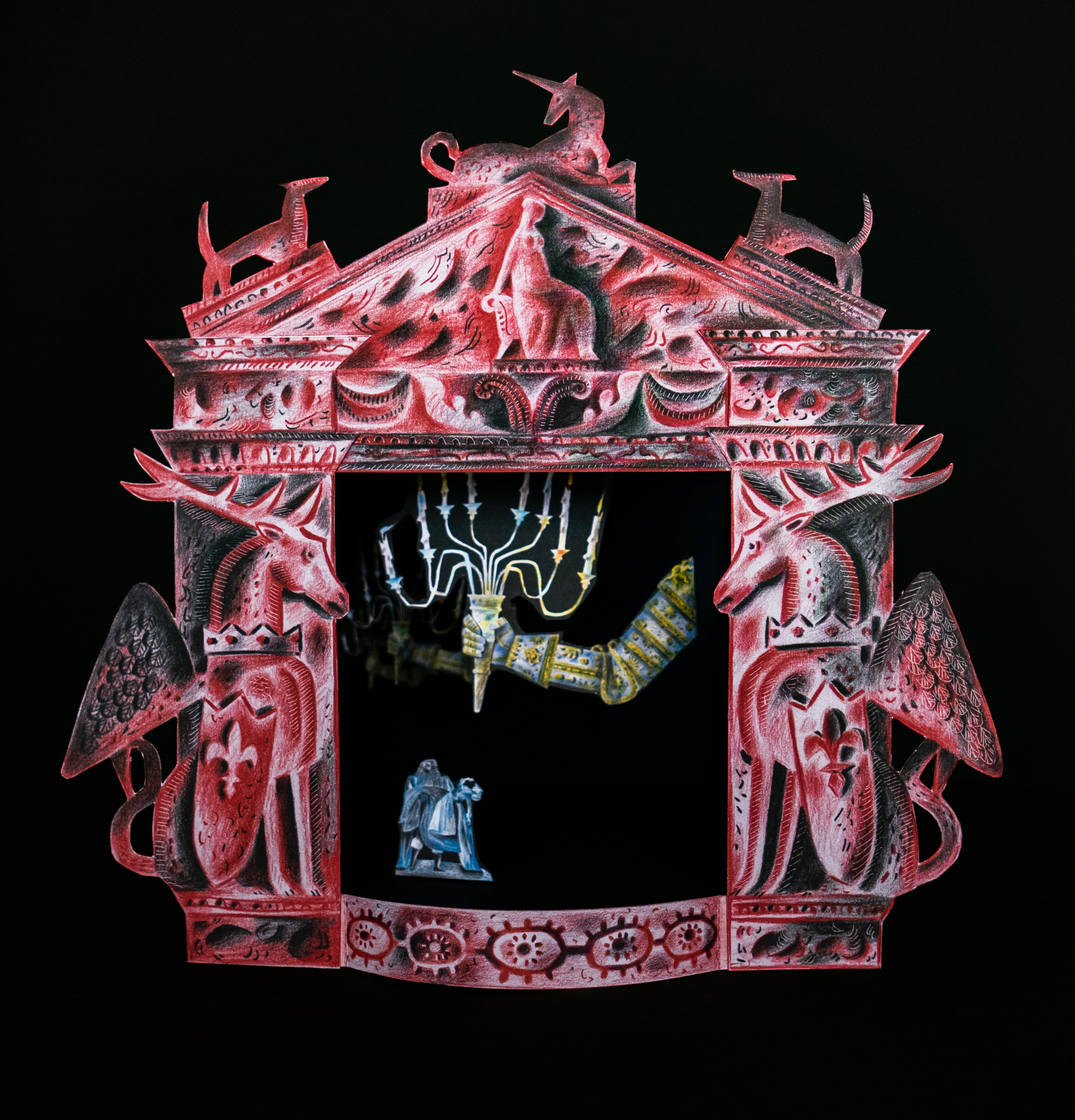
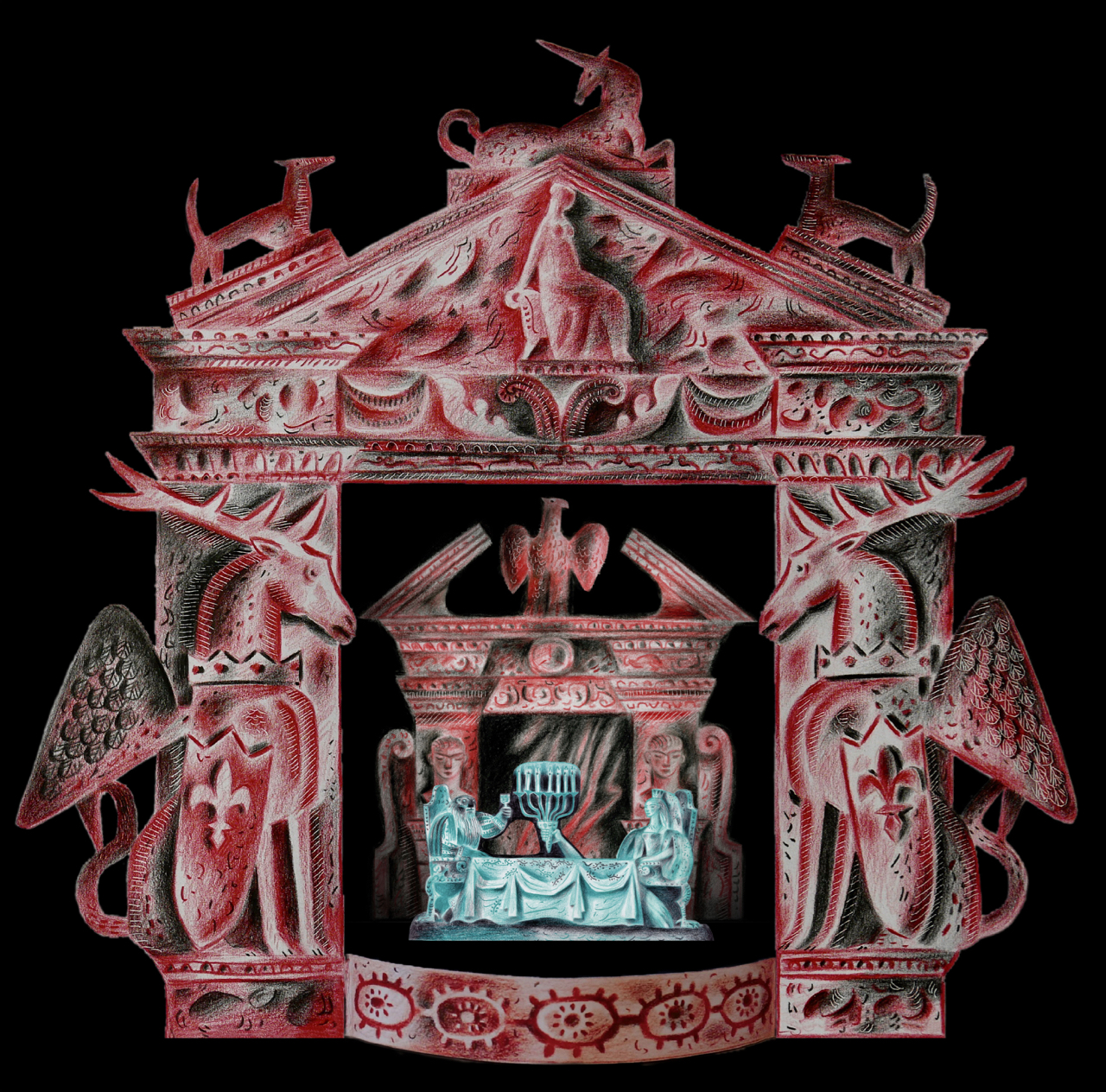
That in the end we fitted so many scene changes alongside puppets and props onto just ten sheets still amazes me, because the toy theatre alone took four. More than anything else I wanted to include the scene of the disembodied candelabra-bearing arms in the entrance to the castle, and I was at the point of offering to personally underwrite any added expense for them when you came back with the news that Joe had agreed to the extra sheets. We were up and away.
Clive: It was quite a roller-coaster we were all on. This was new territory in nearly every respect. The project was complex and we were all aware of how it needed to fit with the main book, while also being separate and stand-alone. Already it was apparent there needed to be considerable adaptation from what I was creating for the book, to what would work for a toy theatre.
Always there’s the line to be walked between being prudent with the budget, yet open to where a bit of extra funding will give real added value. Joe kept everything under close scrutiny as we progressed, and his was the suggestion to present the ten sheets in a folder with pockets, instead of being bound into a book. The script and instructions could then be produced as a small pamphlet, which in the end worked beautifully and saved costs.
David: I was amazed at how quickly everything progressed. It was only later I realised what a frenzy you were in trying to keep up with me, all while I was feeling the need to go faster to keep up with you! But we steadied our nerves and in the end the toy theatre was made at an incredible lick, and it looked wonderful.
In the next post we move on to Beowulf and how David took on the role of Animation Producer for the two Folio Society films he was asked to create to promote the new book.
With the weather blazingly hot in the Ystwyth Valley this morning, I set off while it was still relatively cool to walk Rudi through our field to the red bridge over the stream to our neighbours’ property, and from there across the cycle-path and down to the river, where he likes to retrieve his ball and swim.
Our field was lushly green a week ago, starred with wild flowers and thrumming with insects. It probably hasn’t been fertilised for the best of a century, and this is the first time in several years it hasn’t been grazed – at least in part – by horses throughout the Spring. Rudi vanishes in the chest-high grasses when chasing his ball, and I have to be up-hill of him to trace his trajectory by the parting track like the speeding Velociraptors of Jurassic Park. He emerges sneezing with nether-parts and face butter-yellow with the pollen, reminding me of the little man with a golden beard in Ruskin’s The King of the Golden River. Through the gate and into the steep, wooded valley where the red bridge is cool in dappled shade, rimmed with huge clumps of glossy hart’s-tongue ferns, the bluebells having long gone. (We have the native bluebell in the wood, though the ones in the garden planted before we arrived are the bigger, showier Spanish variety.) Below the bridge our stream continues to run, though the flow is now desultory and the rock pools under the two waterfalls are a lot more shallow than they were a month ago. A quarter of a mile on the river will still be running deep enough for Rudi to swim, so we press on.
A few weeks ago the track down to the the river cut through deep beds of wild garlic. Now the path has transformed with seed-heads dropped from the trees, and it’s as though we’re walking on lamb’s-fleece. As Rudi bounds ahead flashing through shafts of sunlight, little bombs of grass-pollen go off like soft firework displays in his wake. At the river a flotilla of Canada geese watch from the water, regally still at a distance of about a hundred yards downstream, as Rudi doggy-paddles loudly about in pursuit of his ball. It’s lovely to watch him from above, the water clear and the far-below pebbles rippling as his shadow passes over them. When first he came to us a year ago he was circumspect at the river’s edge, only willing to retrieve his ball if it floated within range without him plunging in. Now he cannons in with a splash and swims like a champion, riding high in the water with tail up and ball clenched between jaws held above the surface. (Jack on shorter legs used to ride low in the water, and his river-intake when carrying his ball was prodigious as a result.)
This afternoon, because he asked, I took Rudi for a ball-throwing circuit of the grounds, and halfway across the field in the full blast of the day, wished I hadn’t. Even in my straw hat the heat beat down like a hammer on the top of my head. Rudi vanished for minutes on end, lying flat in whatever shade of grass he could find. The vibrant greens and purples of last week’s grass have now scorched to shades of pale green/straw, and though that’s the way it always goes, this year the transformation has been a lot faster. Right now everything looks beautiful, but we need rain. A week more of this will see a big difference in the landscape.
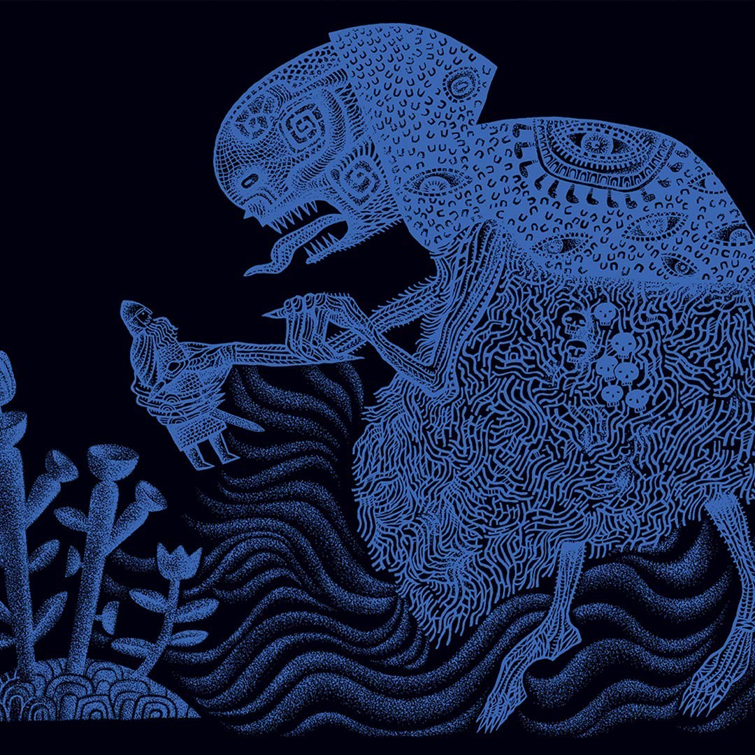
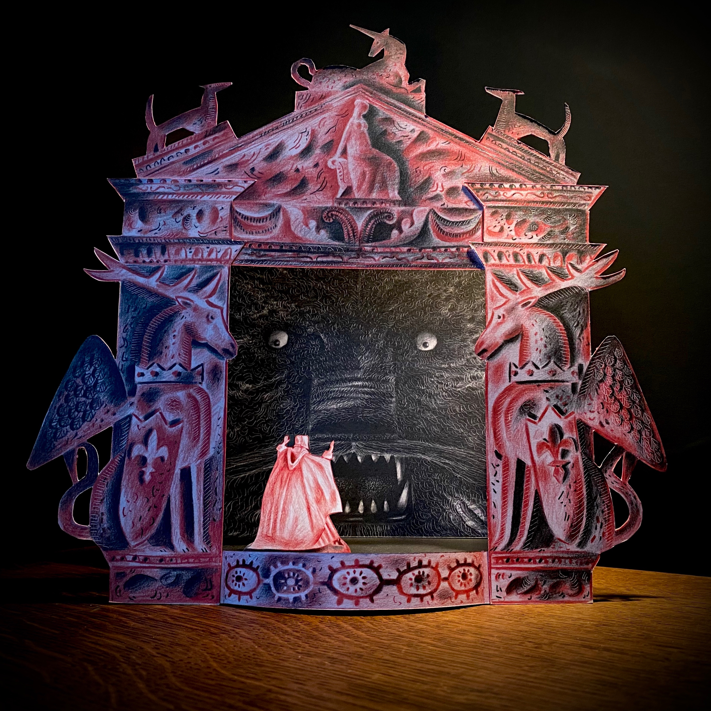
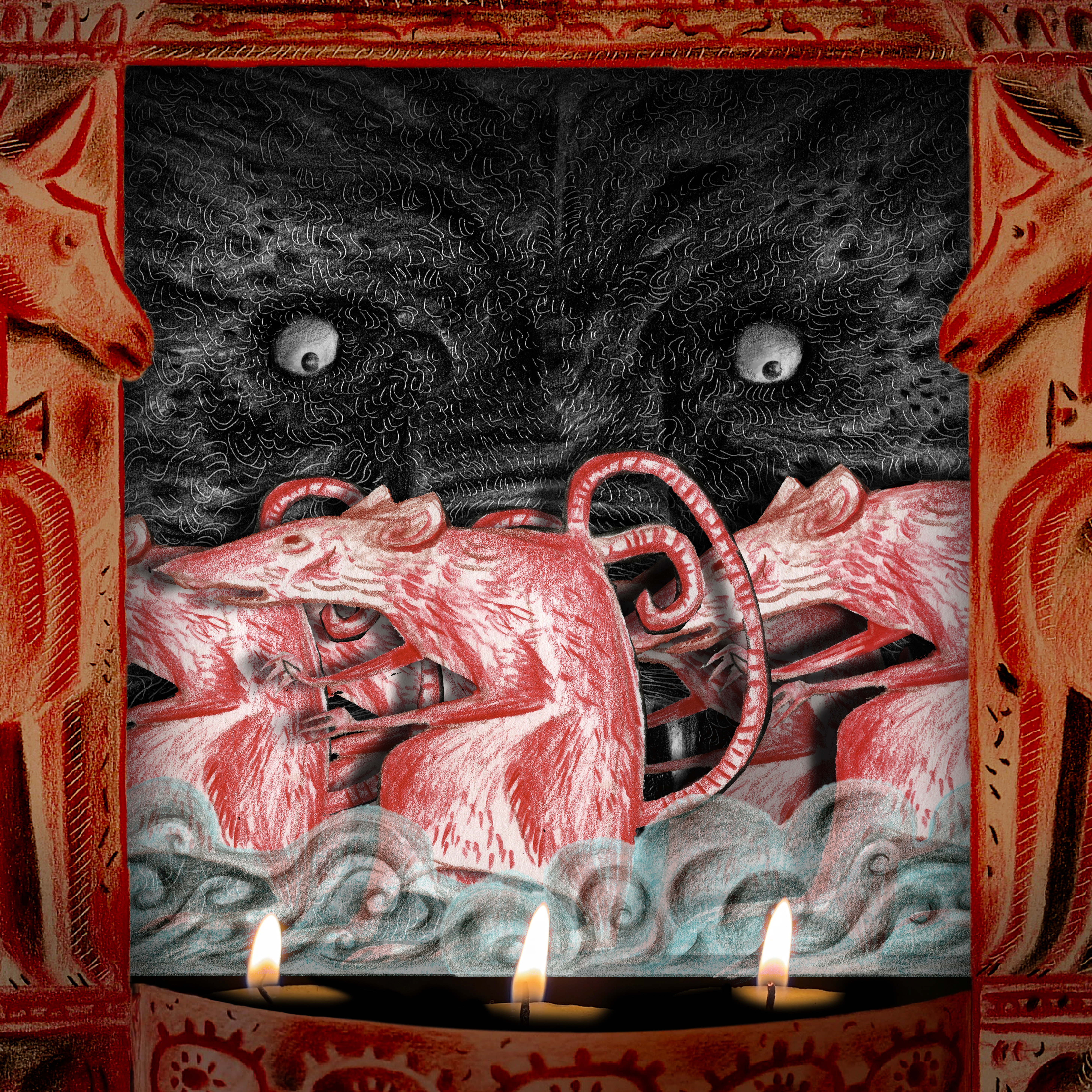
In the print series Sir Gawain and the Green Knight, made in collaboration with Penfold Press, the image of the Green Knight hoisting aloft his decapitated head, had in its background his horse, decked out in a caparison of embroidered foliage, oak leaves, eyes and peacocks.
Above: gouache and pencil study for The Green Knight’s Head Lives
The peacocks in flight, together with the flying oak leaves, subsequently found their ways into a painting commissioned by the Musica en Segura festival in Andalusia, in which alongside several other commissioned images, it was projected to accompany a performance of Messiaen’s Quartet for the End of Time. I made the painting, titled Startled Peacocks, while listening to the music in my studio, the work evolving into a visual meditation of the triumph of brutality over reason and order. I was interested in making an image that was beautiful to look at, whilst not flinching from the idea of unthinking violence.
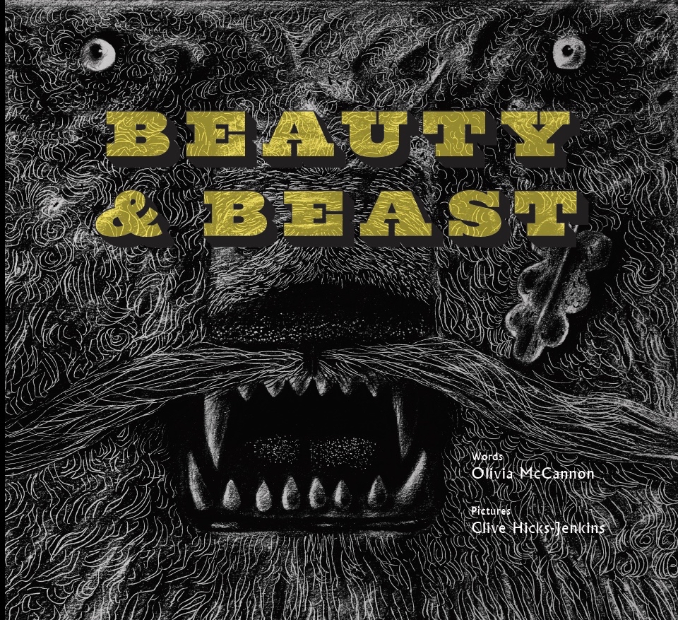
Startled Peacocks then became the foundation of a key illustration in Beauty & Beast, a collaboration with poet Olivia McCannon on an homage to artist/director Jean Cocteau’s film adaptation of the fairy tale La Belle et la Bête. In the illustration the peacocks have gone, but the leonine Beast has assumed the pose of the attacking lion in the previous work. Beauty and Beast was published by Design for Today in 2022.
The peacocks and oak leaves from the Gawain prints and the Messiaen concert re-emerged when I collaborated last year with Tinsmiths of Ledbury to create a textile design. In the first image a drawing is in progress on my desk, and in the second, as it appeared when printed onto linen. The design is being made in a variety of colour combinations.
The Tinsmiths textiles are due to be launched this summer.
In her poem Mares’ Tails Catriona Urquhart recalls the narrator’s unease at the sight of linen bed-sheets on his mother’s washing-line. In this and all but two of the titles in the poetry collection, the poet ventriloquises her subject, my father, Trevor. Catriona was a great gatherer of stories, and in her years of friendship with my father, she collected and stored many of his. She winkled out of him far more than he’d ever shared with his family. I think he was unguarded with her, and recalled his life with real pleasure.
Mares’ Tails
I lie
and coax the clouds down
from the sky
and grab the mares’ tails
and fly
far up
into the blue
and gazing down see
all my landscape
small and strange and new.
The church tower squat and square,
the lilac shadows of the vicar’s yews,
the brook, a silver eel
that snakes around the patient cows,
mere dots of brown.
Ed Hockey, bicycling from the town
seems not to move.
My mother’s washing line
is pegged with people:
Joan and Hetty billow out
but Herb hangs limp
and Vince is twisted at the end.
The linen sheets
that pinion me at night
encasing me in wild dreams,
terror, nightmare,
are waving free
so innocently.
You could not think
they meant to choke and smother.
Catriona Urquhart (1953 – 2005)
It was so very easy to share with Catriona, because when she loved a person she bestowed her full attention and appreciation. Trevor revelled in that. They used to go off on little adventures together, him whisking her away to his favourite country pubs and beauty spots around Monmouthshire, or his regular Italian cafe for lunch in Newport’s docklands, where Maria always had his place set for him. These were his late years and Catriona, who was reeling from the loss of her father, found comfort in mine. Trevor loved this late-blooming friendship, unlikely though it was. He twinkled in her company. They both twinkled.
Trevor didn’t make it into the new millennium. He died at age eighty-six in 1999. He’d been eighty-four when he’d opened up and shared with us the strange event of his childhood that had shaped his life, so there had been just two years for us – for me and Catriona – to gather what facts we could of the occasion when the midwinter mummers had called at his home and Trevor, who was just a toddler, believed the Devil had come for him. It was unlikely that in the hurly-burly of excitement anyone present saw or recognised the effect of the child’s encounter with a ‘Mari Lwyd’. (Grey Mare) Thereafter Trevor believed with the simple certainty of a child, that if ever he spoke of what he’d witnessed, then the Devil would return to carry him away. And because he never told another soul, the memory stuck. He didn’t recognise it for what it was – a celebratory folk tradition – because in imagination it had grown into something private and terrifying, an atavistic horror carried with him into adulthood and hidden away from sight. He simply had no idea that the Devil was a decorated horse’s skull on a stick, with the capering operator hidden beneath a shroud-like draped bedsheet.
All his life Trevor was terrified of entangling sheets, whether too tight on beds or cracking in winds on washing-lines. He never read a ghost story, not a single one, but had he laid eyes on M. R. James Oh Whistle and I’ll come to You My Lad, he wouldn’t have got into a bed again, ever. In hospital, at the end, with his dreams resurrecting old fears, he fought with sheets tucked tight by caring nurses to prevent him falling out of bed. I loosened him and murmured soothingly, stroked his forehead and told him everything would be fine. And then at the end, it was, and he was still.
Catriona died on May Day in 2005. She was a mere fifty-two. She’d been drifting on a tide of Morphine, surfacing infrequently, briefly and peacefully in those last weeks, cared for by those who loved her and the wonderful Macmillan nurses, tending and vanquishing her pain. It’s said she chose her time, May Day having always been significant for her, so perhaps at some deep level she knew the calendar date and took her leave on the day she loved.
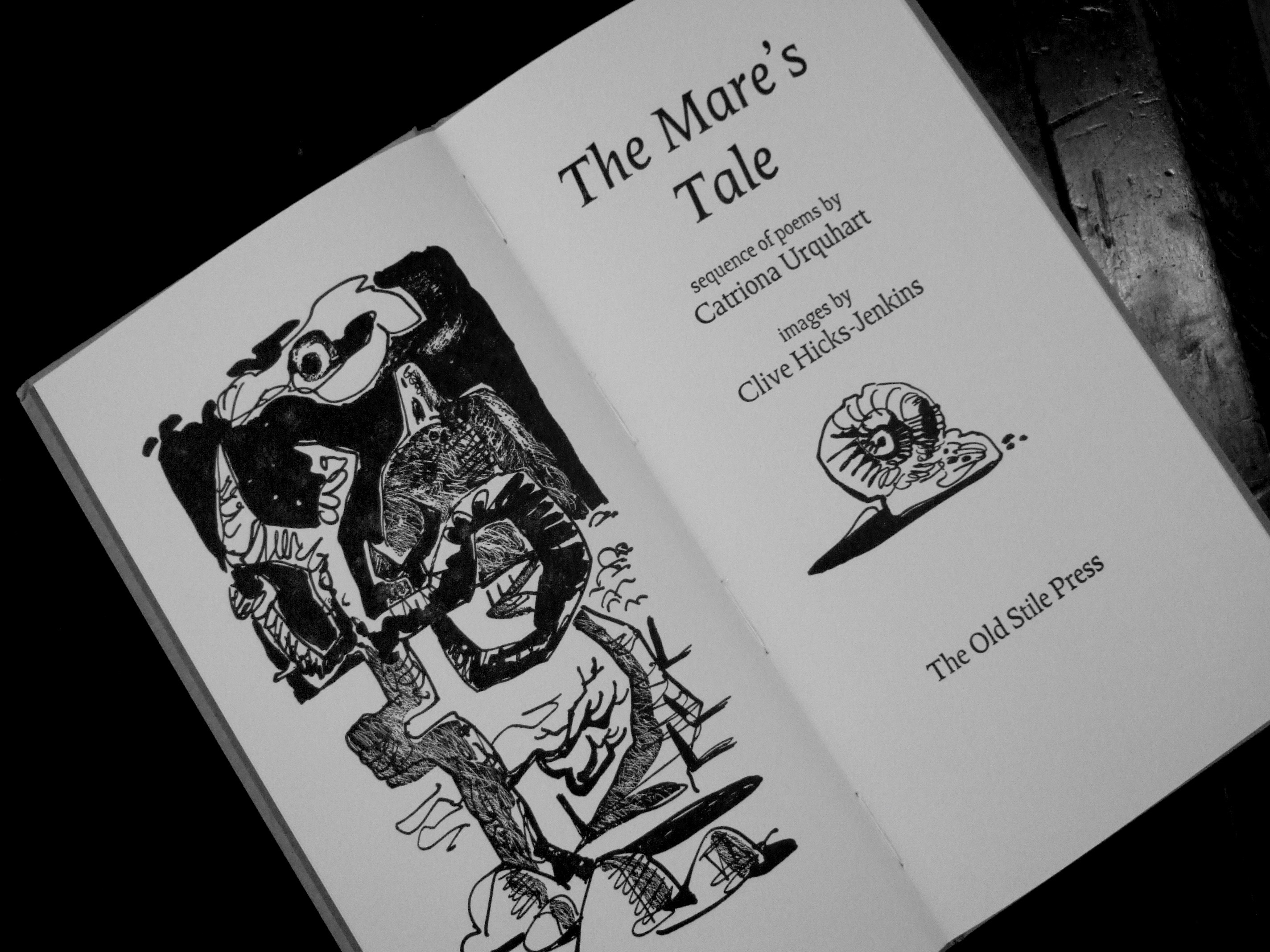
The Mare’s Tale was the sole volume of Catriona’s poems published in her lifetime. The poems were originally intended as the text for my 2001 exhibition of the same title, but when Nicolas McDowall of Old Stile Press came to our house and found her manuscript on our kitchen table, he decided the collection must be suitably honoured in a beautiful edition. And so it was, illustrated by me, printed by Nicolas at Catchmays Court in the Wye Valley, bound in super-fast time by The Fine Bindery and published by Old Stile Press. Launched at the opening of the exhibition at Newport Museum and Gallery, it was the only collection of poems published in Catriona’s lifetime. She destroyed all her earlier work, a fact discovered only after her death. She was always hardest on herself, and had clearly taken in hand what she chose to be remembered by. The Mare’s Tale is a small masterpiece and we are lucky to have it. She was a wordsmith down to her bootlaces.
When I was working on the recently published Beauty & Beast, written by Olivia McCannon and published by Design for Today, I thought it might be a lovely idea to additionally make a toy theatre version of the book. It would be sold separately as an item in its own right, with a script by Olivia. However I knew it couldn’t be a simple matter of recreating the illustrations reduced and trimmed to fit a toy stage. It would require a complete translation into a new language, the language of the toy theatre. In this I was aided and abetted by Olivia, who absolutely understood the nature of translation and transformation, and was able to brilliantly magic her ravishingly beautiful and heartrending text for Beauty & Beast, into a clever, funny, galloping romp of a pantomime for the toy theatre. Artist David W. Slack, too, came aboard, and began translating my illustrations into what would work on a toy theatre stage. We three took one thing and turned it into another. I cannot tell you how we did it. The process defies analysis and certainly defeats the retelling. I found at all stages I was working intuitively. I think we all were. But here, by way of explanation, I’ve illustrated this piece with images of the toy theatre, set against the illustrations which inspired them.
Even the name of the art form is deceptive: Toy Theatre. The word ‘Toy’ makes it sound juvenile, a thing of the nursery, and in fact the toy theatre was born in the eighteenth century and reached the dizzying heights of its invention in the nineteenth as a plaything of young people. (Though I suspect that a lot of those who played most were not children at all.) It sprang out of a desire of theatre-goers to have souvenirs of the productions they’d enjoyed, and sensing the commercial potential of this, the printmakers of the day began first to offer portrait sheets of actors in their roles, and later, ‘toy’ stages on which small, cut-out paper actors could strut and gesture through melodramas, romances and pantomimes. (Toy theatre makers were only able to thrive where there was a lively theatre industry on which they could draw for inspiration and their market, which is why the English tradition of toy theatres developed in and around London’s theatre-land.) Though modern toys would eventually displace toy theatres, the tradition persisted culturally if marginally in Britain, largely because the last printer/seller of toy theatres, Benjamin Pollock, managed to scratch a living into the twentieth century.
After Benjamin Pollock, the faded memories of toy theatre clung on in the small and privately owned Pollock’s Toy Museum in Scala Street, which this year closed its doors for the last time (though there are plans to one day open it in a new premises), and in Benjamin Pollock’s Toyshop in Covent Garden, which is a modern business bearing an old name selling mainly modern toys, but also a range of reproduction antique toy theatres and toy theatres by contemporary designers, myself included.
Below: illustration from Beauty & Beast of Beast carrying Beauty to her chamber, and the set design of Beauty’s room from the toy theatre adaptation:
I was given a set of yellowing toy theatre sheets to cut-out and play with when I was a child, a gift of the actor/author Bill Meilen. Some bore the name Benjamin Pollock. I made my own toy stage to hold them. When I left Wales to attend school in London, I discovered the Pollock’s Toy Museum and the die was cast. At weekends and with time my own, I haunted the place. Toy Theatre got a grip on my young heart and has held it fast for a lifetime.
But how does it work? How may a production made for a real stage shrink to what works on a toy stage? (Or in this case, how does a wide-format illustration made for a book shrink to the square aperture of a toy stage?) It’s not simply a matter of scaling down, though that can be done too, and often is, and with mainly poor results. By some alchemy when the stage shrinks, then new rules apply, and new ways of creating and seeing have to be devised.
The toy theatre may imitate the backdrops, wings, headers and cut-cloths of nineteenth century stages, but there has to be a translation to the reduced form. Think of it this way. If you took a delicious sweet from its wrapper and popped it into your mouth, it would be delightful because the small size suits the intensity of flavour. There would not be a better eating experience were it to be enlarged to a giant size. It exists, at its best, at the scale intended. So it is with the toy theatre, only the other way around.
When you take something devised as life-sized, it is not better for being successfully shrunk to small. It becomes too cluttered, too visually indigestible, too busy. No, the toy theatre has to be a new thing. It has to be tailored to its constraints, though as is so often the way with creativity, the limitations can be made to work to advantage. It is not the real world, but an absolutely unique one, with different rules and languages. At its best it can be a doorway to another country, the way past the coat-hangers into Narnia or down the rabbit-hole into Wonderland. I’ve been tumbling down the rabbit-hole of toy theatre all my life, and I’m tumbling still.
Beauty & Beast, a retelling of an old tale with text by Olivia McCannon and illustrations by Clive Hicks-Jenkins, may be purchased direct from the publisher, as can the Beauty & Beast Toy Theatre:
The Picasso Jug. 1998. Acrylic ink on paper. 24 x 43 cms. Private Collection.
I love the bleak uplands above Merthyr Tydfil. As a child I knew them through the eyes of my father, a wayleaves officer with the South Wales Electricity Board who often took me with him on his work journeys across the country. It’s a windblown, restless landscape of scrub and sky. Few trees, but sweeping vistas of land scoured and shaped by the weather and punctuated, back in his day, by the verticals of wire-looped telegraph poles and the glittering, alien giants of electricity pylons striding the hills. There were no abandoned and burned out vehicles then, vehicles in the 1950s being harder to come by and rarely abandoned when there was still mileage to be had out of them. But what thrilled me most were the parched grasslands of the late summers rippling across the curves of landscape, as though we were perched on the back of some great beast with a bleached pelt streaming in the wind.
Alas, I don’t have a Picasso Jug, and this one from a museum collection was relocated by me into the landscape I love. I felt that jug and landscape were a good fit.
On Tuesday, 28th March at 19.30 BMT, I’ll be ‘In Conversation’ with Rebecca Gibbs as a part of a programme of events organised with the Ecumenical ‘Lent Conversations’ team in association with Articles of Faith and Victoria Methodist Church, Bristol. There’s an exhibition of works from the Methodist Collection of Art, open from 6pm on the evening of the event, at which my painting, Christ Writes in the Dust, commissioned by the trustees of the collection, will be on view. Booking is free on Eventbrite.
The event is taking place at Victoria Methodist Church, 1A Whiteladies Rd, BS8 1NU. There will be a Zoom facility for those unable to attend in person, and details of that may also be found at the link above.
Below: chiaroscuro study for Christ Writes in the Dust.
Looking at my shelves I realise how fortunate I’ve been as an artist to have collaborated on a good many interesting book projects. At the start of my career as a painter, Nicolas and Frances McDowall of Old Stile Press gave me multiple opportunities with their invitations to collaborate on volumes of poetry, plus the covers of two bibliographies. For them I made two volumes of works by the sixteenth century poet Richard Barnfield, The Affectionate Shepherd and the Barnfield Sonnets, plus The Mare’s Tale by Catriona Urquhart, an anthology of poems which memorialised the life of her late friend – and my father – Trevor.
At Old Stile I produced an illustrated edition of Peter Shaffer’s iconic play, Equus, which led to a commission from Penguin Classics to contribute an image for the cover of a new edition of the play in 2006, still in print today.
While at OSP I learned craft on the projects Nicolas chose for me, it would be fair to say it was in the books springing from my creative enthusiasms as an artist, that I’d find the most satisfying experiences. Simon Armitage’s 2018 revision of his translation of the medieval poem Sir Gawain and the Green Knight for Faber & Faber gave the opportunity to use the fourteen-print series on the theme I’d made with Dan Bugg at Penfold Press, edited into illustrations for the edition. That led to a second collaboration with Simon of a much-loved fairytale for publisher Design for Today, Hansel & Gretel: a Nightmare in Eight Scenes, which won me the 2020 V&A Illustrated Book Award.
Next came a second book at Faber with Simon, by now appointed Poet Laureate. The Owl and the Nightingale was conceived as a companion volume to Sir Gawain and the Green Knight, and like its predecessor was a ‘translation’ of a medieval text.
Joe Pearson at Design for Today makes extraordinarily beautiful books which honour the great traditions of illustration, and after Hansel & Gretel in 2019, he invited me to make a child-size ‘pamphlet’ book, The Bird House, which enabled me to indulge my love of toy birds and toy buildings. No text with this one, just page after page of pictures.
Throughout the pandemic lockdowns I worked on my second ‘fairytale’ project for Design for Today, Beauty & Beast, in a reinvention by poet Olivia McCannon. Our starting points had been the eighteenth century French novella of the fairytale and the 1946 film La Belle et la Bête by poet/artist/director Jean Cocteau. However in Olivia’s hands the source materials were thrillingly transformed, underpinned by 21st century concerns about global warming and the destruction of environment.
For fifteen years I’ve been producing cover artwork and page decorations for the American poet and novelist, Marly Youmans. My most recent work for her has been a collection of poems under the title The Book of the Red King, and her novella-length narrative poem, Seren of the Wildwood.
This year I produced my second cover for Penguin, an edition of Shakespeare’s Sonnets, working with Penguin/Random House art director, Suzanne Dean.
Over the years I haven’t seen myself as being an illustrator so much as an artist with a wide range of interests, among which books are admittedly a bit of an obsession. Some of the book projects have been ones I’ve instigated and brought to completion with the help of others. Joe at Design for Today has been my major facilitator for the most significant ones, while others have come via publishing commissions. But however made, the books produced in collaboration with writers I greatly admire, such as Marly, Olivia and Simon, often thereafter cast their influences further into my practices as an artist. I have been majorly influenced and fuelled by poetry. It’s a persistent thread throughout my work at the easel, on the stage and in books. The past year has seen me working for Folio Society on a new illustrated edition of Seamus Heaney’s translation of Beowulf, due out this summer. The project just dropped into my lap, brought to me by Folio Society art editor Raquel Leis Allion. I’d long wanted to work with the text, so it’s been a bit of a dream come true.
The orchard behind the house is is thick with hoar frost, glorious in the winter sun. Despite the sharpness of the imagery in this video capture, what I experience is not what you see here, good though my I-phone camera is. Tiny irregularities on the surface of the human eye make the crystals of ice appear to glitter and flash as I move through the garden. It’s utterly beautiful. Dazzling.
Think back to the Golden Age of Hollywood. Whenever a screen goddess appeared in rhinestones or sequins, her image would simply be off the charts with the reflective sheens and sparks given off by them, because the lenses back then were a lot closer to the imperfect human eye, and their surface imperfections created the starbursts of dazzle which photographers and cinematographers turned into glamorous magic. Here Marlene Dietrich turns the ‘pixie’ hat into an accessory for seduction, with cuffs to match.
Watch any film or tv commercial today and glitter has been added in post-production, and frankly looks like it. Instagrammers add sparkles to their selfies, staring in soft-focussed self-absorption through storms of ‘glitter’ produced by an app. All those 20th century Christmas cards embellished with glitter-frost spoke to us because they looked the way we saw ice and snow crystals with our own eyes. Everything glittered and flashed. These days the Etsy merchants selling vintage Christmas cards ‘with glitter’ can’t reproduce them effectively to show at their online stores. Their cameras can’t capture the reality. Everything flattens out, the glitter/glimmer/sparkle vanquished.
I recognise digital sparkle the moment it appears. It’s unconvincing, not remotely similar to what we see with our own eyes. It isn’t even what cameras from an earlier age captured. I know it isn’t real, just as surely as I know when confronted with a CGI dinosaur, no matter the artistry involved in its making, that it isn’t real. The artifice makes me feel differently about what I’m watching, certainly on a conscious level but almost more so on an unconscious one. I’m just not as engaged/involved. In the first Jurassic Park film the stand-out episode for me was not one created with CGI, but rather the sequence with the hunting velociraptors in the kitchen, which was created with brilliant puppets and razor-sharp editing.
All this is to come to the elephant in the room, which is the AI generated imagery now flooding Instagram. So much of its candy-coloured allure and textural brilliance is leaving many illustrators, painters and stage and production designers feeling that their long-honed drawing and painting skills are going to become obsolete. How, they wonder, can anyone compete with AI capacity to take/steal existing materials and reassemble and embellish them to such clever effect? How can any artist with pencils and brushes compete at anything like the speed? While I don’t believe there will be any turning aside from the technology, neither do I believe it’s game set and match. Just as CGI continues to co-exist with analogue skills, so there will be things which people still do better than a computer programme. After all, old-style glitter is still defeating the apps.
Jan Zalud’s beautiful facsimiles of the Hansel & Gretel puppets he’d made for the stage production of 2018 arrived here several weeks ago.
I commissioned the puppets when the producer Kate Romano of Goldfield Productions and the Goldfield Ensemble, repeatedly declined to lend the originals for my forthcoming exhibition at Oriel Myrddin. It was an inexplicable decision on her part because the puppets were funded in part by an Arts Council of England grant to Goldfield, and in part by me, and so ownership could be disputed. However instead of all the anxiety of embarking on a legal challenge, I decided instead to commission and pay for the facsimiles. It was the right decision. Jan has made a spectacular job of the rebuilds, and I’d defy anyone to spot the difference between these and the originals. Soon they’ll be on their way to costumier Oonagh Creighton Griffiths, who costumed the first puppets.
Rudi is fascinated by the puppets and is very gentle with them.
Over at the Sussex Lustreware website, Gloria has packed the shop with items from the Harlequinade range that we collaborated on last year. Harlequin, Columbine and a host of characters drawn from the great Victorian traditions of Toy Theatre, are resplendent in their sequinned finery and ready for ‘Curtain Up’. To celebrate the range, David W. Slack and I have produced our tribute to the golden age of the Victorian stage!
I find myself feeling sad, a condition, increasingly, of our times. Back in 2013 the book blogger known as Tomcat in the Red Room wrote a dream review of Marly Youmans’ novella/poem, Thaliad, published by Phoenicia. Now Thaliad is a jaw-dropping literary achievement by any standard, but Tom wrote a review which beautifully cast a net to ensnare readers who may not otherwise have found it. When I read his words I rejoiced, because he really understood what a talent Marly is, and eloquently conveyed the fact. I know it, but no-one is going to listen to me. Marly and I have been working together for nearly twenty years, and so when the long-term collaborator says “Read this woman’s work. She is a genius!”, people might well reply “Well he would say that, wouldn’t he?”
So here is Tom’s book-report, so insightful, tender, and clear-sighted. I discovered today that his blog is no longer active, or even viewable. I don’t know whether he still writes online, or even, given the events of the past few years, whether he is still with us. I will forever be indebted to him for what follows.
Tom Cat in the Red Room on Thaliad.
It seems that post-apocalyptic narrative is definitely on a roll here in the early 21st Century; what with Cormac McCarthy, China Mieville, David Almond etc. all turning to the genre in recent years. Marly Youmans’ ‘Thaliad’ is an unusual addition to the field, but it’s also one of the best examples I’ve ever read. ‘Thaliad’ has a commonality with The Road in that it comes from a literary tradition decidedly outside of the SFF mainstream: it’s a mythopoeic epic poem about seven children attempting to survive the aftermath of some non-disclosed apocalyptic event referred to only as `The Fire’. One of the children, a girl named Thalia, soon emerges as the de facto leader of the group, and together they settle in the ruins of an abandoned village on the edge of lake Glimmerglass. What follows is a desperate and genuinely moving cling to life that’s equal parts bleak and uplifting, harrowing and hopeful.
A lazy crib would be: `The Road meets Lord of the Flies in verse’, but such a label, however succinct, fails to encapsulate the sheer inventiveness and lyrical exuberance of Youmans’ writing. Who, for example, could resist such beautiful and strange and violent language as:
Nothing could have halted them from verdict
And vengeance, save angelic messengers
Arrived by unexpected thunderbolt.
A wail went out from Thalia and streamed
Across the mire, across the slough of blood
It’s structurally formal, but the poetry never feels rigidly metered or constrained; a feat entirely due to the beauty, flow and vitality of the writing. Sure it’s heavily stylised in the way you’d expect from epic verse that channels, among others, Homer; but the writing isn’t at all arch or overbearing. Furthermore, the book has some strikingly novelistic traits: chapter divisions, direct speech, and a first person narrator, all of which should act as a helpful way-in for those readers more familiar with novels than poetry.
‘Thaliad’ is composed in blank verse (that is, unrhymed iambic pentameter), and there’s a definite tension between the book’s future-looking, sci-fi-esque premise, and the New Formalist way it eschews free verse in favour of this more traditional approach to rhythm and prescribed syllable count. Wrapped up in this tension between the book’s setting and its form are Youmans’ playful references to the canon of classical epic poetry. The opening line, for example, “It was the age beyond the ragged time” references the first line of The Iliad, with “age” and “ragged” bearing more than a passing phonic and visual resemblance to Homer’s first-line repetition of “rage” (as it’s translated in English, obviously); and this serves as a definite tonal signifier for the poem that follows. Similarly, such chapter headings as `Seven Against the World’ make reference to Greek Tragic drama (as do the frequent allusions to masks), and the text itself is replete with lively puns, such as this clever nod to both the Icarus story and the fabled fluid that supposedly ran in the veins of the Greek Gods (the `ichor’):
The heavens, ichorous, let down a rain
That seemed as if it could have been the blood
Of dying Gods dreamed up in ancient worlds.
The most striking Classical reference is, of course, in the book’s name. Using the titular suffix `-iad’ would have been an act of pure hubris in the hands of less able writers, and initially I was sceptical, expecting Thaliad to be open to accusations of self-aggrandising pomposity and stylistic misappropriation; after all, calling your book `Thaliad’ and hence inviting comparison with Homer could be mistaken as a very cocky move indeed. Happily, there’s a fantastic inter-textual rationale behind this book’s title and its neo-classical form. The narrator (and supposed writer) of Thaliad, Emma, is speaking 60 years after the events she describes, and learnt her trade as a poet-historian by salvaging what books she could (presumably the Classics) from the ruined world’s libraries. So ‘Thaliad’, then, fictionalises the story of its own creation; the book itself is supposedly a piece of history, written as a record of the first years following `The Fire’.
It’s not unlike China Miéville’s post-apocalyptic landscape the `Railsea’, whose inhabitants have re-ordered society through a kind of collective performance of Moby Dick. The world of ‘Thaliad’ likewise addresses the problem of overcoming the apocalypse through an act of textual salvage: Emma and Thalia have re-constructed the world’s history via this filter of Classic literature, and the results are surprisingly uplifting. It really works, but only because the post-apocalyptic setting provides suitable thematic gravitas: no other genre of 21st Century fiction could get away with appropriating the language of classic Greek literature without simultaneously committing some enormous faux pas.
But don’t worry if Homer et al isn’t your particular thing. ‘Thaliad’ doesn’t pre-suppose an understanding of Greek literature, and knowledge of the Classics is not a pre-requisite to fully enjoying this poem. The book’s real appeal is its language, its characters and the heartbreaking decisions they find themselves making. Marly Youmans takes great pains to ensure that ‘Thaliad’ isn’t one of those post-apocalyptic narratives whose characters are mere passive bystanders swept along by Big, Important, Global events beyond their control. Choices made and not-made are the thematic heart of the poem, and for me the book’s most significant event occurs at its very beginning, when the children make their first collective decision: to abandon one of their number, Gabriel, a boy who won’t stop crying:
They shouted at him that he’d learn a thing,
Or two, to not be so unendingly
Unbearable, to weep as all could weep
But did not do.
[…] They drove away.
They drove away! And left that little boy
Alone with bridges, river, blowing ash,
Immensity. He was eleven, a child
The six remaining children soon realise what an appalling thing they’ve done and turn around, hoping to find Gabriel once more, but all to no avail.
The abandonment of Gabriel influences the moral identities of the children more so than any other of the book’s events. Chapters and decades later, it remains the significant episode of their lives, presumably because, unlike `The Fire’, discarding Gabriel is a tragedy of their own contriving. If the apocalypse can be read as a second Fall (and there’s plenty of Biblical imagery at play: “There is no peaceful land, / And gates of Eden long ago clanged shut”), this first decision made by the children is definitely their loss of innocence. On numerous occasions various speakers equate this early naivety with all their future tragedies:
– For where is Gabriel, that child of light,
Who might have been the father of the world? –
[…]
Perhaps the sin of Gabriel, forlorn,
Abandoned on the track has weighted us
Like pocket stones in deepening water.
If you want to be twee about it, you could probably argue that ‘Thaliad’ functions as a metaphor for the end of childhood and the violent emergence into the adult realm of moral responsibility. I wouldn’t tug at this thread too much, but it’s there if you really must.
It would be remiss of me at this point not to mention Clive Hicks-Jenkins, who as well as designing the book’s cover, has illustrated small iconographic vignettes that head each of ‘Thaliad”s twenty four chapters (note: the same number of books divide The Iliad). These striking black and white collages definitely influenced my conception of Thaliad’s world, and the grey-tone in which they’re rendered acts as a satisfying visual call-back to the descriptions of ash and rubble that dominate much of the poem’s imagery. As well as being unusually beautiful, Thaliad’s artwork is loaded with symbolism and connotation. The image that heads chapter twenty three, for example, depicts two of the children (now fully-grown) fighting over Thalia. The icon itself is a silhouette-esque depiction of two men locked in combat, with their swords provocatively placed so as to resemble the positioning of erect phalluses in a way that alludes to the lust that is the deeper subtext and reasoning behind their feud.
Thaliad is an extraordinary, deeply moving and fiercely intelligent poem, and I hope I’ve given some indication of its many achievements. I’ve not written much about the plot because, frankly, it’s difficult to do so without resorting to massive spoilers, but suffice it to say that several of the story’s twists are genuinely shocking, genuinely original. Its greatest accomplishment is the way it successfully melds so many disparate literary traditions into something cohesive, without seams. References to Diana Wynne Jones can be found adjacent nods to Ovid or Cormac McCarthy and Andrew Marvell. It plays with form in memorable and mischievous ways (the first fourteen lines of chapter 18, for example, could easily be isolated as a kind of weird blank verse bucolic sonnet), and it always works. Thaliad is a convergence of genre spaces, and we Science Fiction fans, sometimes so rigid and stubborn in our reading, would do well to embrace it.
A largely forgotten masterwork directed by Roman Polanski, Dance of the Vampires AKA The Fearless Vampire Killers (1967) rewards on every level – if you can find it. Ignore the US print from which sixteen minutes of footage was butchered by interfering producer Martin Ransohoff, who additionally saddled the film with an unnecessary animated credit sequence. He also extended the title to The Fearless Vampire Killers, or Pardon Me, But Your Teeth Are In My Neck, and dubbed Jack MacGowran’s Prof. Abronsius with a silly, cartoonish voice. Polanski so resented Ransohoff’s vandalism that he asked for his name to be removed from the credits of the US version. I have a Blu-ray disc made with a dubbed soundtrack for the Spanish market (El Baile de Los Vampiros), but it comes with the original English soundtrack as an extra. It is, inasmuch as I can tell, Polanski’s original edit. (It runs at 103 minutes as opposed to the 88 minutes of the US release.)
The Vampire Ball
Dance of the Vampires/The Fearless Vampire Killers – as seen in Polanski’s original cut – is both a horror film and a comedy, and the two elements intertwine elegantly with no shortage of thrills along the way. It looks utterly ravishing, with designs embodying every trope which fans of the Transylvanian vampire genre could possibly wish for.
Ferdy Maine as Count von Krowlock and Sharon Tate as Sarah Shagal
Wilfred Shingleton and Fred Carter worked together on production design and art direction, and their creations of the garlic-festooned inn and the dark castle rearing out of a pristinely glittering snow-bound landscape, are nothing short of magnificent. Look out for the scary portraits of Count von Krolock’s ancestors lining the castle walls. The camera doesn’t linger, but what we see is typical of the attention to detail characterising a Polanski film.
The inn is a masterpiece of squat, labyrinthine passageways and interconnecting rooms, wonderfully lending the creaks and pistol-cracks of its expanding and contracting wood construction to a soundtrack ripe with stealthy footsteps on boards and the reassuring clucking of unseen poultry in the yard beyond. Beds with grey over-stuffed duvets, fat as ticks, cram into rooms too small to accommodate them. Everywhere there are unexpected spaces, with cupboard-sized rooms crammed under eaves and a wine cellar which provides a suitably claustrophobic setting for a vampire chase. The design aesthetic is European in every sense, but then Polanski is a European director clearly revelling here in the things he knows and loves. The Chagall-ian tavern (the owner is named ‘Shagal’) embodies the character of a shtetl in a way that would never be seen outside a European film, save perhaps in Fiddler on the Roof. In visual terms the film is completely consistent throughout, with nothing of the ‘real’ world to distract from its immaculate construct. Where real landscapes are incorporated, they are melded perfectly with exterior miniatures and with additional painted scenic elements. It’s a twilight landscape of picturesque snow-drifts and ice-bound forests, where characters freeze solid and have to be carried, stiff as boards indoors, to be thawed back into life. (Or in one case, thawed into undead life.)
The innkeeper’s wife laments the icy fate of her husband
Studio set: a landscape of snowdrifts and fenceposts
The castle is the best in any vampire film, ever. Polanski was paying tribute to Hammer Films with the lush, gothic style, but this goes way beyond anything the Hammer studios ever achieved.
The galleried castle courtyard was elaborately designed for the most perfect ‘chase’ gag, made in an unedited take, and it pays off wonderfully. But the film’s triumph of design is the sequence in which Professor Abronsius and Alfred pick their way across the snow-blanketed battlements and roof-scapes of the castle, and as the camera slides sideways to take in the full, wide-screen panoramic loveliness of the architecture against the mountains, the effect is simply breathtaking.
Above and below: the studio set of the castle roof with an atmospheric painted render of the landscape beyond
Polanski in costume for his role, in front of an exterior miniature of the castle
The cast is perfection, with stand-out ensemble work from Polanski as the timid Alfred and Jack MacGowran as a whippet-thin and physically elastic Professor Abronsius, as though Peter Cushing were being played by Mr Pastry. Alfie Bass is outstanding as the obsequious innkeeper Shagal, bowing and bobbing in deference to the retreating vampire Count (the supremely elegant Ferdy Mayne) who’s just abducted his daughter. Shagal’s basilisk-eyed termagant of a wife is played by Jessie Robins, and Polanski brilliantly contrasts the couple’s physical disparities to create the sense of Shagal as a hen-pecked husband always doomed to come off worse within the marital state, though always straining to outwit the odds stacked against him. With her mountainous presence under an equally mountainous duvet in their tiny bedroom, he looks as though he’s about to be stifled under an avalanche of snow.
The Count’s shambling henchman, Koukol, is the British boxer Terry Downes, just thirty at the time of the filming, and he is astonishingly good. The character’s presence is one of the sinister/humerous lynchpins anchoring the film. He’s both funny and scary, and lumberingly lethal. (He polishes off an aggressive wolf with his bare hands and teeth!) And then there’s Sharon Tate, luminous as the Shagals’ daughter, Sarah, giving a performance so sweet and pitch perfect to the film that your heart aches for what we lost two years later.
Sharon Tate and Roman Polanski larking about in front of the miniature of the castle exterior
Stand out sequences:
The lyrical yet sinister moment when Tate in her bubble-bath suddenly realises that snow is falling in the room, the window above her having been opened.
The Vampire Ball in which our heroes dance with the undead until the sublime moment when their game is suddenly up.
Crossing the snowbound rooftops of the castle.
Alfred carries the frozen Abronsius across the castle battlements
A wonderful pursuit of Alfred by Count Von Krolock’s gay vampire son, Herbert, who has goodness knows what mischief in mind. (What I loved about this film both when I saw it on its release, and now, is that Iain Quarrier neither minces or camps, as a gay vampire would in any American or British film of the time (Kenneth Williams in Carry on Screaming), but plays it as a brooding, predatory dandy, like a blonde Lord Byron. It’s refreshing, funny and scary!)
Krzysztof Komeda’s music for the film shimmers with swooping vocal tracks that make a wordless vampiric chorus to the action. The effect is wonderfully atmospheric and spine chilling, and it was a crying shame he wasn’t enlisted to write music for the German stage musical, Dance of the Vampires, in which the magic of the film was utterly vanquished by relentlessly dreary songs, as though someone had pieced the show together from whatever leftovers never made it into Phantom of the Opera and Les Miserables. You can hear bits online and it’s deeply depressing. Komeda wrote the music for several Polanski films, including Rosemary’s Baby, but in my opinion his triumph was what he produced for Dance of the Vampires.
It’s with huge delight that I can reveal, at last, that my current big project is the commission to illustrate a new Beowulf for The Folio Society, in the acclaimed translation by Seamus Heaney. The illustrations must remain shrouded in secrecy until the book is ready for launch, and I won’t be showing work in progress. Suffice to say that I’m already deeply bedded in the project, awakening every morning excited to be in the thick of it and enormously enjoying the many discussions and planning sessions with my wonderful Folio Society art director, Raquel Leis Allion. But this little vignette is all you’re going to see before the book is published, because we’re keeping the images under lock and key.
I’ve greatly enjoyed the notion of ‘the monster’, whether in novels, in film/tv or in folklore and mythology. Aged eight I was sold on the idea of the ‘Gorgon’ from the first moment I read about her, and the Hydra, too, and the three-headed Cerberus, guard-dog of Hades. As a child, when too young to actually see X-rated films, I pored over imported copies of Famous Monsters of Filmland, so I knew all about the Universal Studios monsters – which were vintage even back in the fifties when they were being given lush spreads in the magazine – long before I ever saw the films themselves. I thrilled to the images of Lon Chaney being unmasked in The Phantom of the Opera, of Bela Lugosi curling back his lips in a pasty-faced vampiric leer, and Karloff sitting in Jack Pierce’s makeup chair being transformed into one of the most iconic monsters of cinema history.
I’m not a fan of all ‘horror’ – in extreme form I find it distasteful – but when makers are creative in producing something that nails you to your seat, the ride can be thrilling. I particularly love it when the scary bits are not too in-your-face. One of the greatest strengths of Alien, is that it pre-dated CGI, and so the fully-grown creature is half-shadowed and all the more alarming for it. I think the best scares in Jurassic Park are in the kitchen where a pair of Velociraptors hunt down the children, because most of what you see is staggeringly clever animatronics and puppetry, made even better by masterful editing. When the monster is actually there, in close contact with the actors, and not just a man in green wielding a ball-on-a-stick to cue their eye-lines for special effects to be added later, there are worlds of difference in the performances.
I’ve particularly enjoyed it when I’ve been given illustration opportunities to engage with old-school classic creatures. For the cover of These Our Monsters (2019, English Heritage), I was able to trace back to Bram Stoker’s account of Vlad Dracula, which was quite an eye-opener because the original descriptions are not remotely like any of the character’s film incarnations. (The cover image here is for The Dark Thread by Graeme Macrae Burnet, who sets his troubling and elegiac short story in Whitby at a time when the mentally fragile Stoker has returned to confront his own creation.)
There were entirely new monsters in the book, too, and I loved creating what Sarah Hall only suggests in The Hand Under the Stone, which is about as close as I’ve ever come to making a monster inhabiting a similar ‘between-worlds’ plane of existence to those found in the ghost stories of M. R. James which I love so much.
I’ve made several varieties of Witch for two quite different books on the theme of Hansel & Gretel, for a stage production in which she was presented via shadow-puppetry, and for a toy theatre for Benjamin Pollock’s Toyshop.
My first Hansel & Gretel book was a more or less textless picture-book for St Jude’s in which there was a Witch scary enough to require a warning for more sensitive readers. I made her glaucous-eyed and short-sighted – as witches traditionally were in some folk and fairy-tales, the Grimm Brothers telling of Hansel & Gretel included – but I dressed her in a garment embroidered with eyes to send out a different kind of message. (I stole the idea from a portrait of the first Queen Elizabeth in a gown embroidered with eyes and ears, as a coded message to her subjects – and more particularly her enemies – that the monarch saw all and heard all!)
A short-sighted Witch in a garment sewn with many eyes
For the Simon Armitage version of the tale, Hansel & Gretel, a Nightmare in Eight Scenes, I collaborated with paper-cut artist Peter Lloyd, providing him with rough drawings that he then transferred into elaborate stop-motion shadow-puppets. To begin with Hansel and Gretel saw only a crone in a bonnet and cloak, but when the cloak came off, the full horror of a spiny crab-like carapace was revealed, reverse-joint legs – like a bird – and a tail with a stinger that snaked into view and coiled and thrashed about.
Guide drawing for Peter Lloyd’s shadow puppets
Close up hands for the Witch created by Peter Lloyd
Animating a large Peter Lloyd shadow-puppet Witch’s head, used for close-ups
When Simon Armitage’s libretto for the stage production was published in 2019 as an illustrated book by Design for Today, I made a monstrous Witch – seen below as she’s turned into a gobstopper when Gretel pushes her into a cauldron of sweets boiled down into molten sugar – and a monstrous personification of the haunted forest, too, wonderfully described by the poet in a text that’s an illustrator’s dream.
The Witch transformed into a gobstopper
The personification of a fairytale haunted wood
Beowulf is jam-packed with the eponymous hero’s encounters with monsters of many varieties. There’s a deep-sea-creature that drags him to watery depths, a dragon he slays – though he becomes fatally wounded in the process – and that arch-monster of literature and father of all horrors that came after him, Grendel, who is of a sufficient size to stuff thirty human corpses into a bag and make off with them. Beowulf tears off Grendel’s arm as a trophy, and the fatally wounded monster slinks away to die ‘off-stage’. We then discover there’s worse waiting in the wings, for Grendel has a mother, and she’s as wrathful as a nest of Asian Hornets on the warpath when she sets out to avenge her son’s death. (And you thought the vengeful mother was invented by the makers of the second Alien film. Turns out that she goes back to Anglo-Saxon literature, and before that to even more ancient mythologies and tales.)
So I am thrilled to be making images of these archetypal monsters, and hopefully in ways that will be unexpected and visceral enough to raise a few hairs at the nape of the neck. But in a good way, of course.
I was – and remain – a big fan of The Avengers. I loved the whimsy and style of the series, the brilliant pairing of the characters John Steed and Mrs Peel, brought so affectionately and stylishly to life by actors Patrick Macnee and Diana Rigg, and the way it dipped so regularly into science fiction, weird fiction and a brand of folk-horror that was all its own.
In The Avengers the streets of London could always be relied upon to be strangely empty – which had the bonus of intensifying the tone of the series and foregrounding the players – and the countryside to be charmingly picturesque and devoid of eyesores. With droll dialogue and unexpected plots, each episode was a pitch-perfect jewel of escapist tv drama, and moreover was never un-balanced by overwrought visuals. The designers and special effects departments worked on a rigorously spare budget, and the constraint made everyone infinitely more inventive. Rigg and Macnee were masters of the quip and the ironic raised eyebrow, so that wherever the implausibilities of the plots would have tripped up more earnest actors, Steed and Mrs Peel instead exchanged knowing looks, poured glasses of restorative champagne and roared off in a convertible to the next chapter. (Or as below, trundled off on the back of a milk-float!)
The Hour That Never Was logged in at episode nine in the fourth series. As so often in the series … because actors know a good thing … it had a sterling supporting cast including Gerald Harper and Roy Kinnear. (The Avengers could always be relied upon for wonderful guest actors.)
Central to the plot of The Hour That Never Was, was a milk-float and a dead milkman. The United Dairies vehicle was an iconic one on the early-morning streets of the country, and there was a popular die-cast Triang toy of it.
My friend Simon Shaw, who is an aficionado of British tv/cinema horror and science fiction, has been busy producing wonderfully inventive models and figures for his Hobbs Lane Etsy Store. (He recently added a glow-in-the-dark possessed bed-sheet to his shop, based on the wonderful Jonathan Miller tv play Whistle and I’ll Come to You, starring Michael Hordern and adapted from the M R James short story Oh, Whistle, and I’ll Come to You, My Lad.) Having found a vintage Triang milk-float in an extremely play-worn condition, he sanded it down (actually he got his ninety-four year old dad to do that bit for him), re-painted it in new livery and then added 3-D printed elements, including milk-crates and the body of the deceased milkman, to make a perfect miniature replica of The Hour That Never Was vehicle right down to the correct number-plate. Then he boxed it in a commercially available reprint of the packaging, adding bespoke stickers to complete the effect. Brilliant!
Hats off to Simon for ingenuity in this charming ‘homage’ to a series so many of us remember with great affection. And yes, dear reader, I did acquire it, to go alongside some of the other memorabilia of tv I’ve loved, including several boxed sets of characters featuring Jo Grant from Doctor Who, given to me by the girl herself, Katy Manning, who’s my much loved cousin.
In 1964 Hammer Films released its Terence Fisher-directed horror, The Gorgon. It was an elegant and unexpected addition to the Hammer canon, taking as its titular ‘monster’ a creature borrowed from Greek mythology.
The studio was rather good at creating female ‘monsters’, The Reptile in 1966 being a significant success, as was The Countess Dracula in 1971.
Working out of Bray Studios, what Hammer Films lacked in budget, they more than made up for in lushly gothic design and brooding atmosphere. Their teams of writers, directors, set and costume designers, make-up artists, matte and model artists and composers, created a rich seam of cinematic horror. They re-invented the old monsters of the Universal Studios – Dracula, Frankenstein’s Monster and the Mummy among them – in ways that found completely new audiences. The films were largely strongly European in their settings, with brooding Carpathian castles looming over villages where peasants lived in dread of their vampiric overlords.
‘Castle Borski’, a combination matte-painting and model for The Gorgon. The skill of the Hammer matte artists created wonderfully painterly settings for the sinister goings-on.
The cast was stellar: Peter Cushing, Christopher Lee and Richard Pascoe, with Barbara Shelley in the role of Carla Hoffman. Shelley was the studio’s top female star. With her rich auburn hair, evenly chiselled features and low voice, she brought gravity as well as beauty to all her roles. In Carla she played a distaff to that horror staple – the werewolf – by being transformed at full moon into Megeara the Gorgon, whose dreadful stare turns human flesh to stone, the premise for which is the ‘serial killer’ heart of the story.
Fisher and his team were concerned that transforming Shelley into the Gorgon was going to create multiple difficulties. The story required the creature’s true identity be revealed only toward the end of the film, but given there were to be several close-ups of the monster’s ‘killer stare’, it was believed the deceit would be hard to pull off were Shelley to be under the make-up. There was also the matter of time. Transforming Shelley’s classic looks into Megeara would hold up filming on a regular basis, so despite the fact that she was very keen to play the character in both manifestations, no matter the discomforts involved, it was decided to use another actress who might plausibly represent a grotesque version of her, up to the point when the duality is revealed.
Enter Prudence Hyam, an actor and retired ballet dancer who Fisher and his team believed would have the necessary performance skills to embody the elegant, poisonous intensity they hoped to achieve in the Gorgon, yet be up to the rigours of of the uncomfortable physical demands. Hyam didn’t disappoint. She cheerfully submitted to the heavy headpiece hiding the snake mechanisms under her wig, which was over seven pounds in weight. She wore bloodshot, full-sclera contact lenses that in these early days of the technology were not at all comfortable.
This short clip shows Prudence in full make-up and towelling dressing-gown, marching out of the Bray Studios make-up department having hitched the cumbersome loops of snake-mechanism cable-controls over her shoulder, while make-up man Roy Ashton follows with the box that will operate everything out of shot. Hyam looks like a woman not to be put off by seven pounds of special-effects attached to her head!
Prudence in the make-up chair while the hairdresser attends to her snaky locks.
Hyam clearly didn’t have any problem with playing a character deemed to be ‘monstrous’. One gets the sense she was a performer to her core, relishing the challenges and an opportunity to be evil.
Make-up designer Roy Ashton working with life-casts of Prudence Hyam and Barbara Shelley.
When the Gorgon makes her first appearance in Castle Borski, it’s a moment of spine-chilling unease. Cobwebs billow as she emerges from behind them, a simple effect that adds to the sense of predatory malevolence. Hyam was on a small wheeled platform that created a gliding trajectory – rather like the one employed under Josette Day in Jean Cocteau’s La Belle et la Béte – and her dancer’s posture wedded to an icy intensity of expression, makes the moment unforgettable.
The set is one which fans of Hammer will know from several films, instantly recognisable by the colonnaded gallery encircling the entrance hallway and the stairway that’s so effective in terms of staging low-angle dramatic moments. Here the space is tellingly furnished with the life-sized hulk of a headless and decaying classical statue, a queasy clue as to what haunts its shadowy recesses.
The Gorgon is not a film without flaws. But having seen it, despite its X-certificate, when I was just thirteen – the local flea-pit cinema never having ever turned down a ticket-purchase on the grounds of age – the memory of it has stayed with me for a lifetime. The appearance of the Gorgon herself has attracted occasionally – in my opinion – unfair comment from critics, with jibes about the character’s design deficiencies. But the jerky rubber snakes and the the too-obvious scaly skin appliances notwithstanding, her appearance gives the film moments of genuine horror, and Hyam’s fierce intensity as she glides out to literally petrify her victims, has persisted in my dreams for five and a half decades. So many times the mood of that colonnaded gallery with its monstress glimmering as green-as-absinthe in the cobwebby shadows has nudged into my work, whether in Neo-Romantic paintings of mood-drenched ruins, or in the creepy filmed sequences of interiors I made for the stage production of Hansel & Gretel: a Nightmare in Eight Scenes.
Soon there is to be a little tribute to the Gorgon, in all her basilisk-eyed venomousness, in a little project I currently have on the go. Watch this space.
Those who deserve credit:
Director: Terence Fisher
Music: James Bernard
Cinematography: Michael Reed
Editor: Eric Boyd Perkins
Production Design: Bernard Robinson
Art Direction: Don Mingaye
Make-up: Roy Ashton
And lastly, Prudence herself, who so memorably added to the canon of movie grotesques, and deserves to be better credited and celebrated.
I’ve had this card for most of my life. Say hello to Ethel Marion Foreman, born in 1887 and died in 1976. Marion was an actress and the first wife of actor Basil Rathbone. While performing with Frank Benson’s Shakespeare company, Rathbone met and fell in love with her. He wrote:
“Marion Foreman had been on the stage for some time before I met her at Stratford on Avon in August 1913. She was an excellent actress with a beautiful speaking and singing voice. Both on and off the stage we saw much of each other for many months.”
The couple were married at the church of St. Luke, Battersea, London, on October 3, 1914. The following July their son Rodion was born. The Rathbones divorced in 1926. Marion believed they would come together again, though that was not to be. Much later the Hollywood ‘press’ presented their marriage as an indiscretion of ardent youth, and she’s barely mentioned in Rathbone’s autobiography. Rathbone was reunited with his grown son Rodrion when the young man tried his hand as an actor in Hollywood, and indeed lived for a time with Rathbone and his wife, Ouida. The evident warmth between father, son and stepmother as expressed in the movie magazines was not to last, and the three were estranged after Rodion and his wife felt that their wedding had been hijacked by Ouida as a Hollywood ‘society event’. (Ouida was her husband’s manager, and by all accounts was a very busy networker.) Rathbone’s Hollywood career placed him on a high pedestal of achievement and success, but his staginess was not to everyone’s taste. The renowned stage actor and wit, Mrs Patrick Campbell, described him in her autobiography as “an umbrella taking elocution lessons.”
Around or about 1956 in Newport, Monmouthshire, my mother Dorothy was getting anxious, believing that I should speak with no trace of the accent she was convinced would hold me back in life. I was five when she delivered me to ‘Madam Rathbone’ for elocution lessons. I recall very little of the lessons beyond the room in her house in which they took place, whch was airy though dark with heavy furniture and the glimmer of silver frames containing photographs on many polished surfaces, including the piano. Madam R would have been in her late sixties at the time, which to me seemed incredibly old, and she wore black. What her connections to Newport may have been or why she lived there, I have no idea. Her address has survived and bears the name ‘Rathbone House’ in Serpentine Road, not far from Newport Civic Centre. (My thanks to Stephen Lyons for that information.)
I was an obedient student and a quick learn. I could imitate with skill. By the time Madam Rathbone was through with me my speaking voice had changed forever. What you hear today is how I spoke when I emerged from her tutelage. Later, as a young actor in my early teens, already I sounded like something out of my time, forever cast as toffs.
I look at Marion Foreman in the photograph, in her teens or twenties, from an earlier age of the performing arts that seems almost inconceivable to us in the first quarter of the 21st century. Marion was born a Victorian, and she bequeathed me the speaking voice I have today.
Obituary of Marion Foreman
1887 – 1976
“Miss Marion Foreman, the Shakesperean actress, died at Denville Hall, Northwood, on September 8. She was 89. One of the oldest surviving members of Frank Benson’s company at its meridian, she played in many Stratford upon Avon festivals. Benson held that she was the best Viola in his experience.
Born on June 2, 1887, Ethel Marion Foreman went on the stage when she was 15. At Stratford before the First World War she was in those famous seasons remembered as idyllic and intimate, that were led by a dedicated visionary. With Benson, too, she toured North America during 1930 – 40, acting Jessica, Gertrude and Ann Page for a company that included, beside her husband the young Basil Rathbone, such celebrated classical players as Randle Ayrton, Dorothy Green and Murray Carrington. A ready and endearing actress (in her day applauded as Juliet and Ophelia), she was also an expert fencer.
During the summer of 1919 she and her husband – who would become as well known in the cinema as he was in the theatre – returned to Stratford for the first festival directed by W. Bridges-Adams. Between wars she acted a great deal in the United States. When finally she retired to settle at Newport, she directed, for charity, performances of Macbeth (1939), playing opposite Donald Wolfit at Caerphilly Castle before the Princess Royal. She also directed at two other castles: a Macbeth at Chepstow and Hamlet at Usk. Respected as a teacher, lecturer and adjudicator, she put on many Shakespearian and modern plays among the Welsh miners with whom her association was always understanding and affectionate.
Her marriage to Basil Rathbone (by whom she had a son) was dissolved.”
UPDATE: I am most grateful to Stephen Lyons for the following information about Ethel Marion Foreman:
Ethel Marion Foreman was born in Stepney, London. Her father Edward was a Superintendent of Baths and Gymnastics Director. Sometime between 1891 and 1895 he moved his family to Wales, where he took up a job with Newport Corporation. In 1939 Marion was living at 1 Serpentine road, and was a Drama Lecturer, Producer and Actress. She was also volunteering as an Ambulance Driver.
I lift the latch of a blue-painted iron gate under the trellis archway laden with the Rambling Rector rose that was the gift of my sister, and enter the garden past the reading-bench tucked to my left under the umbrella canopy of a weeping crab-apple.
Pausing only briefly to admire the unlikely olive tree that has survived in the shelter of this place, I skirt the trimmed box-bushes now grown to the size of large sea-boulders and the myrtle propagated from a sprig stolen by a Scottish poet from a shrub in the grounds of a royal residence, grown from a sprig pulled from a nosegay given to Queen Victoria in 1845 by Prince Albert’s grandmother, the Dowager Duchess of Saxe Gotha.
The olive tree in the circular bed, with the myrtle grown from a stolen sprig to the right beyond it.
I ascend a grassy bank springy with tussocks and clustered with primroses to the ruins of the myrtle thief’s chair, still at the uppermost part of the garden, where in her last evenings with us she sat in the dusk among the flicker of hunting pipistrelle bats, the glimmer of the illicit Gauloises betraying her secret vice as I anxiously watched for her while washing the supper things.
My beloved friend Catriona Urquhart died early on May Day 2005, at home in Caerleon with her partner Ian, her mother and siblings and nephew and niece around her. I was sitting in the chair at the top of the garden in Aberporth thinking about her when the call came with the news. I’d spent time with her the previous week, squeezed her hand and whispered my goodbyes to her closed, peaceful face.
Seventeen years have passed, and still she is with me. Here at Ty Isaf the stick-in-a-pot she gave us is now a walnut tree nearly thirty feet high. Her collection of poems with Old Stile Press, The Mares Tale – still available from OSP – continues with its power to make me weep, because I feel as raw and bereft as I did on the day of her departure. But I laugh, too, whenever I see the myrtle, because Catriona was emphatically not a Royalist, and she would positively crow with delight to see the fruit of her thieving doing so well in this west Wales cottage garden.
Hansel & Gretel Toy Theatre for Benjamin Pollock’s Toyshop, Covent Garden, 2017.
Above: artwork for the BenjaminPollock’s Hansel & Gretel Toy Theatre.
I should say up front that I never set out to be a designer or maker of toy theatres. I love the whole idea of toy theatre and I’m an aficionado of the form. I collect toy theatre ephemera and have from earliest memory. My discovery of 19th century toy theatre sheets as a child was a significant influence on getting me to stage school as a young teenager for the training I’d need for a life of theatre, and while there I found my way, of course, to Benjamin Pollock’s Museum and Toyshop in Fitzrovia, which place still thrills over fifty years on.
Above: Benjamin Pollock at his Hoxton shop.
Above: design of a toy theatre proscenium for the Sussex Lustreware range of Harlequinade tableware.
Design for a joint-Penfold Press/Hicks-Jenkins Christmas card. (Well who doesn’t love a pair of birds in top-hats sitting on windmills or a duck on wheels pulling a cart?)
So all of those things link up for me: love of toy theatre, love of theatre and love of Pollock’s. But what I didn’t see coming was that I would occasionally find myself designing toy theatres. That, was a surprise.
Above: Beauty & Beast Toy Theatre, designed in collaboration with David W. Slack for Design for Today. (Photograph of Jennifer Castle courtesy of Ross Boyask.)
As a stage designer in my thirties, my background of toy theatre undoubtedly influenced the way I thought about stages and the way pictures on them were presented to audiences. Always the sense of a frame and what’s seen through it, which is not so very far from looking at a painting in a frame on a wall.
Above: commissioned Toy Theatre for an as-yet-unreleased horror film.
Above: large toy theatre made as a studio aid.
Above: two of my toy theatres at Benjamin Pollock’s Toyshop, Covent Garden.Above: illustration of a toy theatre in Simon Armitage’s Hansel & Gretel: a Nightmare in Eight Scenes for Design for Today, 2019.Above: backdrop for the Benjamin Pollock’s Toyshop Hansel & Gretel Toy Theatre.
When Susan Williams-Ellis of the Portmeirion Pottery designed her Pantomime range in the 1960s, the records indicate she found the images in a book published by Pollock’s. Mention is made of the engravings being too faint to successfully reproduce on china, which may well be true, though by re-drawing them she will also have sidestepped photographic copyright issues. Whatever the full truth of the matter, her ink drawings were dark and sharp, and they reproduced with clarity.
Portmeirion ‘Pantomime’ ware designed by Susan Williams-Ellis
All the reference material for the Sussex Lustreware Harlequinade range of ceramics has come from my own collection of 19th century toy theatre sheets. Because there were so many printmakers producing these – Green, Skelt, Redington, Pollock etc – I did quite a lot of adaptation so that Harlequinade would have the unity of a single visual aesthetic. Some of my drawings stayed fairly close to the original material, but occasionally I ‘improved’ the designs so as to be what I needed to work for the collection, while always staying firmly within the bounds of the toy theatre ‘style’. My collaborator at Sussex Lustreware, Gloria, came up with the idea of using freehand lustre swags to link the transfer-ware vignettes of the audience around the edges of plates.
Susan Williams-Ellis had rendered her ‘Pantomime’ designs in pen and ink. I drew mine in soft black pencil scanned in greyscale to make transfers ready for applying and firing to the earthenware. Neither Susan’s ink drawings made in the 1960s or my pencil drawings made last year mimic the engravings that were our inspirations, but each of us made what we knew would reproduce well on white ceramic. My pencil drawings have the same silvery tone as some of the old engravings, and the results look particularly good when combined with the soft gleam of pink lustre.
The Golden Beehive Inn is a backdrop from Whittington and his Cat or Harlequin Lord Mayor of London, re-printed by Benjamin Pollock from the play originally produced by Green and then Redington. (The origins of plays can be tangled as toy theatre printmakers frequently re-engraved earlier plates, replacing the original makers’ names with their own.) The Whittington engravings are quite crude, though have a pleasing naive boldness and vigour, and the scene of the inn on a harbour is one I liked so much that I kept returning to it. I combined it on a mug with ‘street’ characters from Green’s The Castle of Otranto or Harlequin and the Giant Helmet, including a ‘Postman’ and an ‘Egg-seller’.
The Golden Beehive from Whittington and his Cat
Postman from The Castle of Otranto
Egg Woman from The Castle of Otranto
Occasionally an original engraving required quite a bit of ‘adaptation’ to produce the image I required for Harlequinade. Clown Riding a Donkey was one such, as I wanted an illustration with much cleaner lines and a better definition of the subject matter than provided in the engraving.
Popular poses and groupings of characters from Harlequinades appear repeatedly in 19th century sheets, drawn by different artists for various publishers. Sometimes I adapted from more than one version of a particular design, as in this drawing for Clown and Pantaloon having a tea-party, reproduced on the Sussex Lustreware Harlequinade teapot.
Groupings of Harlequin characters in a pyramid are enormously popular on toy theatre character sheets, usually with Columbine at the apex.
Above, my drawing for a pyramid of Harlequinade performers, and below, the reference on a sheet by the publisher Skelt. I replaced the two ‘Imps’ with performing dogs.
Sussex Lustreware Teapot with a Harlequinade ‘pyramid’
Pieces from the Harlequinade range may be purchased direct from Sussex Lustreware
In 2016 Random Spectacular published a picture-book of my dark re-working of the fairy tale Hansel & Gretel. There was no text, save what I hand-lettered into the illustrations.
The following year Benjamin Pollock’s Toyshop in Covent Garden commissioned a toy theatre kit from me, based on the book.
In response to the two publications, Goldfield Productions engaged me to direct and design a stage production. Hansel & Gretel: a Nightmare in Eight Scenes with music by Matthew Kaner and a libretto by Simon Armitage, was created for a chamber consort, a narrator/singer and two puppeteers, and it premiered at the 2018 Cheltenham Music Festival followed by a five month tour.
Simon Armitage meets Gretel for the first time at the Guildhall School of Music & Drama.
A matinee at the Barbican was recorded and broadcast by BBC Radio 3 Christmas week 2018.
The following year Design for Today published a hardback edition of Simon Armitage’s libretto that I illustrated, and in 2020 it won me the V&A Illustrated Book Award.
Bombs destroy the children’s formally idyllic world.
In 2023 there’s to be a major exhibition of my work on the theme of Hansel & Gretel at Oriel Myrddin in Carmarthen. The exhibition is to include original artworks made for the several publications, my project books, maquettes and preparatory works.
Auditions for puppeteers at the Guildhall School of Music & Drama.
Lay-out for an illustration from my project book.
There will be many items from the stage production, including shadow puppets created by Peter Lloyd, set models built by Phil Cooper, vintage toys that I loaned to the production and a huge doll’s house, the inside of which I decorated and filmed to represent the interior of the Witch’s lair.
Peter Lloyd’s shadow puppet for the Witch being animated by me. Photograph by permission of Phil Cooper, who was my wonderful design assistant on the production.
Designer Phillip Cooper animating Lebkuchen he’d made for the production.
One of several animations from the production used to illustrate Hansel and Gretel’s imaginative worlds of play.
My little Russian clockwork singing bird (she was made in St Petersburg) appeared in the stage production, and then in the book published by Design for Today.
Permission for a loan to the gallery of the puppets of Hansel and Gretel designed by me for the production, has been turned down by Goldfield’s Artistic Director, Kate Romano. She gave dislike of me as her reason. Given that the costs of designing and making the puppets had been paid for out of an Arts Council grant, and given the budget was so tight that I personally paid a costume designer to create a wardrobe for them, her decision seems at best ill-judged. As the director of a charitable trust which has been extensively funded from philanthropic organisations, anyone might expect better from her than this. The exhibition will be especially appealing to children, and for a registered charity to deny a ‘museums accredited’ gallery the opportunity to inspire young minds with such beautiful examples of the art of puppet-making, is not merely perplexing, but frankly shameful.
I approached the Chair of the Goldfield Trust, Caroline Clegg, hoping that she might persuade Kate to change her mind and save the company from public scrutiny into a matter that looks very bad for both of them. It would be hard to tell from Caroline’s e-mail that she and I know each other, having both worked on the production for months when she was appointed by Kate as dramaturg to it. Weirdly, both her e-mails to me make it sound as though we’ve never met before. This has added another layer of the surreal to what has frequently felt decidedly strange when dealing with Kate Romano and Caroline Clegg. Here’s Caroline’s second e-mail to me:
Dear Mr Hicks-Jenkins,
In response to your recent request the Trustees of Goldfield Productions support Ms Romano’s decision not to loan the Hansel and Gretel puppets.
Kind regards
Ms Caroline Clegg
as Chair of Goldfield Productions
Why am I writing about all this now, so long after the event? Certainly not to persuade Kate Romano to change her mind about loaning the puppets. Over four years I’ve several times held out a hand of reconciliation in the hope of encouraging her to set aside resentments so we may together protect the legacy of what we made. I was and remain proud of my work on the stage production of Hansel & Gretel, and want to be able to share what was achieved in the exhibition. However everything I’ve written to Kate has gone unacknowledged and unanswered. There’s been not one e-mail reply to any of my attempts to lower the temperature of her antagonism. She is down a bunker in this matter, refusing to engage, and such behaviour in the world the way it is right now, is not a good look for anyone, let alone an arts administrator. Today I’m writing this because many are beginning to ask whether the puppets are going to be in the exhibition. Luckily because we have an ample record of the puppets in drawings, photographs and videos, they will be seen, though not be present.
It would be easier in many ways just to make a simple excuse for their absences which skates around what’s happened, but I see no reason to do that when Kate Romano and Caroline Clegg should clearly be the ones to explain why they’ve made the decision to hide the puppets from public view.
Puppeteers Di Ford and Lizzie Wort, who brilliantly brought Hansel and Gretel to life.
Simon’s reinvention of the fairy tale, is eerily prescient of what we’re seeing now in Ukraine. The puppets would have meant a great deal to many visitors had Kate Romano found it in her heart to lend them to the gallery, but she did not. The puppets were conceptualised and designed by me, their making supervised by me, in part funded by me and their performances on stage, shaped by me together with puppeteers Di and Lizzie. Kate’s reason for refusing the gallery loan appears to be all about personal enmity, which is troubling in a CEO in the performing arts. Anyone who feels that she made a decision that requires explanation, might take it up with her.
Kate Romano, CEO and Artistic Director of Goldfield Productions (Registered charity: 1173427) and CEO of Stapleford Granary Arts Centre.
The completed film of the Design for Today Beauty & Beast Toy Theatre that David W. Slack and I have been working on over the past several months, is now available for viewing at YouTube:
The film was made and originally released in five one-act instalments at Instagram. We’d intended it to be a promotion for the just published toy theatre and an encouragement for would-be performers, to show them what might be achieved with the model. However it swiftly evolved into something that was a creative project in its own right, and as David and I planned and worked, our ambitions for the film became greater.
Even though we elaborated on the presentation in ways that were clearly only possible in the realms of digital animation, we felt that the overall effect would be to encourage anyone performing the toy play to be inventive and give creativity a free hand.
I’d asked Olivia to give me a play-script that incorporated all the traditions I associate with nineteenth century toy theatre productions: actors directly addressing the audience, rhyming verses, jokes, songs, political references, allegorical characters and opportunities for sumptuous stage effects. But it was important too to have that sense of the slightly bonkers that I see in just about every historic toy theatre play script. Fairy tale is the right material to be allowed its head in matters of strangeness. Too much sanitising and it loses character. Beauty and the Beast as a narrative can be so much more than is usually allowed. Olivia has followed the threads of earlier iterations, but has reinvigorated the tale by making climate change and pollution the culprits for Beast’s condition, rather than a dark fairy’s curse. Moreover Beast is allowed to be more thoroughly himself than when the storyline moves toward a princely restoration. (When Jean Cocteau gave a first showing of his film La Belle et la Bête (1946) to its cast and technicians, he invited his friend Marlene Dietrich as his guest. As the end credits rolled she could be heard in the darkened viewing-room loudly wailing:
“Ou est ma Bête?”
Most audiences ever since have agreed with her.
The Beauty & Beast Team:
Animated Film: David Slack & Clive Hicks-Jenkins
Script: Olivia McCannon
Original Music for Time for a Change of Heart: Paul Sartin
Narrator: Jennifer Castle
Jennifer Castle’s Portrait Photography: Ross Boyask
Accompaniment for Time for a Change of Heart: Tricia Kerr Mullen
Adapted from the Beauty & Beast Toy Theatre published by Joe Pearson at Design for Today
The Design for Today Beauty & Beast Toy Theatre (see above) may purchased online, direct from the publisher:
All toy theatre is an abbreviation, by reason of the medium. Fifteen minutes is about the maximum length a toy theatre performance can sustain. However the complete fairy tale as retold by Olivia McCannon in Beauty & Beast, illustrated by me throughout, is to be published by Design for Today in Spring this year.
The Owl and the Nightingale will be performed as a reading at the Royal Court Theatre, Jerwood Theatre Downstairs.
In a new translation by the Poet Laureate Simon Armitage, this witty and enchanting edition of the medieval debate poem will be directed by John Tiffany and read by Maxine Peake and Meera Syal with Simon Armitage.
Maxine Peake
Meera Syal
Portrait of Simon Armitage by Clive Hicks-Jenkins
Following his acclaimed translations of Sir Gawain and the Green Knight and Pearl, Simon Armitage shines a light on another jewel of Middle English verse. The disputed issues within the piece still resonate – concerning identity, cultural attitudes, class distinctions and the right to be heard.
Following the performance there will be a book signing in the Balcony Bar.
The Owl and the Nightingale reading is supported by The Institute of Digital Archaeology.
Well, not quite to join the circus, but certainly to have an adventure!
Before the World of Wonders range emerged from Sussex Lustreware, Gloria sent the above photograph of herself with the sheets of the drawings-reproduced-as-transfers, ready to start work in her studio. It was an exciting moment as the precursor to what came later.
None of this would have come about without the novel that started the whole journey, Marly Youmans’ Charis in the World of Wonders, for which I was commissioned by the US publisher Ignatius to make a cover and chapter headings.
So the novel first, then the illustrations for the novel, then the publishing of the novel with its illustrations and after that, the collaboration with Sussex Lustreware to produce the World of Wonders range using the drawings made as chapter headings.
Finally, the still-life paintings I’m currently making of the World of Wonders lustreware. Everything tumbling along merrily. Literature begetting art begetting ceramics begetting art. What a delight it’s been, in the company of people I both admire and love.
All life is light and shadow and the struggle to hold those two in balance. I know that at the extremes, my preoccupations can seem hard to make sense of. One moment artworks I know viewers can find hard to look at, and the next, animations in which the characters of Victorian Harlequinade spring to joyful life. Night versus day, dusk versus dawn, grief versus joy.
At the private view of my Autumn 2021 Martin Tinney Gallery exhibition, a man I barely knew began quizzing me. Gesturing to the walls teeming with illustrations for Simon Armitage’s about-to-be-published The Owl & the Nightingale, he said “So you don’t paint anymore.” (Note the statement, not a question.) I’m always taken aback when someone is challenging almost from the first sentence. I didn’t want to defend myself to a man putting words into my mouth, so I replied simply, “I paint every day.” He carried on regardless, again gesturing to the walls. “Yeah but not REAL paintings any more, you know…” and here he grappled for words … “… the BIG ones!” Me, fixing his eye. ”I paint the things that I care about, and I always have. And now you’ll excuse me.”
The first subject matter that brought me serious attention as an artist was The Mare’s Tale in 2001. As an exploration of a nightmarish experience in my father’s childhood he carried with him for more than eighty years, the work has often been described by others as ‘the son’s exploration of the father’s trauma’. It was partially that, but it was also grief, not only for my dad, but for the many of my family and friends who had gone.
In Simon Armitage’s extraordinary reworking of Hansel & Gretel, the children’s parents are not the malign mother and weak father of the Grimm Brothers’ original tale. Simon sets the story in an unnamed war-torn country, and the children are not abandoned but in an act of parental desperation, directed away from home and bombings. They’re migrant children. At the end of the story they return home to find their father broken, their home in ruins and their mother, dead and buried in a coffin made from their bomb-splintered beds. When making the illustrations for the book (Design for Today, 2019) I researched, made hundreds of studies and drew on memories that are always with me.
My mother’s health had been catastrophically compromised by childhood meningitis. I think she can only have been in her thirties when she had her first heart attack, and though she lived another three decades, the steady advance of heart and organ failure was unstoppable. She was courageous and fought to be well, and there were times of respite when illness didn’t shadow her so heavily.
But in the end, it got her. In those days visiting hours in hospital were strict. No matter how ill the patient, there were no exceptions to the rules. My mother died alone in a public ward without anyone she loved to hold her hand. It was the end she feared most, and not a damned thing that we could do to stop it. We were called at the crack of dawn and raced to the hospital. It would have been kinder of the nurse to tell us the truth in the phone call. Instead we drove like maniacs only to find my mother icy-cold in her bed, having died hours earlier. My father retreated to a corridor, buried his face in an alcove and howled like a dog. I held my mother’s hand and studied her face, careworn with illness but still beautiful.
All life gets poured into my art. Here she is, recalled in the illustration in Hansel & Gretel of the dead mother in her unlined coffin, tenderly garlanded with flowers.
Ralph Richardson added by photographic trickery to a Pollock’s toy theatre stage
It’s largely forgotten these days that the actor Ralph Richardson was significant in the preservation of the toy theatre tradition. Benjamin Pollock, the last of the print-making toy theatre sellers, died in 1937. Thereafter his daughters ran the shop in Hoxton Street until damage sustained during the Blitz forced its closure.
Benjamin Pollock in his Hoxton shop
Alan Keen, a local bookseller, together with Richardson, picked up the threads of Benjamin Pollock’s business and remaining stock, and together carried forward the tradition, enlisting practitioners of the art of toy theatre, famous artists and renowned actors to assist them. George Speaight was an historian, enthusiast and collector of toy theatre ephemera, who in 1946 published the still unsurpassed textbook of the toy theatre tradition, Toy Theatre, and he was among those Keen and Richardson worked with.
Richardson’s celebrity ensured the added lustre of luminaries such as Laurence Olivier and playwright J. B. Priestly stepping forward to promote the art of toy theatre. Olivier agreed to a toy theatre adaptation of the 1948 film of Hamlet, which he’d directed and starred in. Published by what was now being called ‘Benjamin Pollock Ltd’, the Hamlet toy theatre is a curious thing, quite wan in many ways because the ‘puppets’ are all tinted photographs of the actors from the film, while the sets are sketchy if atmospheric black and white drawings by the film’s production designer Roger Furse.
A far more lavish and full colour affair was The High Toby, with a script by J. B. Priestly and scenery and characters painted by the prominent artist, Doris Zinkeisen.
Ralph Richardson with artist Doris Zinkeisen and a Pollock’s toy theatre
The growing cost of the book outstripped Alan Keen’s available funds, and it was done as a Puffin Cut-Out Book ‘in association’ with Benjamin Pollock Ltd. But even with these celebrity contributors, while the book is very pretty, anyone who has tried to offer a performance will know that it’s less satisfactory as a play than one might imagine given who wrote it, and though Zinkeisen’s settings and characters are lavishly detailed, she took no account of how difficult the puppets would be to cut out, massively compromised by fine details like whips, walking-canes, feathers on hats and the slenderest of wrists.
Moreover even when those hurdles had been clambered over, the characters don’t register particularly well against the backdrops, their drawing-room elegance and soft colours legislating against them. Toy theatre needs a robustness not present here, and The High Toby is toy theatre play that looks far better in the imagination, and on its pages, before scissors, paste and card have been brought into play.
Toy theatre is an art, and not just a physical reduction. A long and complex script isn’t the best accompaniment to a toy theatre performance, and scenery cannot simply be a version of what might be seen in a live theatre. There’s something like alchemy in the process of making a successful adaptation of a story to the reduced script and the reduced stage of a toy theatre. The same rules of drama don’t apply, nor do the rules of perspective used on a full-scale stage with breathing actors. The toy theatre requires its own, unique aesthetic. It’s so much better when allowed to be itself, rather than when trying too hard to ape its origins in the live theatre.
When all the components are in place and a toy theatre can be made to work, it works magnificently. But it’s a form fraught with perils, and more get it wrong than right, and always have. English toy theatre – for it was almost uniquely an English form, practiced most successfully in London, that city of many theatres and printmakers – had a period of unrivalled brilliance. When not made overly sophisticated, and when drawing on the lively tradition of the English printmakers’ ‘Actor Portraits’ of the Regency and nineteenth century, toy theatre was at its best, graphically bold and slightly bonkers. Later it became displaced largely because the far more sophisticated toy theatre imports from France and Europe were catching the eye of the public, and the meteoric rise of native toy theatre faltered when comparisons were being made to the enormously elaborate foreign imports. English Toy theatres were not subtle. They had the character of folk art, and were the perfect vehicles for barnstorming melodramas and that most unique theatrical tradition of these islands, the pantomime. (Harlequinade was a hugely popular entertainment of the English stage, and the characters of Clown, Harlequin and Columbine were endlessly reproduced in toy theatre character sheets.)
Marguerite Fawdry acquired the Pollock’s business in the 1960s, afterwards transferring it from Covent Garden to its current address in Fitzrovia, where there was room for a toy museum over the shop and a basement where the Pollock printing press and stock of engraved plates could be stored. The business has continued as a family affair, now helmed by Marguerite’s great grandson, Jack, in whom the toy theatre tradition is still alive and flourishing. There’s a Pollock’s Trust, too, to lend support to the Museum, led by Chairman Alan Powers.
I was commissioned in 2016 by Benjamin Pollock’s Toyshop to design the Benjamin Pollock’s Toyshop Hansel & Gretel Toy Theatre, which was published in 2017 and is still available from the shop. The project led to others, most significantly a commission to develop a new stage production of Hansel & Gretel, and in 2018 Hansel & Gretel: a Nightmare in Eight Scenes, a stage production for music ensemble, actors and puppets with a score by Matthew Kaner and a poetic text by Simon Armitage, directed by me, premiered at the Cheltenham Festival of Music before embarking on a tour. A performance of the work before an audience was recorded by BBC Radio 3 and broadcast Christmas week 2018.
In 2019 the text of Hansel & Gretel: a Nightmare in Eight Scenes was published by Design for Today in an edition illustrated by me. In 2020 I won the V&A Illustrated Book Award for my work on it.
In November 2021 Design for Today published my new toy theatre, Beauty & Beast, made in collaboration with Olivia McCannon, who wrote the script, and David W. Slack, who assisted me and designed the model.
The Beauty & Beast Toy Theatre is available from Benjamin Pollock’s Toyshop in Covent Garden and Pollock’s Museum and Toyshop in Fitzrovia, and also online from:
With Olivia’s play script for the toy theatre delivered, it was time to consider who might write the music to accompany her lyrics for Beauty’s song ‘Time for a Change of Heart’, performed at the end of the play. Olivia approached her friend, musician Paul Sartin of the group Bellowhead, and to everyone’s delight, he agree to join the team.
Once his music was ready, it was time for graphic designer Laurence Beck to lay out Olivia’s play script, Paul’s arrangement for her lyrics, David’s instructions for constructing the model and my brief histories of toy theatre and the origins of Beauty and the Beast, into the booklet to accompany the model. The 10 construction-cards to cut out and make the toy theatre, scenery and characters of the production, together with the 24 page booklet, were designed to fit into a 23 x 25 cms folder where the scenery, puppets and script could be stored for safe keeping once the theatre was made. All that remained was for the many elements of the toy theatre to be printed and packed ready for sale.
The toy theatre constructed
To promote what was about to be published, with Joe’s agreement David and I set about producing an animation video for the Beauty & Beast Toy Theatre, to be shown at YouTube and on various social media platforms. The plan was to offer a condensed visual account of Olivia’s scenario set to music, and as he’d already played such a significant part in creating the toy theatre, David was perfectly placed for making the animated version of it. With the animation prepared, everything was set for launch. We would have our beautiful toy theatre out in good time for the Christmas market.
Still we weren’t through. David and I had been wondering how we might further promote the toy theatre, and what alternatives might be open to us if we weren’t able to have a pre-Christmas live event to which an audience could be invited.
A broadcast film of a performance might be the solution, but even that could be difficult to organise given the current circumstances. So we began to plan a film in which all the contributing creators could work at a distance from each other. The first and most urgent requirement was to find an actor to read Olivia’s play script, and moreover one who would seize the multiple opportunities afforded by it. Here were poetry, humour, menace and crackling atmosphere, and we needed an actor skilled on multiple levels to give a nuanced and mesmerising performance. Luckily I knew who would deliver all that for us in bucketloads, and Jennifer Castle became the final creative talent to join the Beauty & Beast team, alongside Ross Boyask, who undertook to both record the audio tracks of Jennifer’s performance and take the many portrait shots of her that we needed in order to incorporate her into the film.
Jennifer Castle and Beauty and Beast
The work is underway and further announcements will be forthcoming before too long. Here’s a toy theatre that is not just a desirable object, but one that comes with all the online creative encouragement and inspiration that anyone could wish for. I’m enormously proud of the team that made it. My thanks to:
Joe Pearson at Design for Today
Olivia McCannon
Paul Sartin
David W. Slack
Laurence Beck
Jennifer Castle
Ross Boyask
The Design for Today Beauty & Beast Toy Theatre is available
It all began earlier this year with the Hansel & Gretel Toy Theatre I’d designed in 2017 for Benjamin Pollock’s Toyshop. David W. Slack and I didn’t know each other, but exchanged a flurry of messages at Instagram about how he was planning to adapt his newly acquired Hansel & Gretel model to include a curved stage-front. Before we knew it we were in regular contact, fuelled by the fact we’re both painters and by our shared passion for Toy Theatre. I was working flat out on the illustrations for my next book with publisher Design for Today, Beauty & Beast, in collaboration with writer Olivia McCanon, and David and I talked about the evolving images for it. In photographs, his finished model of the Pollock’s theatre I’d designed was sharp and meticulous. The man really knew how to cut and construct a toy theatre.
I had a notion to make a very simple toy theatre as a promotion for Beauty & Beast. It would have to be simple because I had no spare time to work on it. Before I tried the idea out on my publisher, Joe, I confided in David about it, casually wondering whether if he had the time he might consider helping me out. As it was going to be a modest project and would hopefully not take up too much of his time, it could be fun. Beyond the sense of ease that made online conversations between us so relaxed, I had the strongest feeling that we needed to collaborate. It was almost an imperative. Luckily he felt the same way and enthusiastically leapt in.
Puppets for a toy theatre
The division of labour evolved with complete ease. I made roughs while David worked confidently to produce the optimum design for the model. Ideas flowed smoothly. We were so attuned that we developed a pattern allowing each of us creative freedom. Once the proscenium arch design had been settled on, David produced prototype toy stages at extraordinary speed, each version improving on the last. By this time he was leading with the design work, briefing me on what I needed to be making. He was drafting scenery, too, often using my completed illustrations made for the book as initial sources. I was having to fit all this between my daily schedule of illustrations for the main book, though things became simpler when David began sending me templates so all I had to do was fill in the shapes with drawing, knowing the ‘fit’ had already been worked out.
David’s prototype toy stages
David’s enthusiasm for the project meant that he was forever coming up with ideas to ‘improve’ outcomes, which meant the dawning realisation for both of us that it was a rather more complete production than we’d anticipated at the outset. Olivia McCannon was enlisted to write the script, a task she undertook with good grace even though it greatly added to her already overburdened work-load. It wasn’t to be a straight adaptation of her beautiful text for the book, but a clever reinvention of a nineteenth century toy theatre pantomime, ingenious and slightly mad. I broke the news to Joe Pearson with some trepidation that we’d gained more construction pages than originally estimated, and that moreover several of them required printing on both sides, which would require meticulous alignment by the printer. Joe took it all in his stride and began costing.
The script was still being written and so we had no idea how many pages it might fill. We began considering the matter of the binding for the toy theatre book, so as for it to be simple to take apart. I’m pretty certain it was David who first suggested we consider not binding, but offering loose construction sheets in a folder, and Joe who came up with the idea of something like an old-fashioned double-LP cover, with half-wallets inside. These were exciting developments because they meant the toy theatre would be unique in its presentation. Joe felt a separate ‘chapbook’ for the script and instructions would be the way forward, slipped into one of the pockets of the folder. The idea of a script in miniature for toy theatre performances was lovely, and mirrored the toy theatre scripts of the nineteenth century. Everyone was in a frenzy of invention and creativity.
Today I take pleasure in announcing that Jennifer Castle has joined the Beauty & Beast Toy Theatre team, and that we are working together to create a filmed performance of Olivia McCannon’s wonderful play-script with Jennifer giving life to all the roles, accompanied by the toy theatre in action. In a curtain-raiser to all that excitement, Jennifer and I have been in conversation.
Clive: Jennifer, for the past nine months the artwork, model construction, script and graphic design for the Beauty & Beast Toy Theatre have been gently evolving into the product we have today. You’ve come to the project only recently, but from our conversations I’m getting the distinct impression you’ve hit the ground running, and that in part must be to do with the script by Olivia McCannon. What were your feelings when you read it?
Jennifer: Right from the beginning, I suspected that Olivia McCannon and I might be close together in age. So many of what at first glance might seem to be ‘throwaway’ lines resonate deeply with me. For example, Beauty herself, so often portrayed as the noble ingenue, in Olivia’s hands becomes a somewhat exasperated, fully formed young woman cognisant of the ridiculousness of her situation. Her brusque ‘we know why I’m here, let’s not waste time getting up to speed’ attitude, combined with the innocence, intricacy and beauty of the poetry itself delighted me. Yet Beauty remains recognisably the same character we have all come across as children for 300 years. Thanks to Olivia’s writing, I feel free to explore the character of Beauty, all of her anger as well as her inherent goodness, without worrying that she will be unrecognisable to anyone. From a technical point of view, in terms of the actual playscript; it is subtle and wicked, the work of a poet at the very top of her game, and I feel a keen sense of responsibility to do the rhythm of the work justice.
Clive: My friend Simon Callow, who has a fair number of one-man shows under his belt, once told me that the thing he missed most when performing alone, was the camaraderie of the team and the liveliness of a rehearsal room filled with people and ideas. How do you feel about the fact that you’ll be performing all of the roles in this short play?
Jennifer: I will be performing all the roles in the play. So I will play! As a child, I didn’t have any problems holding a doll in each hand and improvising full blown dramatic confrontations that would put a soap opera to shame. It’s been a while, I grant you, but if a toy theatre can’t help me back into the unselfconscious headspace of a child with a couple of Barbies, I think I may be in the wrong profession! Joking aside, I am happy to say that I don’t consider this to be a ‘one-woman show’ at all. I’ll have the beautiful characters written by Olivia, drawn by you, and brought to stunning animated life by David W. Slack right alongside me. When we first spoke on the telephone about this project, you told me that in a previous collaboration with Simon Armitage of Hansel & Gretel, what had impressed you most in a live reading of the piece by him was that he didn’t attempt to ‘do’ voices for each role, but simply read the lines in his own voice and let the characters speak for themselves. I found that really interesting.
Clive: The pandemic has changed the conditions of work for all of us. But because I live in a far- flung corner of west Wales, long before social distancing catapulted just about everyone into working through the mediums of email, messaging and ‘Zoom’, I’d been forging collaborative relationships via social media. My close collaboration with Dan Bugg of the Penfold Press has for the past five years been carried out almost entirely through Facebook and Insta messaging, and although David W. Slack and I have been in extensive daily contact as he designed the Beauty & Beast Toy Theatre model, we’ve never met. (A fact I find hard to believe because we feel very close.) The entertainment industry has been hard hit by Covid, and particularly live theatre which effectively closed down completely. How have things been for you as an actor? Have unexpected ways of working – and unexpected projects – emerged out of all this strangeness?
Jennifer: Can I tell you something? As an actor, the most unexpected thing for me was how I came to view NOT working. When we think of actors, we naturally think of household names. But only 2% of professional actors make a living from the profession and 90% are out of work at any one time! So when the pandemic hit, I suddenly didn’t have to go through the exhausting ritual actors face every time we meet casual acquaintances or family: answering the question “So what are you acting in now?” with a self deprecating shrug and a “well….” It was such a relief. Of course I got fed up of sitting on the balcony reading comics within about 2 weeks, so I and my fellow actor friends soon found each other online and began planning for the moment lockdown ended! I wrote my first script, participated in Zoom script readings for friends and rediscovered a desire to get out there and just DO something that had been waning in the couple of years prior to 2020. Though restrictions are now easing, I’ve had to come to terms with the fact that the future of film and tv castings is going to be ‘self-taped’ auditions, which may sound convenient but instead of getting to meet and connect with a casting director, getting a feel for the room and trying a scene out a few times with feedback, I now have to film myself in a bathroom and hope for the best, which can sometimes be a frustrating experience! But on the whole? I was so happy when productions were allowed to start up again. Remote work can be valuable and productive, but as an actor, NOTHING beats human contact when it comes to creating. What about you? As an artist, do you think that you would still live in ‘far-flung West Wales’ if you didn’t have the internet or would you need to live closer to an artistic hub?
Clive: Moving to Ty Isaf fifteen years ago coincided with the burgeoning of the Internet and the appearance of social media. Facebook was just taking off. Almost from the first week here our connections with the outside world began to grow. Of course the world managed to function perfectly well pre-Internet, but my re-location to a far-flung corner of Wales has been founded from the start on good, strong connections with my collaborators through social media messaging services, e-mails and much later, Zoom. How would I manage without these connections? I suspect not at all well. I love peace and quiet and even isolation in bite-size chunks. But I am collaborative by nature and I’m social by habit, so I need a balance. Before Covid Ty Isaf had been a bit of a creative hub, with my collaborators frequently spending time here so as to be able to work in close contact. We’ve held early brain-storming production meetings on performative works here, and I have a pretty good pop-up animation studio that I can fit into the dining-room when occasion demands.
Although you and I met just the once, several years ago in Cardiff at the home of a mutual friend, you’ve come to this project via a post you made at Facebook (social media, again) that caught my eye and got me thinking.
Jennifer: You have generously omitted the fact that my bad day was caused by my absolutely bombing in an audition that morning! I took to Facebook to admit as such and received a surprisingly sympathetic response. We actors rarely admit our failures because like sharks, theatre folk can smell blood in the water.
Clive: It must have been a slightly strange experience having someone coming at you out of the blue with a hard-to-describe and evolving project after you’d admitted on social media to having had a bad day.
Jennifer: If you were reading a novel, and the protagonist, dejected after yet another failed audition, received a message from a famous artist telling her that he’d like to offer her a chance at a challenging project because her honesty impressed him and she replied “Eh….nah”, how far across the room do you think you would throw the book?
Clive: I take your point. Nevertheless, you took a leap of faith and engaged with me where many would have balked, and I appreciate that.
Jennifer: Gosh that’s interesting that you would say that. Who would balk? Should I have balked? In all seriousness, you not only took a chance on me, you’ve shown nothing but faith in me from the start of this journey. I’m not taking that for granted.
Clive: Are you generally a cautious or adventurous person?
Jennifer: Yes, sometimes cautious and sometimes adventurous.
Clive: David W. Slack and I have a passion for the work of David Firmin and Oliver Postgate, who were the creators at Smallfilms of Clangers, Noggin the Nog and Bagpuss. When I described to you that Bagpuss was an inspiration for the low-tech way in which we hoped to make the film, you yelled with delight and enthusiasm. Did that cinch the deal for you?
Jennifer: I was already enthusiastic at the thought of a toy theatre, but the old stop motion beauty of Bagpuss is timeless and perfect and wonderful. It’s so very British – comforting and sometimes uncomfortable at the same time. I can’t wait to see what we come up with together. I’m excited and nervous, comfortable and pushed beyond my comfort zone – I’m ready to be Bagpussed!
…
Clive Hicks-Jenkins and Jennifer Castle were in conversation. The top image is by David W. Slack, with special thanks to Ross Boyask for Jennifer Mullen’s portrait shot.
The Design for Today Beauty & Beast Toy Theatre is available:
Artwork by Clive Hicks-Jenkins, Model Design by David W. Slack, Script by Olivia McCannon and Music for the play by Paul Sartin. Graphic Design for the Playbook by Laurence Beck.
This post was written by my friend and collaborator Gloria, who under the umbrella of her business Sussex Lustreware, has produced the Harlequinade range of lustre-embellished transferware for which I made drawings on the theme of Victorian Toy Theatre.
A post on the subject of theatrical swags – and collaborative sparks!
“With our first collection, the World of Wonders, Clive gave me his beautiful drawings and more or less carte blanche on the production and decoration of the pots, largely leaving me to get on with it as I thought best, a touching display of trust!
With Harlequinade he was creating the artwork especially for them, and greater collaboration on the overall design seemed in order to make the most of it. So over the summer we had some lengthy chats via Instagram, with pictures and ideas flying back and forth between us. And emojis of course! 😀😆👍
As an admirer of Laura Knight’s ‘Circus’ designs for Clarice Cliff in the 1930s I was keen at the chance to use plate rims in a similar way, with an audience and ruched swags suggestive of a night at the theatre.
Laura Knight Circus plate
Laura Knight Circus plate with the audience around the rim
Clive obliged with small groups of spectators, while I tried to work out how best to suggest draped velvet with lines of lustre.
Clive Hicks-Jenkins Post-It with suggestion for swag placement
Above and below: Harlequinade audience
Other influences and inspiration cropped up in conversation, from Hockney’s ‘Rake’s Progress’ Glyndebourne sets, through Rex Whistler interiors, to the trompe l’oeil Austrian curtain wallpaper in my aunt’s C20 Bethnal Green bathroom 🤩.
Rex Whistler ‘swag’
Hockney design for The Rake’s Progress
We decided that a single ellipse was too abstract, that three were too much, and so arrived at two. Plus the trio of embellishments, so that the glamour of the occasion – and our fluency as semioticians – should be in no doubt!
From a 19th Century Toy Theatre Character Sheet
Reinterpretation + swags
I was so pleased with the results that the swags ended up not just on the plates but festoon the jugs and trinket box too ✨💖
Lustre swags before firing
Trinket-box with with swags
It was really fun working in this way, so I thought you might like to see a few snippets ‘behind the scenes’!”
Behold the Harlequinade teapot. The wonderful Gloria at Sussex Lustreware has boldly decorated its Falstaffian belly with two scenes featuring Clown, Pantaloon, Harlequin, Columbine and some performing dogs. In addition the spout and lid swarm with vignettes of Cinderella’s slipper, stars, a jovial sun, oak leaves and a jaunty windmill!
The Harlequinade range celebrates the great Victorian tradition of toy theatre and brims with the characters that would be found in nineteenth century theatre entertainments. Harlequin, Columbine, Clown and Pantaloon were adopted into British pantomime from the Italian Commedia dell’arte, leading a supporting cast of tradesmen and street-sellers forming the backgrounds to their adventures.
There were also assorted fairies, sprites, ogres and demons from the world of faery, together with a mix of gods and goddesses of the Ancient Worlds plus a spattering of historic characters.
Neptune in his shell chariot drawn by seahorses.
The London printmakers who created the toy theatres which became so popular, adapted their scenery and character sheets from live performances, and that’s why the 19th century toy theatres are such an excellent record of what was going on in the real theatres of the times.
Green’s Character sheet for Harlequin and the Giant Helmet.
The actors of Harelquinades were adept at all the performing arts, and we can tell from depictions of them in toy theatre sheets that they were acrobats, dancers and even equestrian performers. In my images for the range of china I’ve represented them in all their diversity of skills.
Below: My drawing of Harlequin, Columbine, Clown and Pantaloon in the ‘pyramid’ arrangement so common in toy theatre representations of the characters.
Harlequin as an equestrian performer.
The photographic record of Harlequinade is very thin, composed of costumed performers in photographers’ studios, because the art of photography at the time was not up to recording them in action on stage. Here in an undated but late-Victorian hand-coloured studio photograph, actors in the roles of Harlequin, Columbine, Clown and Pantaloon pose in all their Pantomime finery:
Toy theatres, by contrast, with their scenery showing all the elaborate transformations and spectacular stage tricks, as well as the wide range of characters, give us an excellent impression of how the live performances looked to an audience of Victorian theatre-goers.
Harlequin & Columbine plate from the Sussex Lustreware Harlequinade range.
Above: Gawain prepares to decapitate the Green Knight in my print series, and below, the poster for David Lowery’s 2021 film
In 2016 I was already partway through a planned fourteen print series exploring the themes of Sir Gawain and the Green Knight, when the poet Simon Armitage unexpectedly appeared and asked whether the prints, when completed, might be available to illustrate a forthcoming ‘revision’ of his translation, due out from Faber & Faber in 2018. My print collaborator, Dan Bugg of Penfold Press who was publishing the series, was as keen as I to take this heaven-sent opportunity, even though it meant we’d have to get our skates on, as the original intention had been to publish just two prints a year for seven years. It was Simon Armitage’s 2007 translation that had been our inspiration for the series, and a dog-eared copy of it had been at my side throughout the work completed to that point.
Simon was a thoughtful collaborator. He let me have my head, and although my emphasis in many of the images was different to how he saw things, he was invariably gracious and allowed me leeway. There were aspects of the poem I’d been wayward with in my translations to images. Before the agreement with him and Faber, I’d been freely interpreting the poem as I wished. For reasons too numerous to bore you with here, I’d changed the Pentangle on Gawain’s shield to a Star of David. The print had already been made, showing a six-pointed star rather than the five-pointed one described – at length – in the poem.
Gawain as he appears in the Penfold Print edition, with a six-pointed star on his shield.
Simon listened carefully to my reasons for the change. He said that if I were determined to stick to my guns, he would support me in my decision, but that I should know it would cause problems among academics and readers who would notice. I admired him for that, and without hesitation agreed to make the change. I couldn’t make it to the edition of seventy-five prints already out in the world, but I could digitally adjust the image that appeared in the new book. I say I, but in fact I have no digital skills, and so the work was undertaken as a favour by my friend, digital printmaker, Mark Brown. Mark also re-coloured Gawain’s sash green in another image, where I’d bleached the green in a twilight setting. Simon lobbied for a greener sash, and he got it.
Preparatory drawing for the print: gouache and pencil
David Lowery has taken liberties, too, in his film interpretation of the story. That’s not a bad thing. Artists and directors need to be free to ‘adapt’ literary sources. A poem is far from a film, or even a painting – or a print. The film has to work entirely through its visuals. There are the words too, of course, but the way a film looks is what it will stand or fall by.
Clearly I’m not the only one to have a problem with the colour green. Lowery and his designers have bleached their eponymous Knight to an ashen grey/blue with barely a vestige of green. What works for me when he appears, is less his appearance than the truly spectacular sound editing that so compellingly and viscerally announces his presence. (I can’t recall anything in previous films even close to the artistry achieved with the clop of hooves, creak of leather and the belching breath of the horse in this scene.)
David Lowery directing his Green Knight and Gawain on set
My anxieties about the colour green were all about avoiding any possibility of the Green Knight looking silly. The descriptions of him in the poem are unequivocal. He is both a man:
“a fearful form appeared framed in the door: a mountain of a man, immeasurably high, a hulk of a human fromhead to hips, so long and thick in his loins and limbs I should genuinely judge him to be half giant, or a most massive man, the mightiest of mortals.”
but also, green:
“Amazement seized their minds, no soul had ever seen a Knight of such a kind – entirely emerald green.”
So not even plain green, but ’emerald green’, which is a hard thing to pull off in a world where the Jolly Green Giant and the Wicked Witch of the West have set a precedent in bright green that’s common currency today, though would not have been for the original readers of Sir Gawain and the Green Knight in their medieval world.
Lowery’s Green Knight is splendidly filmic, man-shaped, but not in the slightest bit fleshy, more of a mash-up of the Winter King and and the Forest Giants of the Lord of the Rings films. Twiggy and somewhat desiccated, you sense he’d bleed not blood, but sap. This distances us from him. He doesn’t have the vulnerability of a man’s flesh and blood, that too-slender fragile neck-stem of skin, muscle and bone awaiting the decapitating blow of an axe. By turning the Green Knight into a character that appears entirely un-fleshy, the inhumanity of decapitation as a wager is less powerfully repellent than were he a man.
The Green Knight as a forest spirit
Decapitation is pretty much an unsurmountable problem, for film-makers and artists. In a world where terrorists perform such atrocities for the dark web, execution by decapitation remains the thing that is too dreadful to show on news channels or in documentaries, and rightly so. It can be inept and agonising when performed by hand, far from the swift efficiency of the guillotine. Even in drama, where CGI makes all things possible, decapitations are the events from which, for the most part – the schlockier film-makers aside – the camera averts its implacable eye. I was relieved beyond expression when in the TV adaptation of Wolf Hall/Bring Up the Bodies, the execution of Anne Boleyn was off-screen. Claire Foy’s horror alone was knee-trembling enough to make me lose sleep for nights thereafter. In the poem the axe-blow to the Green Knight is described in detail, as is what follows, when the headless yet still-standing Green Knight retrieves what has been lopped from his shoulders:
“For that scalp and skull now swung from his fist; to the noblest at the table he turned the face and it opened its eyelids, stared straight ahead and spoke this speech, which you’ll hear for yourselves:”
So, another element which though fresh in its day, has since been rendered a cliché by every film in which some Viking/Roman/Barbarian/Troll, strides to camera bearing a head swinging by its hair from a clenched fist, and it was one I went twelve times around the block to avoid in my illustration of the moment. This is how, after much trial and error, I showed the Green Knight bearing his own head, counterbalancing him with his caparisoned horse, ears back and eye rolling in terror. The poem describes the great spurt of blood from the wound, but that too felt clichéd when I attempted it, and so I abandoned the description and made instead a strange, unfurling organic blood-cloud, like a fungi springing from his truncated neck.
Preparatory drawing for the print: gouache and pencil
Arthur’s Court, in the poem, is young and vibrant. The rot we know is coming – in later accounts of the Arthurian myth – has yet to get underway:
“All these fair folk in their first age, together in the hall: most fortunate under heaven, with Arthur, that man of high will; no bolder hand could ever be found on field or hill.”
Gawain is a privileged and yet, up until now, untried youth. We discover he is pure of heart and steeped in the chivalric code of medieval Knights. He is undoubtedly a virgin, and the only woman who has him, body and soul, is the Queen of Heaven to whom he dedicates himself. When armed for his quest, his shield-lining bears an image of the Virgin and Christ child.
Penfold Press print of The Armouring of Gawain
I like the premise in the film, so different to the poem, that the court of Camelot is ageing. Lowery gives us a King bone-weary from a hard life, and a grizzled Guinevere, ramrod straight and glitteringly armoured with tiny metallic talismans worn like a breastplate against harm. Unexpectedly Arthur speaks in dialect. The pair look sick and tired, like weary saints in icons, complete with halo-like devices fastened to their crowns that gleam in the half-light.
When reading from the slip of parchment deposited on the round table by the Green Knight, Guinevere, like a medium channeling the dead, delivers the challenge in a voice not her own. In response, Arthur admits he is too old to face down the Green Knight, and appeals to his court for a champion. Steps forward Gawain, his nephew. Everything to this point is engaging. Afterwards, not so much. When the Green Knight takes the fatal blow, it doesn’t amount to anything, because he’s not really a man, and so there’s no fragility in him and therefore no tragedy. Behind Gawain’s back, the corpse stirs and lurches to its feet, a moment that might make the flesh creep, but doesn’t. There’s no sense of dread, or more critically, of impossibility. Nothing is surprising here, because the Green Knight is so patently unreal.
A year later, Gawain steps out to meet the Green Knight’s challenge, to accept a blow the equal of the one he gave, no matter the consequences. In the poem he’s armoured by the King, magnificently encased in engraved and jewelled plate metal. His trials are not described in detail in the poem, though we know they entail battles with serpents (dragons), ogres and ‘woodwoses’ (wild men). With no ‘squire’ attendant to unfasten him from his elaborate armour, he’s effectively sealed into it, travelling, sleeping, fighting, sweating and steaming in the equivalent of a pressure cooker. In the film he is not so encumbered. Neither is he the lithe and practised fighter of the poem, and when he has run-in with the wonderfully creepy feral-boy, Scavenger (Barry Keoghan pitch-prefect in the role), Gawain comes off the worst, and loses his weapons, his shield, his money and his horse, Gringolet.
Barry Keoghan. mesmerising as the feral Scavenger
There is a GGI fox which mercifully talks only briefly, but departs without leaving any impression on the story. (A real fox would have worked so much better. Foxes are infinitely stranger and more beautiful than anything cooked up in a computer animation programme.)
Eventually Gawain seeks respite from his journey at a sumptuous castle where an un-named Lord and Lady welcome and shower him with affection and favours. The Lady (Alicia Vikander) gets jiggly with Gawain in his bedchamber, and the encounter has none of the almost unendurable sexual tension of the poem, where her verbal duelling with the sleep-befuddled and embarrassed young man is so dazzling that every time I read it I find myself holding my breath in anxiety that her husband might burst in. (Or get wind of the shenanigans.) In the poem Gawain is aware – and ashamed of – his nakedness, covered only by a bedsheet in the presence of the Lady, though he is unaware of his own beauty, described so alluringly by the poet. So we can picture clearly, in imagination, the gulf between her worldliness and sexual teasing, and his vulnerability and confusion. (Mrs Robinson and Benjamin in The Graduate.)
Preparatory drawing for the print: gouache and pencil
Counterpointing these exchanges, verses describing the hunting, killing and butchering of animals by the Lord of the castle add a bloody and steaming physicality, as he too appears to be intent on sexual games, demanding from his young houseguest the gifts (kisses) his wife has elicited from Gawain while he was cornered beneath his flimsy bedsheet. (We’ve witnessed that there was rather more than kisses exchanged, but the film ducks that.) In the poem the episode of the castle where Gawain is wooed is full of unease because he is a sexually innocent and deeply honourable young man endeavouring to be polite in the face of predatory behaviour. By contrast in the film we know him to be sexually experienced, so there’s no tension when Lady Bertilak mounts him in his bed and we get the swift, unnecessary shot of ejaculate on the hand with which he grasps the green belt that’s the token of her ‘affection’.
Penfold Press print of The Exchange
Chivalry is the foundation on which everything in the poem is built. But in the film the codes of chivalry don’t exist, and without them, everything that transpires is meaningless and unanchored. It’s glacial in pace, which initially invests it with a sense of gravitas, though that palls as we realise the meandering narrative is yielding little to keep us engaged. Gawain meets giants plodding in slow motion across a misty landscape, but nothing happens. He has an odd meeting with the ghost of St Winifred, martyred by decapitation but still hanging around asking for her head to be retrieved from a nearby pond/stream/sinkhole and reunited with her decomposed corpse, laid out on a bed. Gawain obliges.
At the Green Chapel we arrive at the encounter toward which the entire trajectory of the narrative has led. The poem gives us another spectacular entrance by the Green Knight, Gawain bowing his head to receive the axe blow to his neck, and all the threads of the tale coming together in the revelation of what underlay the Green Knight’s challenge at Camelot and who was responsible for it. In the film we know from the start that Gawain’s mother conjured the Green Knight, and so all that remains at the chapel is for the challenge to be completed. Gawain discovers his nemesis sleeping, and has to wait patiently for him to revive. It’s deadly dull, a damp squib and ends with an ungainly scrabble of an escape. A cluttered, decades-leaping montage later, we learn that we were not shown all that transpired at the Green Chapel, but by then I’d stopped caring. Odd that in the twenty-first century, this film-maker has produced a second, much-anticipated meeting between Gawain and the Green Knight, that is decidedly less cinematic than the account offered by the medieval poet.
Preparatory drawing for the print: gouache and pencil
My misgivings don’t extend to the performances. Dev Patel, Sean Harris, Alicia Vikander and Barry Keoghan are excellent. (Sean Harris’s King is infinitely more interesting than the Arthur of the poem, who seems a cardboard cut-out by comparison – though of course that was intended by the poet.) If Patel seems to me to be too mature for the role, that’s because I have the fixed view of Gawain as an innocent, physically tough though barely out of boyhood. But that’s what I get from the poem, and it’s not how the character is presented here, where he’s dissolute and an untrustworthy lover from the start of the film. Throughout The Green Knight we’re offered intriguing scenes and visual treats, though there are worrying and atmosphere-destroying errors of judgement. The Lady at the un-named castle inventing the pinhole camera in the Middle Ages, and the Green Knight exiting Camelot cackling like a Disney villain, are frankly wince-making moments.
Jade Healy’s production design is bleak though beguiling, and costume work by Malgosia Turzanska is great right up to the moment when suddenly, at the end, a new character appears who’s a dead-ringer for Padmé Amidala in The Phantom Menace. What impressed me more than anything in this film was the music by Daniel Hart, which will stay with me for a long time, not least because I’ve purchased it and plan to read the poem while listening to it.
The 2018 illustrated edition of Sir Gawain and the Green Knight
For over three years I was completed immersed in the world of Sir Gawain and the Green Knight as I produced the fourteen prints and the Faber book. I read the poem every working day, often from beginning to end. I knew the characters and their experiences inside out. I made thousands of drawings. Nevertheless I was fully prepared to set all that aside so as to be able to experience a different telling of the tale. I longed for a different version, something I could lose myself in. I love cinema, and an underlying passion for the history of film underpins a lot of my work. (The book I’ve just finished illustrating, Beauty and Beast, is a paean to Jean Cocteau’s La Belle et la Béte, a film I’ve loved for over fifty years.) But here there was just too much borrowed from the poem, yet without the context that would have made sense of it. The film-makers should have perhaps detached themselves further from the text than they did. I acknowledge that the complex codes of chivalry are not anything a modern audience would understand or have sympathy with, but a simplified expression of them could have better supported the narrative of a knightly quest. Gawain is not everyman. He’s not ‘one of the boys’ who we identify with because he’s just like us. His code of honour drives him, and would make him uneasy company in any age. He has something in common with the character played by Edward Woodward in another film with roots in what’s now known as folk/horror, The Wicker Man, who we discover late in the story is a virgin, which accounts for the way he behaves and places him as an annoyingly principled outsider. The poet’s Gawain is an outsider, too. He may glitter with youth and idealism and the borrowed trappings of jewelled armour, but he is a loner. No-one wins his heart, which is set on higher things. He begins and ends the poem alone, and there seems very little chance of a good outcome for him beyond the conclusion.
Gawain appears in subsequent Arthurian stories from other hands, though never again as a central character. Placed at the periphery he is not the hero any longer, but a Knight grown sour with age and disappointment.
The past months have seen me pleasurably employed in a second collaboration with Sussex Lustreware designing imagery for their forthcoming range, Harlequinade. This has been a bit of a dream project for me, and one which I suggested to Gloria on the coat-tails of our collaboration earlier this year, when illustrations I’d made as the chapter headings for Marly Youman’s 2020 novel, Charis in the World of Wonders, were re-purposed as lustre-embellished decorations on the Sussex Lustreware World of Wonders range. Gloria and I got used to working around each other on World of Wonders, and on Harlequinade her glorious freehand lustre embellishments suggesting the swags of theatre curtains and the flashes and arabesques that conjure the glitter and tinsel of the stage, are perfect companions.
For the yet to be released Harlequinade range of plates, bowls, trinket-boxes, mugs, jugs and a teapot, I used my life-long love of Victorian Toy Theatre as inspiration, turning to my collection of toy theatre ephemera for inspiration.
Neptune
All design from historic sources requires adaptation, and in order to make images that fit the various available spaces on the china, and to ensure that the designs have consistency across the range, I’ve reworked – and occasionally reinvented – material from many diverse sources. Toy theatres were produced by a host of print publishers over hundreds of years, who all had their favourite artists. Although overall the toy theatre ‘style’ had something of a consistency, close examination shows many different hands at work, and those wrinkles needed to be ironed out for the purposes of re-presenting the characters here, for a new generation to appreciate. Here you will find the stock characters that were originally lifted from the Italian Commedia dell’arté, Harlequin, Columbine, Pantaloon and Clown, together with a handful of interlopers such as the god Neptune, in his shell chariot drawn by mer-horses – because Harlequinades loved to have a good spattering of the mythic/fantastic – and the fairies so essential to Victorian (and contemporary) pantomime.
There are the tradespeople who had their goods filched by Clown, and the performing dogs and circus horses so appreciated by 19th century theatre-goers. (In the age before motor cars, trained horses were so popular that specialised indoor arenas were devoted to equestrian spectacles, and to this day some theatres bear witness to their previous lives in the name, Hippodrome.)
Equestrian Harlequinade
Entrance of the Bower Fairy
My collaborator David W. Slack and I have been busy together making some animations to promote Harlequinade in the run-up to its launch. I draw and David animates, though we could as easily reverse that as David is a wonderful artist as well as an animator, and I too am an artist who also animates. It makes the collaboration particularly pleasurable, as we always understand what the other is doing, and the challenges of the work. Watch this space. There are more on the way.
In the first six months of Lockdown I turned my attention to several outstanding book projects, including the commission from Faber & Faber to make illustrations for Simon Armitage’s new translation of The Owl & the Nightingale (see image above) and a small picture-book, The Bird House, for Design for Today. With those completed I turned my attention to a subject that had long held fascination for me, and with a commitment to publish from Design for Today, I invited the poet Olivia McCannon to explore with me the fairy tale Beauty & the Beast.
Illustration from Beauty & Beast, published by Design for Today
Olivia and I used many literary and cinematic sources for our work, most significantly Jean Cocteau’s 1946 film of La Belle et la Bête, and the result of what we’ve made together, Beauty & Beast, will be out later this year.
New works from Clive Hicks-Jenkins: Adventures in Books, will showcase my illustration work of the past couple of years, including artworks for The Owl & the Nightingale, Beauty & Beast and the Beauty & Beast Toy Theatre, also published by Design for Today.
The Beauty & Beast Toy Theatre, published by Design for Today
I’ve worked over the past months on the designs for a new collection from Sussex Lustreware, which earlier this year produced the World of Wonders range of ceramics. World of Wonders charmingly utilised chapter-head drawings of animals I’d made for Mary Youmans’ novel Charis in the World of Wonders, published in 2020 by Ignatius.
A World of Wonders bowl from Sussex Lustreware, decorated with drawings made as vignettes for Charis in the World of Wonders
For Harlequinade I’ve made all the images specifically for Sussex Lustreware, inspired by the great tradition of Victorian Toy Theatre. In preparation for the launch of the collection, I’ve worked closely with my collaborator, animator David W. Slack, to produce a series of films to promote the range. Here’s the first:
The animations are made up almost entirely of drawings produced for the ceramics, brought to life on a stage which I designed specially for Harlequinade.
The Harlequinade collection is traditional black on white transfer-ware, embellished by hand with pink lustre and occasional splashes of gold. It will consist of plates, jugs, bowls, mugs, trinket-box and teapot. The Autumn launch date has yet to be announced. Watch this space.
Nineteenth century Redington backdrop for Charles II, professionally hand coloured
I first came across Toy Theatre sheets in the 1960s, when as a boy I was given a stack of them by the actor and playwright, Bill Meilen, who thought I might enjoy them. The sheets were a mix from a great many ‘plays’, the quaint titles of which printed along the top edges were all unknown to me. There were a gratifying variety of backdrops, cut cloths, headers, ground-rows and wings, few of which matched up, depicting rural idylls, dense pine forests, mountain passes ripe for bandit attacks, raging storms at sea and buildings that ranged from rustic hovels to fanciful palaces. There were no scripts, no theatre in which to hang the scenes, and no characters either, but I was a resourceful child and deft with my pencils and paints, so the omissions were just challenges I found stimulating. I built myself a toy theatre, and made the characters to fit the scenes.
Some time later, when I left my home in Wales to attend a school in London, I discovered Benjamin Pollock’s Museum and Toyshop, and thereafter I was lost. The toy theatre disease was in my blood, and it was incurable. All my pocket money was spent in the Pollock’s shop, and later theatre became my profession. As a theatre director and designer I was forever making model stages, because that’s how full-size sets are designed. And later, when I began to work as an artist, I returned to that early love of toy theatres, making them as a part of my practice, but also just for pleasure.
Title-page character sheet for Green’s Wapping Old Stairs
Toy theatres are much on my mind right now as I have two shortly-to-be-announced toy theatre-related projects nearing completion. (And I must first offer my apologies for having to hold back on revealing them for a little while longer.) But while clearing my desk in preparation for the next project, I came across a photocopied reference-set of all the characters and scenes for Green’s production of Wapping Old Stairs, published originally in 1845. Lingering over the loose sheets as I numerically ordered them ready to be put away, I had a sudden pang of the old joy and anticipation that came upon me all those decades ago, when first I held sheets of 19th century toy theatre scenery and tried to figure out exactly how to cut and colour and assemble it all into a three dimensional setting just waiting to be filled with the characters I planned to create.
Victorian toy theatre sheets didn’t come with instructions. The scripts, printed and gathered into chapbooks, gave the order of scenes, but the would-be toy theatre producer had to use imagination and ingenuity to get the stage into a performable state, and it’s a fact that for most, the visions in their heads of how the production would look, were infinitely more splendid before clumsiness and impatience had rendered the results disappointing. Colouring the sheets alone was a minefield, as the clarity of black and white became muddied with the inept application of watercolours. The dreams of how wonderful a scene would look when expertly painted and assembled, were what kept me going, the perfect example of optimism overriding past experiences.
The art of Toy Theatre reached magnificent heights in the 19th century. The sheets sold by the print shops and toy-sellers were so beautiful in their pristine states, that any child confronted with hundreds of them pegged out for inspection, must have been incoherent with the agonies of choice and the calculations of how far their pennies would stretch. Characters and scenery for entire plays, including scripts, could be had by those whose pockets were deep. There were even professionally hand-coloured sets available, for those with no skill with watercolours and brushes. For the rest, the productions had to be purchased in plain black and white, a sheet at a time, with each purchase carrying the producer a little closer to the goal of a full production.
Here, in a microcosm of the problems that have historically made toy theatres a challenge for their builders, I show the components of a single scene from Wapping Old Stairs that illustrates how bewilderingly complicated the matter of interpretation can be, and how any misjudgements would almost certainly result in disappointment. On the title-page character-sheet can be found a small vignette of how Scene 3 of the play might look on the stage. Here’s an enlargement of it:
Enlarged decorative vignette of Scene 3 from Wapping Old Stairs
Below, the backdrop itself. It’s different in many details from the vignette. Most notable at even a cursory glance, is that the buildings of the vignette are much more elegant, whereas they’re undeniably stolid and lumpen in the backdrop. Moreover the outside edges of the buildings are visible in the vignette, whereas they’ve been cropped in the backdrop. I wonder which came first, vignette or backdrop. Whichever the order, the sketch above is so sure, and so lively and fresh that I’m certain it’s not by the same hand as the backdrop. (I do have a warm affection for the rather foursquare, naive style of British toy theatre scenery, quite different in character to what was appearing in European toy theatres of the time, so it’s perhaps unfair to draw comparisons between the deftness of the above sketch – which would be a perfect illustration in a book – and the toy theatre backdrop below, which also serves the purpose for which it was made.)
A sheet of 4 x wing-pieces carries the information that they can be used for several of Green’s productions, including Wapping Old Stairs. Confusingly wing sheets didn’t offer the numbers of the scenes they were intended for. It was a question of trial and error and putting them where they best fitted.
So how can we be sure that the wings were meant to accompany this particular scene in Wapping Old Stairs? It’s because, helpfully, an illustration was included with the set of sheets that was intended to convey the full splendour of the scenery when set up on the toy theatre stage, complete with a tableau of the characters in the closing moments of the play, and two of the wings from the sheet of four are flanking the stage.
However the artist has stretched the scene well beyond the edges of the backdrop as provided, and indeed this ‘panorama’ format is not at all representative of the proportions of most British toy theatres, which offered a much more compressed image, side to side.
Enlargement of the ‘panoramic’ scene
In the illustration the wing pieces allow the audience to see the full width of the backdrop, whereas in reality on a stage of the proportions for which this play was designed, even one set of wings would substantially close down the audience’s view of the backdrop. So neither of the two images – not the vignette and not the panorama – may be relied upon as indicators of how the scene will look on the stage, though they’d almost certainly be regarded as reliable by anyone cutting and pasting away and hoping the result would look as good as it does in the illustrations.
So back in the nineteenth century making toy theatres from the sheets sold by print-shops was always a perilous activity, fraught with the anxieties that the results would be disappointing. These days we have the wonders of inkjet so we don’t have to cut up anything irreplaceable, but there is still the business of getting it right, and making something that matches, at least in part, the wonderful dream that we have in our heads of the perfect production.
Nineteenth century toy theatre sheet with original hand colouring
In 1985 Pollock’s Toy Theatres Ltd published a facsimile of one of the most ravishingly beautiful of Orlando Hodgson’s plays for the toy theatre, The Giant Horse or The Siege of Troy. Hodgson’s sheets were published in 1833, engraved from original ink and watercolour drawings by Robert Cruikshank (1789 – 1856), caricaturist and lesser known brother of George.
Robert Cruikshank drawing for Orlando Hodgson’s Giant Horse of Troy
Pollock’s Toy Theatres Ltd used a copy of the the play from the V&A Theatre Collection, producing it in an edition of 500, of which mine is numbered 456. The original ten sheets were enlarged so as to fit Pollock’s Redington stage front, and the edition included the original script and a leaflet of the history of the production, packed into a large paper and card envelope.
Pollock’s 1985 reproduction of The Giant Horse of Troy
Hodgson & Co had been a forceful presence in the world of printing for the toy theatre, producing between 1821 and 1825 close on seventy titles. But perhaps the pace and ambition had over-extended the business, because it then passed into other hands.
Robert Cruikshank drawing for Orlando Hodgson’s Giant Horse of Troy
Enter Orlando Hodgson, who emerged to relaunch the family business and reputation. After a slow start as a printer of ‘fancy stationary’, he reverted to the family tradition of publishing sheets for the toy theatre, and between 1831 and 1835 produced full productions of Aladdin, Chevy Chase, The Miller and his Men, The Maid and the Magpie, The Giant Horse and The Forty Thieves.
Robert Cruikshank drawing for Orlando Hodgson’s Giant Horse of Troy
The beauty of Orlando Hodgson’s toy theatre sheets notwithstanding, the rough and tumble of a trade in which others undercut and undermined his business by producing prints that were smaller and cheaper, were discouragements he couldn’t live with, and The Forty Thieves was his last title.
It’s sometimes said that the printmaker West, who came after Hodgson, surpassed him in terms of artistic merit, and that might be engagingly debated. He certainly made more of a success of his business. But for me, the Hodgson sheets have a delirious extravagance that remains hard to beat, and the Cruikshank drawings for The Giant Horse are proof of the lengths to which Hodgson went to ensure that the translation from drawings to printed sheets, were meticulously done.
Robert Cruikshank drawing for Orlando Hodgson’s Giant Horse of Troy
Peter Wakelin’s obituary for Nicolas which appeared in yesterday’s Online Guardian ‘Other Lives’ section, was a necessarily reduced version of what he produced. Here is the obituary in full:
Nicolas McDowall Obituary
Nicolas McDowall, who has died aged 84, spent a lifetime creating beautiful books, first in educational publishing and then through the private press he established with his wife Frances, which was at the forefront of the British fine-art press movement.
Nicolas and Frances worked directly with artists to create between one and five books a year for forty years under their imprint, the Old Stile Press. Among dozens of collaborators were Harry Brockway, Glenys Cour, Natalie d’Arbeloff, John Elwyn, Garrick Palmer and Peter Reddick. Sometimes Nicolas also made books of his own, such as his typographic conceit A Bodoni Charade. They published historical texts and worked with contemporary writers including Ted Hughes, George Mackay Brown and Kevin Crossley-Holland. Such choices reflected their love of the natural world and a humanitarian ethos attuned to Nicolas’s Quaker faith.
Each book was a beautiful object that brought word, image, type, paper, binding and slipcase into a creative unity. Values of design were fundamental; Nicolas balanced type and imagery and sought a satisfying negative space on each spread. The guiding spirit was a neo-romanticism that melded traditional qualities with modernist inventiveness, underpinned by Nicolas’s enjoyment from an early age of William Blake, the Kelmscott Chaucer and the contemporary artists then showing in the London galleries. He explored techniques unfazed by the sensitivities of purist bibliophiles but he loved the age-old feel of words and images impressed in paper. Like autographic prints, the books often used artists’ blocks directly and were numbered in a signed limited edition. They ranged from miniatures and pamphlets to a folio of Philip Sutton’s woodcuts nearly half a metre square and the full script of Peter Shaffer’s play Equus with images by Clive Hicks-Jenkins.
Nicolas was born on 22 May 1937 at Emsworth in Hampshire. His father, Toby McDowall, was a GP and consultant psychiatrist and his mother Nell (née Kewley) was a full-time mother to their three children. His education at Winchester College was excellent but he was deeply unhappy. Studying Philosophy at the University of St Andrews was a joyous contrast and it was there that he met his future wife Frances Pickering, daughter of the Fleet Street editor Sir Edward Pickering, who was reading English and Music. They married in 1964, by which time both were working in publishing, Frances at OUP and Nicolas at Edward Arnold. He began as a sales rep touring schools before moving into management at the Mayfair offices. He became a commissioning editor, head of the education department and finally a director. His creativity came to the fore promoting bold typography and graphics in books for schools, exemplified in the poetry anthology Dragonsteeth, which used a strikingly wide format with a stark silhouette of Stonehenge on the cover.
In the 1970s Nicolas took classes in typesetting and bookbinding and began printing letterpress in a studio in their back garden at Blackheath. The first Old Stile Press book appeared in 1981, by which time Robin and Heather Tanner had become crucial friends and mentors. As the press had been named after a country stile Robin designed a pressmark based on the flared ‘squeeze-belly’ examples found in Wiltshire. Nicolas went part-time at Edward Arnold so as to concentrate on the new venture and in the late 1980s, once their children Daniel and Cressida had left school, they moved to a spot beside the River Wye upstream of Tintern Abbey and he took the opportunity of redundancy.
A big, powerful man, Nicolas was nevertheless reticent and spoke in a mellow voice with a slight stammer; he hated public speaking and business lunches and avoided exhibition openings and literary events unless duty compelled. The peace, natural surroundings and creative work of the decades after they moved to Monmouthshire were a tonic to the debilitating depression he had suffered periodically since his schooldays; while Frances toured the international book fairs he enjoyed the therapeutic routine of day after day working at his presses and roaming a garden that stretched from river to woods. He designed each book and printed every sheet by hand while Frances ran the business operation, commissioned bindings and made paper in the basement.
Their Arcadian idyll was shared by like-minded visiting artists and writers (I was one of them) who spent happy days talking and planning projects over the dining table, experiencing a unique atmosphere of kindness and encouragement that enabled both youthful and established talents to flourish. Visitors were fascinated by the works of British neo-romantic artists that surrounded them: Nicolas said that he aimed to stretch his resources to minor works by the major artists and major works by the minor artists. He and Frances were keen to share their enthusiasm with others: they loaned works freely and an exhibition from the collection toured public galleries.
Nicolas died of cancer on 31 July after a short illness. Frances died in 2019. They are survived by their son Daniel McDowall and daughter Cressida Maher, grandchildren Luke, Toby, Oliver, Imogen, Willow and Fenn and Nicolas’s younger siblings Julian and Christabel. The books of the Old Stile Press are in public and private collections across the world and its archive has been acquired by the University of Indiana.
Great Pucklands by novelist Alison Alison MacLeod appears in the anthology These Our Monsters, published in 2019 by English Heritage. The story focuses on the close bond between Charles Darwin and his daughter Annie. I found myself deeply bound up in both the story and the history that underlay it. A print-out of what I believe to be the only known photograph of Annie sat on my desk throughout the work, though I had no intention of making a direct likeness of it for the illustration. Somehow that wouldn’t have fitted with what I wanted to convey of Alison’s story. I needed to absorb the mood of the piece and somehow create something that had Annie in it, but transformed. Here’s the drawing.
I loved making it, and I kept all the sketches and studies preparatory to it. The ammonite and trilobite are from my small collection of fossils. Sometimes a story gets under your skin, and you have an imperartive to serve it well and to do it justice. That was the case with this one. But I also wanted to honour the person at the heart of it. This image was made for Annie Darwin, who died aged just ten in 1851, one hundred years before the year I was born.
The only image of Annie is a lovely one captured in a daguerrotype. In a world where lives are charted every hour of every day, snapped on smartphones and loaded onto social media sites, and when it seems everyone on the planet is photographed incessantly from birth to death, a single, beautifully accomplished portrait of a child who clearly prepared and gravely composed herself for the momentous occasion, tugs at the heartstrings. Annie left behind so little: this photograph, a gravestone and the ‘box’ in which her parents preserved a small handful of mementoes. Perhaps it’s the modesty of what survives her that opens the door to creativity, because it gives the freedom to writers and artists to ‘imagine’ versions of her into life.
On Friday our friends Sarah Joseph and her son Sam came to Ty Isaf to be with Peter and me for my birthday. All of us now twice vaccinated yet still super cautious, we sat distanced in the dining room while Sarah and Sam pored over the Beauty and Beast drawings. (Soon to be dismantled from their hard-cover sketchbooks before scanning for the publisher and thereafter framing for the October book launch and Martin Tinney Gallery exhibition.)
With windows and doors open to a bracingly cool breeze, Sarah and Sam worked with admirable slowness through each of the – to date – forty illustrations. It was something Sarah and I had done regularly with her husband James throughout the long months of creating Hansel & Gretel, the publishing of which by Design for Today we were able to push through before James’ death in 2019, so that he was able to see what he had watched being made.
Before even the first studies had been made for Beauty and Beast, James quizzed me over how long the book might take, as he had plans to lobby his oncologist for more time in order to be able to be with us throughout the project. That was not to be – as he well knew – though he liked to pretend otherwise.
Long ago, when James had been a stage manager, and I a choreographer, we had been friends and co-workers travelling the world together. In time the habit had grown between us of him being my advisor in all things related to music. His knowledge was encyclopaedic and his skill as a musician ran deep. Throughout the preparations and rehearsals for the music theatre production of Hansel & Gretel that preceded the published edition of Simon Armitage’s libretto, James and I discussed the themes and studied the score together, and his insights brought depth and nuance to my understanding and direction of the piece. Through the incredible determination and support of his family he was even able to be present at the premiere of the work at the 2018 Cheltenham Music Festival, in his wheelchair, and loving every moment of the evening.
I’m going to be a little indiscreet here, and I apologise in advance to any of those who were present at the occasion I’m describing and feel uncomfortable about what I’m about to reveal.
Is this how it’s going to be from now on?
On Friday I was seventy. I should say I’ve never had trouble acknowledging the passing of years before now. This time, however, the number choked me. It seems so impossible an age, and not the person I see myself as being. Or perhaps I should say ‘saw’ myself as being, because now, I do. I have to.
In 2019 I was commissioned by a big organisation to lead on a project to design what was to be the major element of their creative theme of the year. The first meeting took place at the offices of the digital render company who would build and launch the project, so we could all talk and get the ball rolling on the design work. There were quite a lot of people around the table, including the digital company’s Managing Director. I was the only old man at the table. Most around it were in their late twenties to mid thirties. The M D looked super cool, a bit of a surfer-boy-turned-exec. He was, if I’m honest, a tad prickly, as he’d lobbied for his company to provide in-house design. Instead he got me. As the creative talk began and ideas flew around the table, I listened carefully before beginning to throw in suggestions that I could see were going down well with the team from the organisation who’d commissioned me. I could see I was making a lot more work for myself, but on the plus side all the thematics of the project were going to play to my strengths. Toward the end the MD turned to me and said that if I found the pace and demands of the project to be too much, his team would be happy to take on any work I wasn’t up to completing. The air around me turned to ice.
The MD was being a twat. But just as I drew a sharp intake of breath before releasing a fusillade, the Art Director of the commissioning organisation stepped in and quite sharply explained to the MD that there would be no designer on the project other than me. And that’s the way it went. I wasn’t yet out of the woods. The Project Manager at the digital company threw deadlines at me throughout the design process that would have daunted a man half my age. I worked through weekends and nights for three weeks. It was a sort of hell, though it was also exciting.
I never missed one of those deadlines, and I’m proud of that. And in the end the project looked damned good. The old man pulled it off.
I’m guessing there’s going to be more of this, as time goes by. People will look at me when I walk into a room, and make assumptions. That bothers me, a lot. Keep watching. I’ll let you know how it all works out.