Big Ten

Big Ten is an academic union which was founded in the year 1896. Until 1990, this union consisted of 10 universities, but in June 1990 Pennsylvania State University was added. They didn’t want to change their name, so they added the number 11 to the logo.
Amazon.com

This logo doesn’t seem to hide much at first sight, but it gives you a little insight in the philosophy behind the brand. First of all, the yellow swoosh looks like a smile: Amazon.com want to have the best customer satisfaction. The swoosh also connects the letters a and z, meaning that this store has everything from a to z.
Eighty-20

Eighty-20 is a small consulting firm. Most people think that the logo has nothing to do with the brand name. But the trick is to view the dark squares as 1′s and the light squares as 0′s. Then the top line reads 1010000 and the bottom line reads 0010100, which represent 80 and 20 in binary.
Fedex

This is probably one of the best known logos with a hidden meaning. If you look closely, you’ll see an arrow that’s formed by the letters E and x. This arrow symbolizes speed and precision, two major selling points of this company.
Continental

Continental is a manufacturer of tyres. You could actually see this in their logo, because the first two letters create a 3-dimensional tyre.
Toblerone

Toblerone is a chocolate-company from Bern, Switzerland. Bern is sometimes called ‘The City Of Bears’. They have incorporated this idea in the Toblerone logo, because if you look closely, you’ll see the silhouette of a bear.
Baskin Robins

The old logo of Baskin Robbins had the number 31 with an arc above it. The new logo took this idea to the next level. The pink parts of the BR still form the number 31, a reference to the 31 flavours.
Sony Vaio

Sony Vaio is a well known brand of laptops. But did you know that the name Vaio logo also had a hidden meaning? Well, the first two letters represent the basic analogue signal. The last two letters look like a 1 and 0, representing the digital signal.
Eight

I really love this logo: every letter is made of the number 8. I also selected this logo as the logo of the week a few months ago.
Carrefour

Carrefour is one of the biggest European retailers, and it’s also French for “crossroads”. The logo symbolizes this word via two opposite arrows. They also added the first letter of the name, because if you look closely you’ll see the letter C in the negative space between the two arrows.
Roxy

Roxy is a company that specializes in clothing and accessories for girls who love snowboarding, surfing… The company is actually a part of Quiksilver. The Roxy logo is made of two Quiksilver logos that form a heart.
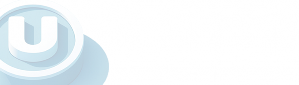
Unilever

Unilever is one of the biggest producers of food, beverages, cleaning agents and personal care products. They produce a huge amount of different products and they wanted to reflect this in their logo. Each part of the logo has a meaning. For example: the heart represents love, care and health - feeling good, a bird is a symbol of freedom. Relief from daily chores – getting more out of life.
Northwest Airlines

This simple looking logo actually carries a whole lot of information. First of all you can see the letters N and W, the first two letters of the brand name. But what most people don’t see is the compass that points to the Northwest, another reference to the brand name.
Milwaukee Brewers

The Milwaukee Brewers is a professional baseball team from Milwaukee, Wisconsin (well, duh…). Their logo is actually made up of the letters M (on top) and B (below the m). These two letters also form a baseball glove.
Hartford Whalers

This logo also uses a negative space to create the letter H. You can see three different parts: the letter H and W and a whale’s tail in blue.
Tostitos

If you look at the centre of this logo, you can see two people enjoying a Tostito chip with a bowl of salsa. This logo conveys an idea of people connecting with each other.
Formula 1

At first, this logo might not make much sense. But if you look closely, you’ll see the number 1 in the negative space between the F and the red stripes. I also love how this logo communicates a feeling of speed.
Elefont

This logo might look like a simple letter, but don’t be fooled: you can see a part of an elephant’s trunk in the negative space inside the letter e.
Sun Microsystems

The Sun logo is one of the most famous ambigrams in the world. You can read the brand name in every direction; both horizontally and vertically. This logo was designed by professor Vaughan Pratt of the Stanford University.
NBC

The NBC (National Broadcasting Company) is one of the biggest American television networks. I think most of you have already seen the peacock in this logo. The peacock has 6 different tail feathers, referring to the six divisions at the time that this logo was created. The peacock’s head is flipped to the right to suggest it was looking forward, not back.
GreenLabs

I know this logo looks like a simple, boring green tree, but if you look at the tree crown, you’ll see that it can also be interpreted as a brain. The logo lays emphasis on the strong intellectual capabilities of the company’s staff and also reflects ‘green’ and ‘labs’ parts of their name.
Presbyterian Logo

If you think the previous logos were a good example of a hidden meaning, then take a look at this logo. It’s the seal of the Presbyterian church and it has several hidden messages. If you want to learn them all, you should take a look at this article.
Twins

This logo was made for twins. To reflect the essence of the duo, a bold typeface was created to reflect the boldness of their approaches. The number 2 was integrated to show the creativeness of their ideas.
Awesome post. Some I already knew but most amazed that I never saw the hidden messages. Thanks for sharing. Maybe I need to rethink my logo… hmmmm!
Great find. Really enjoyed the article.
Unfortunately, Northwest airlines (http://www.nwa.com/) replaced brilliant simplicity with graphic stupidity. So sad to see an international corporation take such a giant leap backward in their identity program.
Also, while the Formula 1 logo does suggest speed and movement, it suggests them going in reverse. Not the best way to win a race in my book.
Big Ten and Baskin-Robbins still stand in a very elite group of all that good graphic and typographic design should be. Both are outstanding examples of our craft!
Nice one!
Very cool post!!! i read through every single description there..
Cool stuff.
Oh WOW!!! Baskin Robbins and 31 flavours of ice-cream..I am simply floored by the creativity.
May I place this article on my website with clear reference that it is your research?
Sure, go ahead Shobha.
Very Creative
the first time you see it – it nice.
the second time is – ok
after you’ve seen these logos in 1000 other sites you kinda get annoyed by it!
StumbledUpon your page. Thanks for the list. Embarrassed at the countless times the FedEx logo has gone right by me and I never saw the arrow…of course, now I can’t see anything else.
Have a local one for your list: an Indianapolis florist has a logo along the same lines – hate to admit that I saw it only as a stylized flower for years before I noticed it was their initials:
http://www.mcnamaraflorist.com/
@Randall: Once you’ve seen the arrow in the Fedex logo, it’s hard not to see it
You should check out the logo for the Cougars of Washington State University. It is by far my favorite sports logo, incorporating the school mascot and letters.
http://www.campusexplorer.com/media/376×262/media-CC238D79.png
Great find John, thanks for sharing
For me one of the funniest logos is Kappa, an Italian brand of sportive clothes that have sponsored a lot of important clubs, like FCBarcelona, Roma etc.
Take the image of the logo and try to cover the two heads of the womenn and there it is…. Explicit content.
Hehehe, tell me what you think!!
Your Comments very good i liked look moore the corona beer
Excelente, i translate it to Spanish, great post!
http://www.rpgamerz.com/2010/01/04/23-brillantes-logos-con-mensajes-ocultos/
This is one of the coolest most informative reads I’ve seen in awhile. The logos and hidden meanings intrigue me and definitely hold a lasting effect on my logo designs in the future to come. Great read, great post.
great findings! -ps- the most best ever company holiday party I’ve ever been too was thrown by Sun MicroSystems. Complete with Monster Trucks, Sushi chefs, all you could drink bar, firework light show and sky divers! A Gigantic Crazy Rockin Waste of cash!
Love it.
In France we also have the logo for the TGV (high-speed train). When you turn the logo upside down, you can see a Snail:
http://www.my-os.net/blog/images/decembre2005/logoTGV.jpg
Since yesterday we have the HADOPI logo (government agency against internet piracy):
http://www.ecrans.fr/local/cache-vignettes/L450xH288/hadopi_450-c7ad2.jpg
Well, I let you discover the hidden message… LOL
Brilliant !!!
You should add NZPost to this, the use an envelope with the n and z characters.
Thanks for mentioning the NZ Post logo, John. For those of you who don’t know it, you can find it here:
http://en.wikipedia.org/wiki/File:New_Zealand_Post_logo.svg
This post makes me smile! Awesome.
Great findings and nicely explained. Really inspiring for designers. Great job Kvn!
Very interesting, I like the mystery of more that one meaning!
Outstanding! Great post!
These are nice logos certainly, but not hidden meanings. They are just very well designed. Good examples of how a designer or agency has done their research properly and provided branding that works. For a corporate logo to work it has to visually encapsulate the company’s product or service, especially across a multi-lingual customer base. If you don’t notice it straight away then that’s ok, but don’t interpret it as hidden.
Great post. There’s a few more in the same category here: http://www.tripwiremagazine.com/2009/05/deep-dive-into-the-secrets-of-great-logos.html
nice..awesome work…
Extraordinary collection … I like it alot.
Thank for open my eyes, I don’t take care about logos, but now I look well and discover a lot of funny things.
Hey Guillermo, the MOTOROLA logo have much more “Explicit content” ….or maybe I am mind-sick….jajajajjijijajj
Excellent post. Just a small remark – the Unilever logo is also a very smart representation of the ‘Horn of plenty’ or ‘Cornucopia’.
I always thought the Goodwill logo was pretty cool and has a little hidden G in there: http://www.lowcountrygoodwill.org/images/logo.gif
Super interesting – thanks
Your Commentsnice, I never have seen a bear in Toblerone! You have opened my eyes!
Interesting, what you have to say about our logo http://www.facebook.com/varkakru don’t mind the background, I always play with it.
The Logo is my vision and letters done by me colleague who have helped me layout idea of the logo as well
I believe the Milwaukee Brewers discontinued use of the logo shown here. The Hartford Whalers moved to North Carolina in 1997 and are now known as the Carolina Hurricanes.
the last one reminds me of “eins zwo”
a splitted german hip hop band
http://t2.gstatic.com/images?q=tbn:FSN2lrybeSynAM%3Ahttp://oldpage.kulturladen.de/images/konzertbilder/einszwo/einszwo_konzert08.jpg
I dig Logos a much under appreciated art form
One of my personal favorite logos, which i was sad to see off of this list is the Infiniti logo. The actual logo depicts a road in the middle which appears to go on forever. this both represents the concept of infinity as well as the purpose of the company. It is also a very clever alternative to the actual symbol of infinity.
There are some nice looking logos here. I really like the Eight logo. Pretty cool stuff.
I heard Scott McNealy say the original source of the Sun logo was U-shaped packing peanuts that a group of them were idly rearranging while chatting (presumably, including Vaughan Pratt).
Their packing-peanut-inspired version of the logo was on its side. Later they paid a design firm to generate the real corporate logo, which rotated it 45 degrees and colored it purple.
I also like Mammoth Mountain’s logo. It’s both an M, a silhuette of a Mammoth and a silhuette of two Mammoth Tusks pointing up.
Don’t forget the erect penis also visible in Amazon’s logo. (It’s there to show you that either a) you’ll get an erection because of how awesome they are or b) that you’re about to get fucked.
I’m not really sure what it means, to be honest.
Nice. Appreciate the time it took to collect these.
It’s funny. Most client think that this stuff actually works but in my experience it’s often the designer who’s just having a little fun and sneaking this stuff in on the side. Still, it is fun.
Your Comments this was fun and it kept me interested!
Great post and valuable information.
I have also bookmarked your site for future reference.
You forgot to mask out the white inside the B in ‘NBC’.
Very cool logo art. I never noticed the bear in the Toblerone logo before.
Nice work, too bad thee Big Ten now has 12 teams…
I’m gonna redo my logo and make a cool one like these!!
One of my faves:
http://logofaves.com/2010/01/spartan-golf-club/
Itz really fantastic…..n my interest in freelance logo creation got escalated …..n am too happy to noe of this…..thanx for this gr8 information dude !
White spaces in the B from NBC. That wasn’t a hidden message, right?
Great! Loved it!
someone just showed me the arrow in the Fed Ex logo the other day. the pittsburgh zoo logo is another good example, though a bit more obvious than most found here.
@ Alex: It’s the peacock you see in the graphic above.
Nice article. I enjoyed reading the article!
I never noticed the bear in the Toblerone logo before – and I’ve eaten plenty of their chocolate!
The United States Cyber Command logo has a hash in it, a sort of hidden message. Not sure if it would fit this list perfectly, though.
http://www.wired.com/dangerroom/2010/07/solve-the-mystery-code-in-cyber-commands-logo/
Nice Post…. I never seen so much details from these logo before

Northwest airlines logo was mind blowing…
it was a really nice read… Though about the unilever logo the symbols that make the U also are some where related to its product line….. There is a Coconut tree symbolizing Parachute brand ( Of Coconut Oil in India), Than there is this splash right on the top – it symbolizes a washing powder/ bar brand name surf excel…. Than there is this heart logo which is commonly associated with its icecream brands …. The symbol of bird is for its product Dove!! U can actually find associations with all its symbols… leaves for its Lipton Tea brand etc. Cheers!! Keep up the good work!!
That was a fantastic review thanks for that! I live in New Zealand but think a lot of people like myself have never noticed how the Roxy logo was made from the Quicksilver logo. Nice work!
Its really cool stuff..
Interesting! Never noticed the arrow in FedEx before, now I feel slightly stupid!
check out the logo for Winfield cigs on the packets, turn it upside down and you will see WinPlay, the f and the i join to become the y and the e looks more like an a, Winfield used to be a big sponsor of sports here in Aussie, hense the Play to Win theme
liked the page, but my favorite is still the pittsburgh zoo logo
http://upload.wikimedia.org/wikipedia/en/thumb/5/5b/Pittsburgh_Zoo_&_PPG_Aquarium_logo.svg/432px-Pittsburgh_Zoo_&_PPG_Aquarium_logo.svg.png
Great post. But u guys forgot the Coca-Cola logo, if you reflect on a mirror it says “No Mohammed No Mekka” in Arabic!
incredible the toblerone one
Wow, awesome article! Thought I’ve seen those logos so often, I’ve never noticed ANY of those things. Except maybe the NBC one lol.
Brilliant indeed!! Thank you for this post, Kvn.
FedEx, Baskin Robbins, Northwest, Tostitos, and Formula 1 are my favorite ones.
The racist burning cross logo doesn’t really belong on this list. Yes, we know you don’t like blacks.
Great post. You might also want to take a look at the Goodwill logo and the Saturn cars logo – both very clever.
Super cool! But they forgot to mention the “spoon” between the E and the D in FedEx. Although it has little to do with the company, it’s pretty neat, eh?
Out of interest I would like to see the full background of the header you used
I thought this was a clever logo for Royal Cup Coffee – can you see the cup?http://pcahouston.org/images/royal%20cup%20with%20tag.jpg
That’s not a bear… That’s Manbearpig!!!! I am deadly serial!!
You are doing a good job by introducing interesting visual material. But your cut and paste research with equally inadequate cut and paste disclaimer is nothing more than superficial eye candy without explanation of the brief and without giving credit to the creators and owners of the logos. Some of the logos above have been created by iconic designers and brand design agencies, but you have not bothered to find them and acknowledge. This is blatant violation of all copyright norms.
very cool. i didnt know about the Toblerone logo myself. Love it! haha
this is fucking stupid. you could say shit like this bout most anything. and no shit on more than half of them. lets see something cooler
i never knew, wow, that’s rad
You missed the Toyota Logo, each letter of the word Toyota can be found in the logo itself.
its awsome!
Your Comments
any theory on the Apple macintosh apple bite?
1) snow white
2) Adam and Eve
3) Alan Turing
I go with number 3.
nice site just doing my uni Graphic design module, pointing out the ‘fedex’ arrow was cool..
Fantastic. inside of all logo are very good. when i saw Carrefour, Baskin Robbins i didn’t think it. but in Vaio massage is very clear.
GREAT just greatpost
I loved this article
Thanks for sharing your perceptions on all these
Best
AYRTON
WONDERFUL!!!!
cooooool!!! i never knew those logos have a lot of meaning.
there’s more in the roxy/quicksilver logo.
you can see a mountain (for snowboarding) and a wave (for surf)
Thanks for sharing your perceptions on all these
the sun looks like a swastika in the negative space
Great!! I want to see more!
This was really interesting & eye-opening. I can’t believe I have never seen the arrow in the FedEx logo before – once it’s pointed out it is glaringly obvious. Very cool
I’m really surprised you didn’t have the Good Will logo on this list, it’s one of my favorites.
This is an awesome post. Great compilation, advertising really does have some hidden meanings sometimes…
Awsome research, many of the hidde nsymbols are hard to spot at first!
Thanks for pointing those I out i never noticed it until I came across this post. Hmm now i’ll be on the look out for other hidden logos.
For the record, the Carrefour logo also shows the tricolor – the French flag
Amen!
There’s nothing like a great logo.
But hidden message logos???? Awesome!!!
I never realized about the Sun MicroSystems one.
People see the FedEx logo EVERY day and most of them never see the arrow. Same with the Baskin Robbins 31 flavors! So smart!!!!
You forgot a hidden message in the Fedex logo. Theres a spoon in it. Its for how delicious they are! xD
Awesome collection of logos and fabulous explanation of the hidden messages..
I too am a design enthusiast but not actively involved in any of the design processes but always get excited on finding such great stuff..
Thanks…
I love the Amazon smile…
This is exactly why I’m taking an advanced graphics design course in school. :3
Hi every body i’m like this share. Thank you so much for grate share
Pretty clever. I wasn’t aware of some of these.
The logos are cool, but the commentary is painfully contrived. Just post the logos without any explanation: it is better to mull over it than be led through it like a two-year-old.
You have put together an excellent site. It is very entertaining to see the creative ways major companies have altered their logos. Do you know if Marriott has any hidden messages in any of their logos?
There are pictures all taken at a Marriott by University of Maryland in the site attached with my name above.
I love logo design, one of my favourite things to do for my clients!
AND I never noticed the toblerone one!! NICE FIND!!
I know another logo. The vans logo. It’s “square root the ‘ans’wer”
i love the logic of “eight” logo and i really like it.. thank you 4 sharing
I did not know that about FedEx and its pretty obvious now that i look at it. Kudos! Awesome blog.
Pretty cool!
Awesome post mate!!!
Thanx!
I see OGC is noticeably absent
A little unnecessary to tell us to “LOOK CLOSELY” or say “you may not see it at first, but…” on almost every single logo, since the “hidden” things in almost all of them is BLATANTLY apparent from a glance and you would have to be an idiot to need them spelled out for you.
kinda lame. i was dissappointed by this.
commentary was seeringly painful. i know you have to write to the lowest common denomonator but it actually seems like the writing is by the lowest common denomonator. poor
I feel smarter after reading this; I bet not many people know that there’s an arrow in FedEx’s logo; or a bear on Tolberone’s mountain.
wow this is simply amazing..
wow good photo & nice blog thank share
Great article, was a good stumble.
Boy, you would love this logosite:
http://www.johnlangdon.net/logos/
Awesome post mate!!!
Thanx!
I enjoyed reading the article!…
I can’t believe how many of these I didn’t catch on my own. Like the two people holding a chip in the Tostitos logo or the Northwest Airlines logo has a compass pointing to the NW. Totally missing both of those. Thank you for sharing, what a great stumble.
interesting as well as creative
experience logos ……… i like it…………..
interesting as well as creative
Cool post, i knew a couple of the logos already and what they represented but the Sony Vaio one is new to me. Cheers
I knew about many of these but there were a few that I had no clue about until you pointed them out. Very creative and tricky. Thanks for putting this list together.
they missed that the quiksilver logo shows a mountain and a wave
Stumbleupon is really throwing me at the nice pages. I like it bro.
interesting as well as creative! xD
I’ve enjoyed eating Toblerone for years, and not once have I ever noticed the silhouette of the bear! I love hidden messages like that. I shall enjoy eating them all the more now for knowing the genius behind the design.
Fiona! Its Yes!
As a result of you – this is awfully constructive !
wow!!!!!!!!!!!!!!!!!!!!!
I really found out a lot hidden messeges thanks a lot
thanks nice great site and i have added in my favorites list
Kevin, Thanks for your article! Very interesting. Loved the Eight logo. And though I’ve eaten a hundred bars of Toblerone, I never knew about the bear in the logo. Can’t wait to make a bet with my brother and win.
I love that kind of stuff. I do drawings sometimes with hidden messages and pictures in them. Great post!
in the f1 logo the f is the back of a formula 1 car and the 1 is the speedy look
Hi,
I rreally enjoyed looking at the hidden messages in the logos.
Keep me posted if you any more.
Cheers
the canterbury clothing company is 3 c’s with kiwis in the negative space
Love the thoughts on hidden messages with in logos its a unique idea and the way you explained it really is great!
Your Comments
Amazingly interesting. creativity at its best.
There are hidden meanings in lots of logos especially the ones that you have shown. It is all interprited by the viewer.
WOW, I really found this interesting. Great post, I enjoyed reading this.. Thanks
Dear friends,
I am from Rio de Janeiro, Brazil. I Live in a city that is very hot most of rhe year. I plan to start an ice cream business. Can you help me create a logo with a subliminal message ? Thank you very much.
GREAT BRAINS HAVE GREAT IDEAS I LIKE ALL LOGO AND THE IDEAS AND MESSAGE HIDDEN BEHIND
Stupid yo!!!!
What a fun post. You tend to forget just how much effort firms go through designing logos. An exercise in design awareness. And marketing.
excellent web site. many thanks for this wonderful post. i enjoy it lots.
I don’t like Eighty 20′s logo. The top row of “binary” is backwards, and means 4. The bottom makes 20. I have no problem a big company’s logo standing for 420, but both of them are missing a figure.
I personally like Toyota’s logo because each of the letters of “T-o-y-o-t-a” is contained with it.
How about the old Montreal Expos logo.
If you look closely, you see the letters M, E, & B — for “Montreal Expos Baseball”. One of the most clever logos in sports…
I always thought the old International Harvester logo was perfect.
I wish we had a logo this good! Never knew any of these. Shows its important to look at things in a deeper way to find the hidden meanings.
unidb Logo required
Excellent post! Enjoyed viewing the logos and their hidden messages. Will definitely share with our clients and friends.
This is all very nice and an interesting take on graphic manipulation of corporate symbols, but it clearly is not a “hidden meaning” like Bryan Key’s “subliminal seduction” nor David Brown’s fictitious nonsense. It is purely a nice example of graphic engagements we have at our disposal as corporate communicators.
Love these logos. This is what we were going for with our logo. The Metalmark is a custom chainmaille jewelry shop so the “Metal” part of the name is pretty obvious, but metalmarks are also a family of butterflies that have silvery spots on the wings, so the logo is an “M” that also resembles a butterfly.