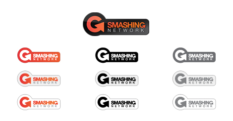
If you want to learn more about the design process behind the Smashing Network logo, you can should check out this article on ImJustCreative. Graham explains everything from the initial brief to the finished result. As you can see he also made some colour variations.


Appreciate the write-up. It was an interesting project to work on for sure, given the ‘critical’ nature of design. A little daunting for sure, but think we came out OK with it.
good designs
Very cool logo. kinda reminds me of Burton’s.